50 Useful Libraries and Resources for Responsive Web Design
Let's talk about responsive web design. People are increasingly dependent on their smart mobile devices, and chances are that a large portion of the visitors of your website have used their phone or tablet to get to it. In this article you will find 50 articles, tools and resources, which will help you learn what responsiveness is, and how to apply these techniques to your current website. Happy learning!
Basics
Let's start with these articles which explain the basic ideas of responsiveness.
1. Make it Responsive
Google's "Make it Responsive" is a great introduction in the topic. It will get you into the responsive web-designs. During this course, you will be building a site that works across multiple screen sizes and device types. They also have other useful guides which we recommend.
2. MDN's Responsive Web design Tutorial
This is a nice MDN article about some of the basic strategies people use to achieve responsiveness, such as liquid or fluid layouts, media queries and fluid images. They have also highlighted useful links to external resources on responsive web design.
3. 5 Really Useful Responsive Web Design Patterns
DesignShack's awesome article features lots of example patterns which can help you plan your own page layout. Some of the examples are really simple and others provide more imaginative ideas on how to arrange HTML elements.
4. Responsive Web Design Tutorial
Shayhowe presents an excellent series of lessons on web design. One of them teaches you how to make any page mobile-friendly. They start from the foundation of responsiveness and move up to different ways of making any page perfectly viewable in different screen sizes.
5. 9 Basic Principles of Responsive Web Design
Froont made this strange article that shows us the difference between divergent strategies used in making responsive web apps. They get bonus points for using cool animations to present the advantages of each technique. This is a very fun way to learn new things.
6. A List Apart's Responsive Web Design Tutorial
An in-depth article on responsive design that covers topics such as fluid design and media queries. You'll find something to learn in this great resource whether you are new to web developing mobile-friendly apps or you've already done a few responsive projects.
7. Responsive design in 3 steps
This tutorial is intended to show you the basics of responsive design. It's short and focuses only on the most important aspects. It features a helpful section on the viewport meta tag so that your sites can fit on screens perfectly.
8. Interface Sketch
This is not a guide, but is useful nonetheless. This is a collection of free sketch templates for web, mobile and tablet platforms. The templates are in PDF and contain multiple pages and layouts. Simply download a template, print out the pages you need and start sketching your next responsive design.
CSS frameworks
Writing responsive CSS by hand takes a lot of experience and most times you will be better off by using a framework. Here is a list of some of the best.
9. Ink
Quickly create responsive HTML emails that work on any device & client. Even Outlook. Email anywhere. On any device. How HTML email was meant to be read.
10. Skeleton
Skeleton is a small collection of CSS files that can help you rapidly develop sites that look beautiful at any size, from desktop to mobile. This framework consists of a base html page that includes the necessary initial markup, some stylesheets which can help you with styling your page and an included icon-set.
11. Columnal
The Columnal CSS grid system is a “remix” of a couple others with some custom code thrown in. It makes responsive prototyping a little easier. It is 1140px wide, but since it is fluid, it will respond to the width of most browsers.
12. Bootstrap
Bootstrap is the most popular and maybe the most powerful from the frameworks presented here. It is made for folks of all skill levels, devices of all shapes, and projects of all sizes. There is also a large number of bootstrap plugins which you can use to extend it.
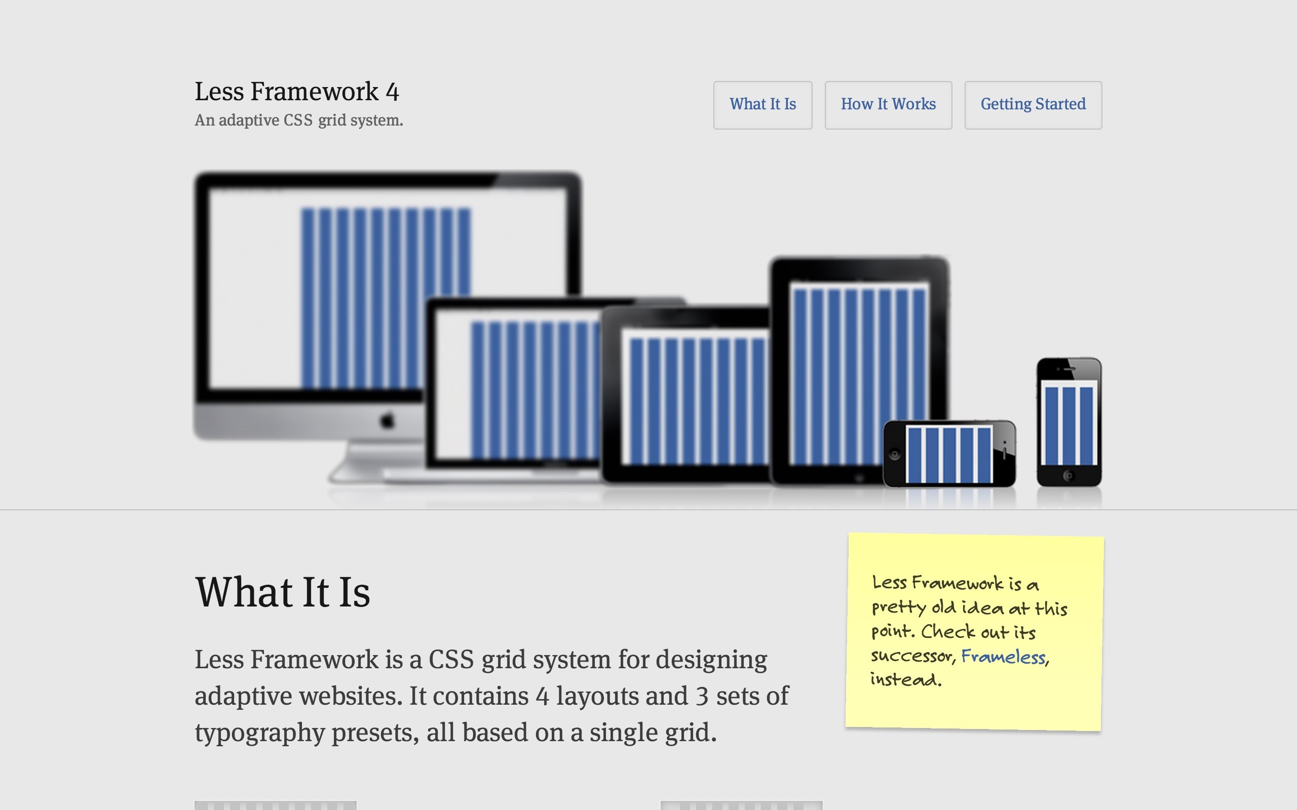
13. Less Framework
Less Framework is a CSS grid system for designing adaptive websites. It contains 4 layouts (Default, Tablet, Mobile and Wide Mobile) and 3 sets of typography presets, all based on a single grid. The only measures that change from layout to layout are the amount of columns and the width of the outer margins.
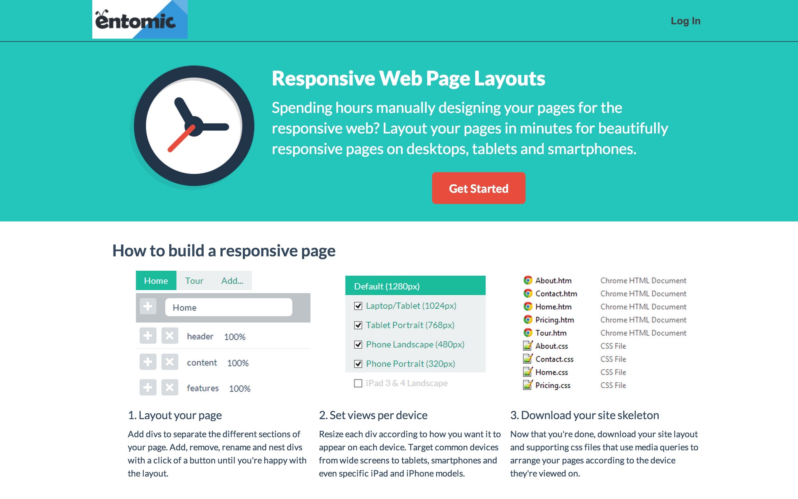
14. Entomic's Responsive CSS
Layout your pages in minutes for beautifully responsive web sites on desktops, tablets and smartphones. A service that provides the option to create the layout of the page based on popular screen sizes. Simply create boxes and set their width, export the layout and just start using it.
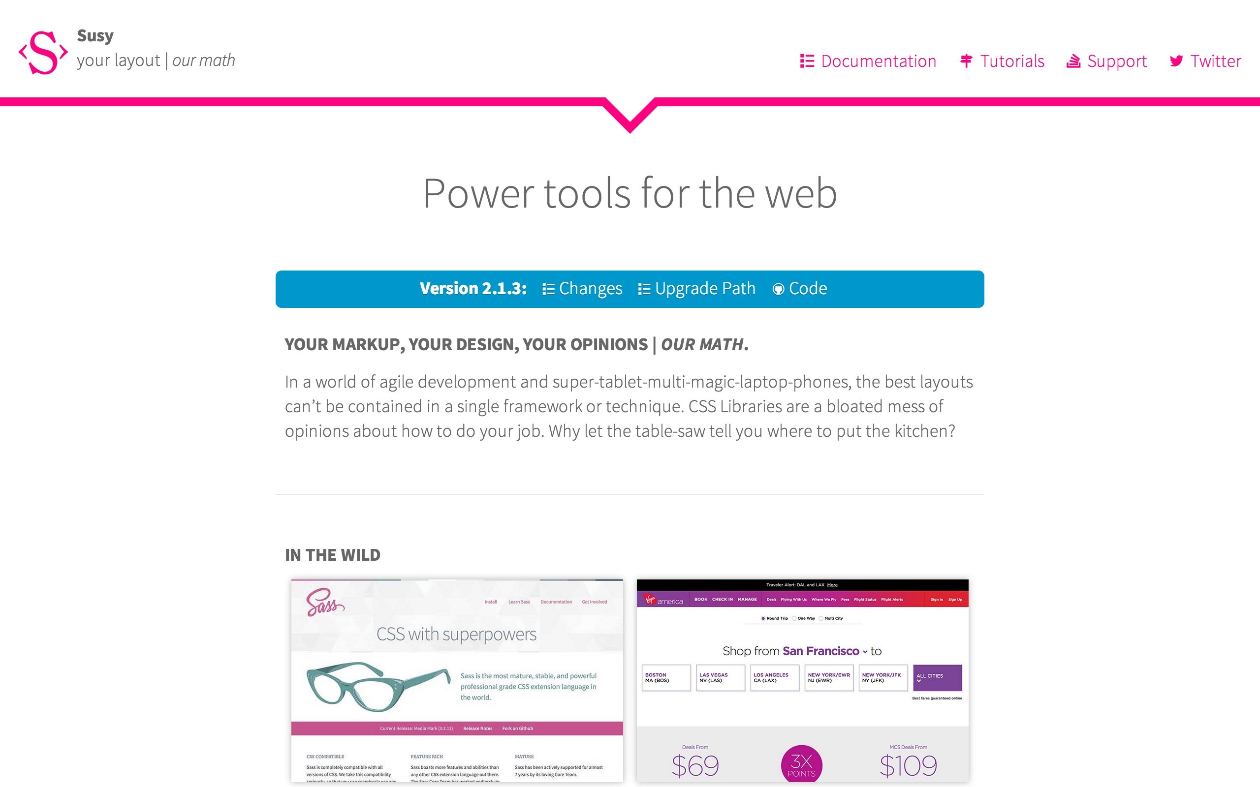
15. Susy
In a world of agile development and super-tablet-multi-magic-laptop-phones, the best layouts can’t be contained in a single framework or technique. CSS Libraries are a bloated mess of opinions about how to do your job. Why let the table-saw tell you where to put the kitchen?
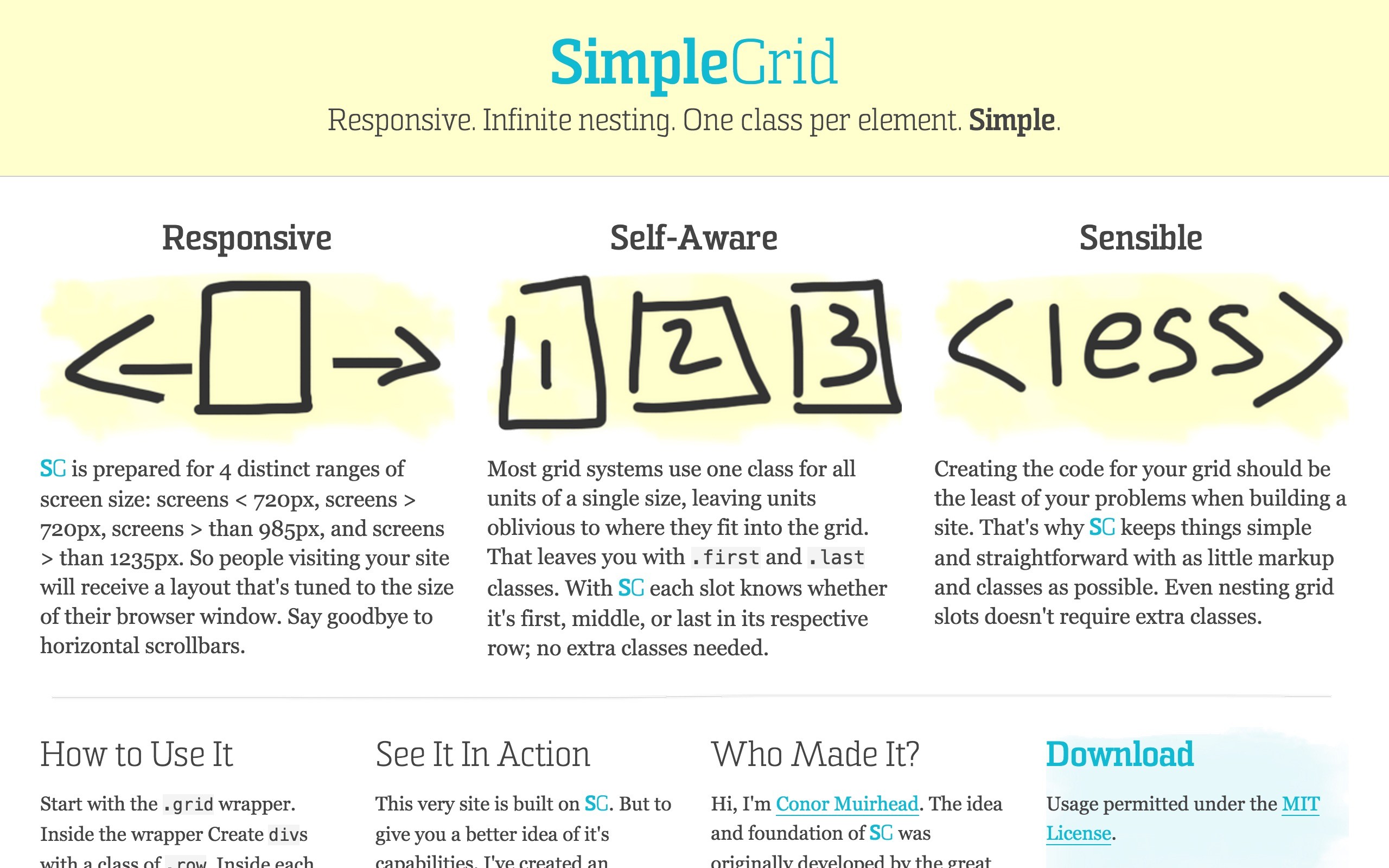
16. Simple Grid
Simple Grid is another CSS grid framework. It strives for simplicity, so if you don't need all the extra features of something like bootstrap, this framework is a good choice.
17. Furatto
Lightweight & friendly front-end framework to get the job done. Whether you are using Scss or CSS, it is really easy to start a project and get things done in no time.
JavaScript and jQuery Libraries
There is also a number of useful jQuery libraries and plugins that can give your website the extra responsive magic that it needs.
18. Intention
Intention.js offers a light-weight and clear way to dynamically restructure HTML in a responsive manner. What should an element's classes be on mobile vs tablet? Where should advertising markup be placed when viewed on a desktop browser? Does the page require an alternate slideshow widget on touch-enabled devices? These are all scenarios that Intention.js can handle, altering the page based on users' devices.
19. JResponsive
JResponsive will organize your content in an efficient, dynamic and responsive layout. It can be applied to a container element and it will arrange its children in a layout that makes optimal use of screen space, by "packing" them in tightly.
20. ReStable
jQuery ReStable is a very simple and lightweight (~1Kb) jQuery plugin that make tables responsive making them collapse into ul lists.
21. Responsive Elements
Responsive elements makes it possible for any element to adapt and respond to the area they occupy. It's a tiny javascript library that you can drop into your projects today.
22. Restive
Restive.JS is a jQuery Plugin that helps you quickly and easily add features to your Web Site to enable it respond and adapt to virtually every Web-enabled Device. Using a combination of Device Detection, Advanced Breakpoints Management, and Orientation Management, Restive.JS will give your Web site an uncanny ability to stay robust in the face of a constantly changing device landscape.
23. Fit Text
FitText makes font-sizes flexible. Use this plugin on your fluid or responsive layout to achieve scalable headlines that fill the width of a parent element. Oh, and don't you dare let us catch you using FitText on paragraph text. This is for gigantic display text only!
24. Collage Plus
This plugin for jQuery will arrange your images to fit exactly within a container. This creates an effect similar to Flickr's profile pages or Google+ Albums. This plugin for jQuery will arrange your images to fit exactly within a container. This creates an effect similar to Flickr's profile pages or Google+ Albums.
25. Chartist
You may think that this is just yet an other charting library. But Chartist.js is the product of a community that was disappointed about the abilities provided by other charting libraries. Of course there are hundreds of other great charting libraries but after using them there were always tweaks you would have wished for that were not included.
26. OWL Carousel
Touch enabled jQuery plugin that lets you create beautiful responsive carousel sliders. You can add an unlimited amount of images which can be slided with a butter-smooth animation.
27. Swipebox
Swipebox is a jQuery "lightbox" plugin for desktop, mobile and tablet.
28. Slides
SlidesJS is a responsive slideshow plug-in for jQuery (1.7.1+) with features like touch and CSS3 transitions.
29. Glide
Glide.js is responsive and touch-friendly jQuery slider. Based on CSS3 transitions with JS fallback for older browsers. It's simple, lightweight and fast. Designed to slide, no less, no more.
30. FlickerPlate
A cool jQuery plugin that lets you flick through content. It is also fully responsive and touch enabled.
31. One Page Scroll
Create an Apple-like one page scroller website (iPhone 5S website) with One Page Scroll plugin.
32. FlexSlider
FlexSlider is an awesome, fully responsive jQuery slider toolkit.
33. Royal Slider
RoyalSlider is an image gallery and content slider plugin.
34. Camera
Camera slideshow is an open source project, based on Diapo slideshow, but improved a lot.
35. PhotoSwipe
PhotoSwipe is a self contained JavaScript library that can be easily integrated into your mobile websites.
36. Responsive Slides
ResponsiveSlides.js is a tiny jQuery plugin that creates a responsive slider using elements inside a container.
37. MasterSlider
Everything you ever wanted in an animated content and image slider, all packaged up into one awesome plugin!
38. Magnific Popup
Magnific Popup is a responsive lightbox & dialog script with a focus on performance and providing best experience for a user on any device.
39. Justified
This is a jQuery plugin which arranges photos in a perfectly spaced grid, compensating for the different sizes of the photos. See a live demo here.
40. Double Tap To Go
This is a concept for a multi-level navigation menu which works on mobile devices. To compensate the lack of a real hover event, the menu options get activated on double tap.
41. Menu-Aim
Menu-Aim is a jQuery plugin for dropdown menus that can differentiate between a user hovering over a dropdown item and trying to navigate into a submenu's contents.
42. Menutron
Menutron transforms your navigation menus from a list to a select menu when resizing your browser. This is especially useful for navigation menu with lots of options.
43. SlickNav
SlickNav transforms your navigation menus into a hamburger menu when resizing your browser.
44. Sidr
jQuery plugin for creating responsive side menus. They can be shown from the left or right side.
45. Big Slide
BigSlide is a teeny tiny (~1kb compressed) jQuery plugin for creating off-screen slide panel navigation.
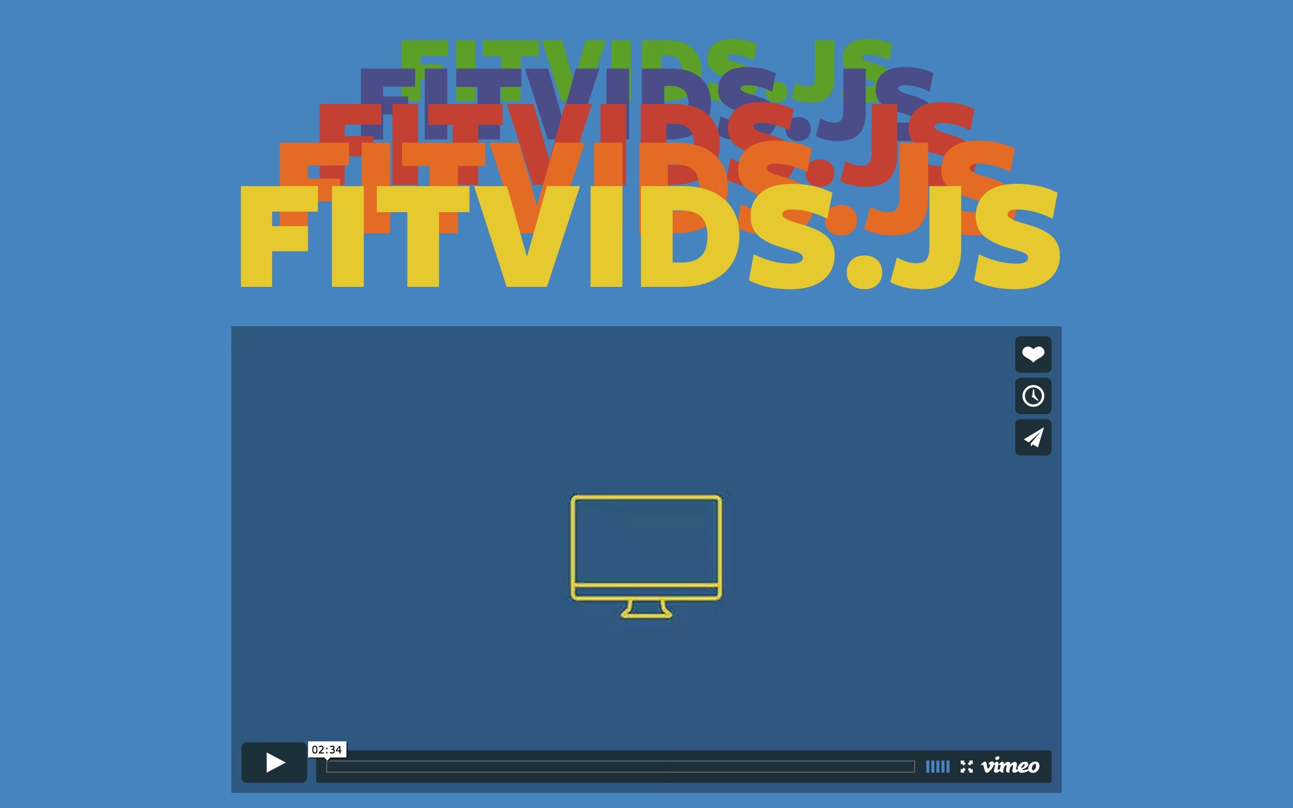
46. FitVids
A lightweight, easy-to-use jQuery plugin for fluid width video embeds. FitVids automates the Intrinsic Ratio Method by Thierry Koblentz to achieve fluid width videos in your responsive web design and it's really ease to use.
47. Adobe Edge
Testing mobile layouts is a pain. To help you, Adobe has created Edge Inspect. It is an essential application for web developers and designers who need to preview their content across multiple mobile devices.
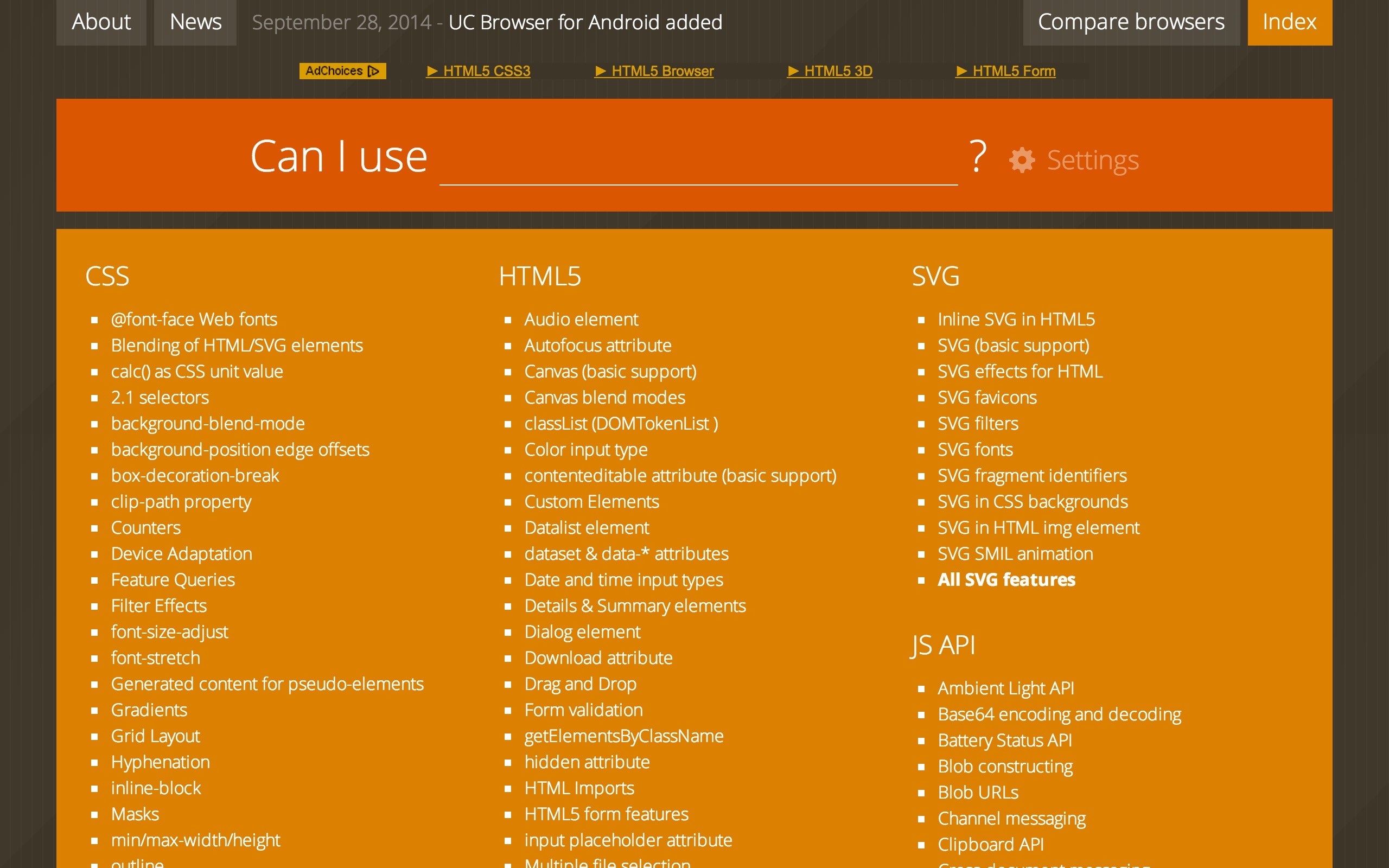
48. Can I use ...?
Not all CSS features are available on mobile devices. To make sure that no pieces of functionality are missing on mobile devices, you can use caniuse, which is the go-to web site for up-to-date browser support tables.
49. Am I Responsive?
"Am I Responsive?" helps you to see if your website is a responsive one or not. It is also a great way to take a quick screenshot with your page in a number of devices at once.
50. Device Mode & Mobile Emulation
Google has also developed a way for testing mobile layouts. If you use Google Chrome, you can try Device mode & Mobile emulation right from your developer tools, or even try remote debugging on an android smartphone connected to your computer.
Conclusion
We hope that you find all these responsive plugins and resources useful! They will give you a great start into responsive design, and a lot of tools for creating your next awesome design. Did we miss anything? Tell us in the comment section :)
Bootstrap Studio
The revolutionary web design tool for creating responsive websites and apps.
Learn more
Sorry but I can't believe bxslider is not on the list.
Thank you! bxslider looks like a great resource.
Zurb Foundation is a massive omission from this list - it is almost as popular as Bootstrap and the two of them combined are far more popular than all the others put together.
You got Zurb's Ink platform though, which is cool.
Thank you for the addition! We should have included it.
Lots of goodies on this list. Thanks for putting it together. A couple of other nice, simple frameworks for future reference: Layers CSS and Base
Wow, these are great additions to the list. Thanks!
Semantic UI is missing in Framework section. i think is awesome for front-end developer. otherwise it's great collection...
Masterslider rocks. Used many times over and I absolutely love it.
According to me you are missing a very fine plugin named <b>“Avartan Slider”</b> which is very responsive & can able to create attractive multi content slider. You can check it here http://avartanslider.com/
Otherwise great collection. Thanks...