Design Tips For Developers
Professionals in both fields seem to have realized of late that it helps for designers to have an understanding of web development, and for developers to know about good design practices. And yet, this awareness doesn't often get carried very far in practice. It feels so much safer to stay within your sphere of comfort, where arcane design terms don’t get tossed around with bewildering frequency. But a lot of headaches and misunderstandings can be evaded by understanding just a few of the basic principles that underlie good design.
1. Space
The hallowed concept that designers call white space (otherwise known as negative space) is one of the most essential components of web design. It’s the margins, the padding, the letter spacing and line height within text; it’s every part of the site that isn't filled with some eye-catching object (meaning that patterns and images can sometimes be a part of white space, as long as they recede from focus, rather than grab at it).

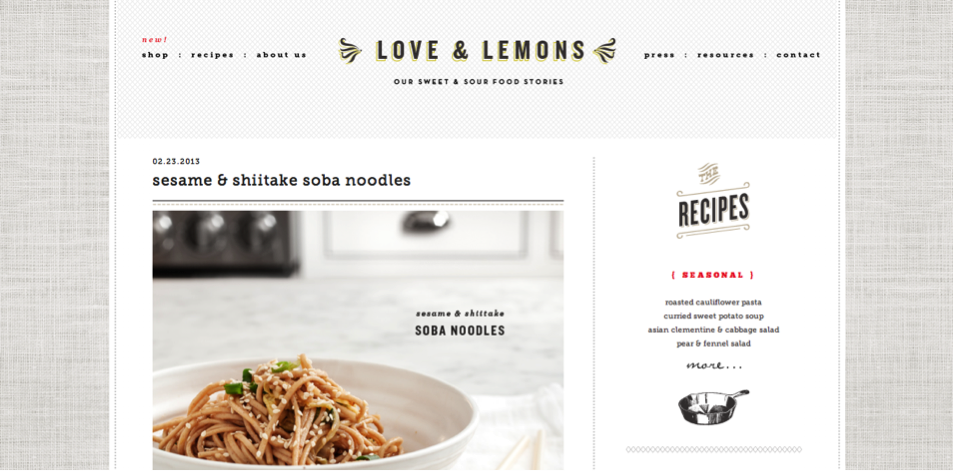
For example, this blog has plenty of white space, although you might at first think that the patterns on the top and sides don’t count. But they do, because they’re low-contrast and restful to look at. That’s the point of white space; it rests the eye, creating pauses in content intake that stops users from getting overwhelmed by an excess of information. Notice how all the sections in the sidebar take up so much space to say very little; this makes the text more readable and sections more distinguishable. All these spaces are what makes this site feel so clean, well-organized, and welcoming.
Tips on White Space:
- Make sure blocks of text are always broken up with shorter paragraphs, lists, or images.
- Soft textures, patterns, and images can be used as white space, but don’t overdo them. Too many conflicting elements become confusing, no matter how low-contrast they are.
2. Contrast
There are a lot of ways to achieve contrast in design, but at least a few of them must be employed to make a website look good. There’s contrast in color; people unconsciously respond to this whenever they see a brightly-colored button against a neutral background. There are also ways to use contrasting sizes and shapes. In all its forms, contrast is used to call out important sections, and add a sense of movement and interest to elements that would look static and plain if they were too similar.

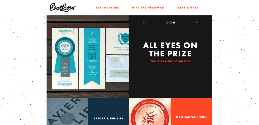
This website uses all three types of contrast mentioned above: the bright, flat blocks of color pop out against the light, textured background. The organic shape of the logo on the left contrasts with the rest of the type, which are all blocky and architectural. Furthermore, the title typeface stands out because it’s so much larger than the others.
Tips on Contrast:
- Refer to common color rules, using a color wheel to determine which hues look most striking when put together.
- Typefaces don’t always need to be very different in scale and in shape, but at least one of these contrasts will always help a design.
3. Balance
The last major concept to conquer is one that deals with the arrangement of the page. If a layout is too lopsided, it won’t look right. On the other hand, if it’s completely centered, it risks looking stale and boring. Balance is struck when the visual weight on one side of a page is countered by elements on the other side.

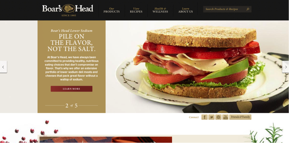
For example, you might at first identify this site as being off-balance because the banner and the logo are both on the left-hand side. However, the visual weight they give to that side of the page are met on the other side with the navigation bar and a striking photo.
Tips on Balance:
- Half close your eyes when you check a page for its balance. The elemental block shapes will be easier to identify, and distracting details will be less apparent.
- Balance doesn't mean exactly equal. A large block of orange on one side of a page can be balanced by an orange button on the other side.
- Check out some infographic design tips to get a better sense of balance; layout is one of the most important considerations in this field.
Developers shouldn't feel like they need to get an arts degree to have a working understanding that gives designers a leg up with their work. All it takes is a general understanding to be able to cooperate in creating great web design. An understanding of these few principles will add immeasurably to your interaction with designers, and the visual aspects any project.
Bootstrap Studio
The revolutionary web design tool for creating responsive websites and apps.
Learn more
Great article. Will read through to improve my designing skills. I am a photoshop learner. Also I would like to share this tool which helps designers to find color combinations used by other site's by reading its css. Here is the link of my version of CSS color extractor: http://cube3x.com/css-color-extractor
Thanks again for this great article.
Some very useful tips there. Thank you good post.
Thank you, very useful :)
Interesting article. I reblogged a piece about Brain Friendly web design a while back:
Research shows the most effective way to get readers to visit and stay on a website is to keep it simple. White space is a good way to do this.
“The brain can only process so much information at a time,” said Paul Bolls, an associate professor of strategic communication at the school. “Too much information can overload it and cancel out understanding and retention. Consuming news and advertising involves receiving information, adding previously held knowledge for context and then storage of the new information.”
You can read that post here - http://blog.red-website-design.co.uk/2013/03/09/brain-friendly-website-design-attracts-more-viewers/
Really great article with some basic design tips for designers. I think it's really important as well that both designers and developers understand a bit about the other. If we don't keep up with each other than it is bound to cause problems.
The white/negative space is also commonly found in logo design. The most common example is FedEx. With the white space they form an arrow between the E and X. It's something hard to find and oh so beautifully designed.
For smaller websites, most of the times the developer is the designer and vice-verse. These are all useful tips and can be used to improve the website design with very little efforts by developers. Thanks for the tips!
All developers should consider the design. Even if they are not the ones creating it they should strive to push forward with a good design. The user interaction with the process and the visuals often make or break an application or website. This is often more important than raw performance (though it is still required after the visuals are met).
Hi Luck, I really enjoy reading your design tips. I would probably apply them to my works. Thank you for sharing.
Really nice tips thanks for sharing, if you can also make a video of the above content and elaborate a little bit then it would be much more easier to understand and will also seep in nicely, still great stuff though.
Sam: http://www.averox.co.uk/