5 Flexbox Techniques You Need to Know About
Flexbox is a CSS standard optimized for designing user interfaces. Using the various flexbox properties we can construct our page out of small building blocks, which then are effortlessly positioned and resized any way we want. Websites and apps made this way are responsive and adapt well to all screen sizes.
In this article we're going to take a look at five flexbox approaches to solving common CSS layout problems. We've also included practical examples to showcase real life scenarios in which these techniques are applied.
1. Creating Equal Height Columns
This may not seem like a difficult task at first, but making columns that have the same height can be really annoying. Simply setting min-height won't work, because once the amount of content in the columns starts to differ, some of them will grow and others will remain shorter.
Fixing this issue using flexbox couldn't be easier, as columns created this way have equal heights by default. All we have to do is initialize the flex model, then make sure the flex-direction and align-items properties have their default values.
.container {
        /* Initialize the flex model */
    display: flex;

        /* These are the default values but you can set them anyway */
    flex-direction: row;    /* Items inside the container will be positioned horizontally */
        align-items: stretch;   /* Items inside the container will take up it's entire height */
}
<div class="container">

    <!-- Equal height columns -->

    <div>...</div>
    <div>...</div>
    <div>...</div>

</div>
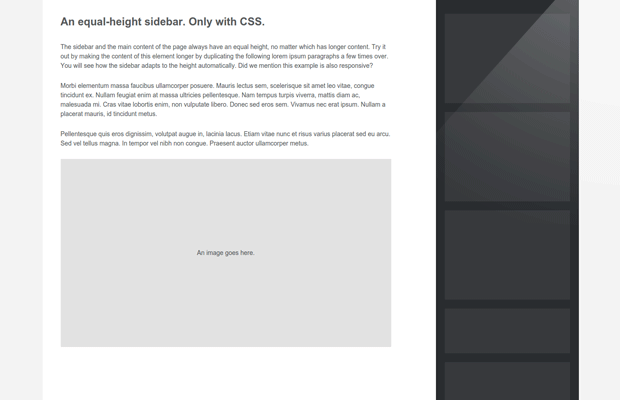
To see a demo of this technique, you can head out to our Easiest Way To Create Equal Height Sidebars article, in which we create a responsive page with a sidebar and main content section.
2. Reordering Elements
A while ago, if we had to dynamically change the order of some elements, we would probably try some CSS hack, quit in frustration, and go do it with JavaScript. With flexbox however, this task comes down to applying a single CSS property.
It's called order and just like its name everything about it as straightforward as possible. It allows us to swap any number of flex items and change the sequence in which they appear on the screen. It's only parameter is an integer determining the position of that element - lower numbers mean bigger priority.
.container{
    display: flex;
}

/* Reverse the order of elements */

.blue{
    order: 3;
}

.red{
    order: 2;
}

.green{
    order: 1;
}
<div class="container">

    <!-- These items will appear in reverse order -->

    <div class="blue">...</div>
    <div class="red">...</div>
    <div class="green">...</div>

</div>
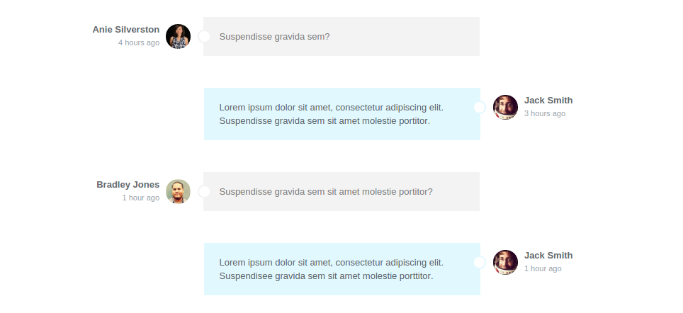
The order property has many practical uses. If you want to see some of them, you can check out this article, where we use it to build a responsive comment section.
3. Horizontal And Vertical Centering
Vertical centering in CSS is one of those problems that makes us ask ourselves: How is such a trivial thing still so complicated to do? And it really is. If you google vertical centering CSS, an infinite amount of different techniques will pop up, and most of them will involve tables or transforms - things that aren't designed for making layouts.
Flexbox offers an easier solution to the problem. Every flex layout has two directions (X axis and Y axis) and two separate properties for their alignment. By centering both we can position any element right in the middle of its parent container.
.container{
    display: flex;

    /* Center according to the main axis */
    justify-content: center;

    /* Center according to the secondary axis */
        align-items: center;
}
<div class="container">

    <!-- Any element placed here will be centered
         both horizonally and vertically -->

    <div>...</div>

</div>
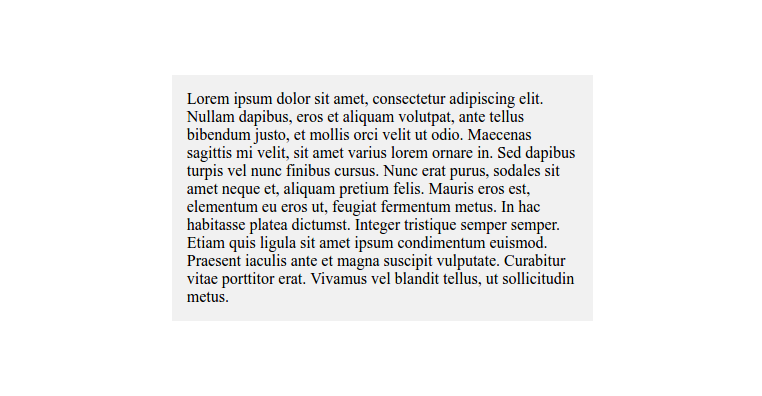
To see this tecnhique in action and read more about it, you can go to our quick-tip article on the same topic.
4. Creating Fully Responsive Grids
Most developers rely on a CSS frameworks when creating responsive grids. Bootstrap is the most popular one but there are hundreds of libraries that can help you with this task. They usually work well and have tons of options, but tend to be quite heavy. If you are a DIY person or don't want to implement a whole framework just for the grid, flexbox has you covered!
A row in the flexbox grid is simply a container with display:flex. The horizontal columns inside it can be any amount of elements, setting the size of which is done via flex. The flex model adapts to the viewport size, so this setup should look fine on all devices. However, if we decide there isn't enough space horizontally on the screen, we can easily turn the layout into a vertical one with a media-query.
.container{
    display: flex;
}

/* Classes for each column size. */

.col-1{
    flex: 1;
}

.col-2{
    flex: 2;
}

@media (max-width: 800px){
    .container{
        /* Turn the horizontal layout into a vertical one. */
        flex-direction: column;
    }
}
<div class="container">

    <!-- This column will be 25% wide -->
    <div class="col-1">...</div>

    <!-- This column will be 50% wide -->
    <div class="col-2">...</div>

    <!-- This column will be 25% wide -->
    <div class="col-1">...</div>

</div>
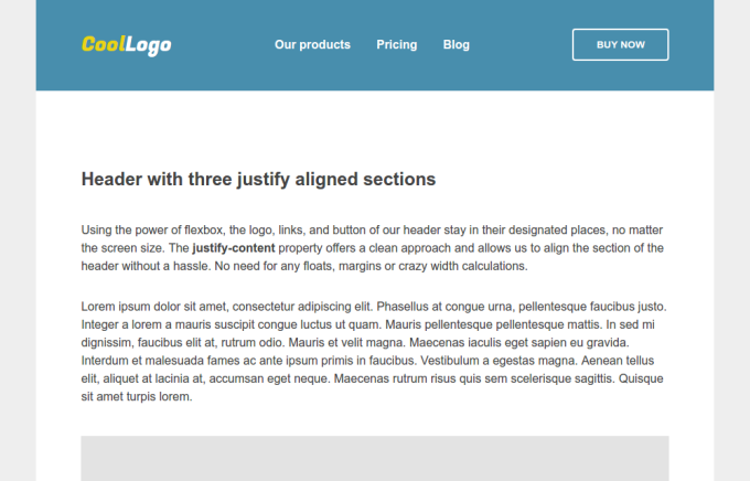
You can check out a variation of this technique in our The Easiest Way To Make Responsive Headers Quick Tip.
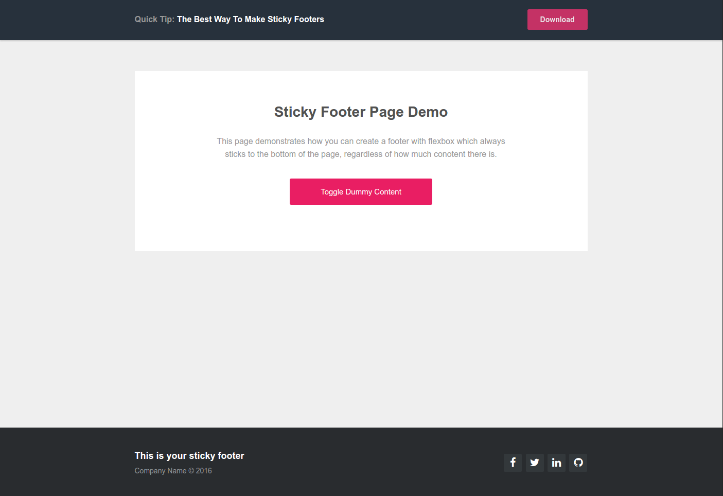
5. Creating The Perfect Sticky Footer
Flexbox has an easy solution to that problem as well. When building pages that include a sticky footer, by doing the whole thing in flex elements we can be sure that our footer will always stay at the bottom of the page.
Applying display: flex to the body tag allows us to construct our entire page layout using flex mode properties. Once that's done the main content of the website can be one flex item and the footer another, which makes it really easy to manipulate their positioning and place them exactly where we want.
html{
    height: 100%;
}

body{
    display: flex;
    flex-direction: column;
    height: 100%;
}

.main{
   /* The main section will take up all the available free space
      on the page that is not taken up by the footer. */
   flex: 1 0 auto;
}

footer{
   /* The footer will take up as much vertical space as it needs and not a pixel more. */
   flex: 0 0 auto;
}
<body>

    <!-- All the page content goes here  -->

    <div class="main">...</div>

    <!-- Our sticky foooter -->

    <footer>...</footer>

</body>
You can find more information about this technique in our article The Best Way To Make Sticky Footers.
Conclusion
All mainstream browsers (except IE 9) now support the flex layout mode, so unless you have a user base that prefers retro Microsoft browsers, it's safe to say that flexbox is production ready. If you haven't used it by now, we highly recommend that you try it!
We hope you found our CSS tips useful and that they will help you build better and more robust responsive layouts. Enjoy!
Bootstrap Studio
The revolutionary web design tool for creating responsive websites and apps.
Learn more
With flexibility.js you can use Flexbox also in IR 8 & 9 ;-)
https://github.com/10up/flexibility
A very good tutorial on the flexbox usage. After your tutorial, I got confidence in using flexbox in the CSS styling.
Thanks for sharing it.
Good article!
Thanks a lot, man.
Genuine question from a CSS amateur: is it better to use height: 100% for <html> and <body> tags to get a full-height layout, or would height: 100vh be more appropriate?
Fantastic, thank you!
For example second Reordering Elements, flex-direction: row-reverse; can also work no need to add orders for each child but for property purpose its fine.
Reading this with some flexbox sandboxes ( like https://loading.io/flexbox ) could also help. nice article, thanks man!