10 Awesome Sass Libraries You Should Know About
SASS is the most popular CSS preprocessor today. It allows you to supercharge your stylesheets with features like variables, mixins, functions, inheritance and nesting. There are hundreds of Sass libraries, frameworks and plugins that are available and can save you a lot of time when creating your website.
In this article we are going to share with you a collection of 10 interesting Sass libraries that we think you should definitely check out.

Gridlex
Gridlex is a simple css grid system for creating modern layouts and submodules. It is easy to use, you just need to wrap your column (.col) elements in a grid container (.grid). It offers responsive designs, based on media-queries and supports nesting grids directly in a column.
Buttons
This is a free and open-source highly customizable CSS button library created with Sass. It offers a fast and easy way to add good looking and colorful buttons in your website. There is a large variety of buttons that you can choose from including flat, rounded, glow, 3D and many more.

Bourbon
Bourbon is a simple, lightweight Sass library that offers an easy way to create stylesheets for cross-browser use. It contains almost everything you need to create amazing websites - mixins, functions, and addons. The library is dependency-free and requires no configuration.
Sassy Inputs
A Sass mixin library for creating minimal CSS3 cross-browser form input styles. It includes mixins for text, textarea, search, select, radio, checkbox, and button inputs. Sassy Inputs are customizable and fully keyboard operable.
Saffron
Saffron is a simple Sass mixing library that offers a fast way to add CSS animations and transitions to your website. It is easy to use, all you need to do is include the mixin in the Sass declaration and set the variable for the effect you want to use. There is a large variety of animation and transitions available- fade in and out, slide in and out, shake, bounce and a lot more.
mini.css
This is a lightweight and mobile-first CSS framework for creating amazing and responsive websites. It is only 10kb gzipped, and its responsive grid and modern components offer a fast and easy way to craft beautiful designs for all screen sizes.
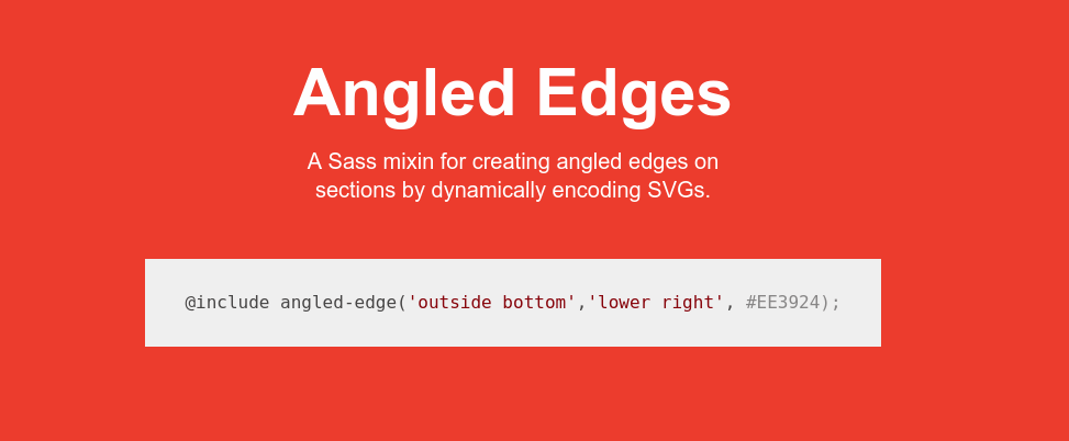
Angled Edges
A Sass mixin for creating angled edges on sections by dynamically encoding SVGs. It creates an svg triangle that is set as a background image, and you can use it's parameters to set the location, hypotenuse, fill color, height and width. It has support for all modern browsers - Chrome, Firefox, Safari, Edge and including IE 9+.
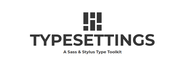
Typesettings
With Typesettings you can set your font-size in modular scale with Ems, vertical rhythm, and responsive ratio based headlines. It has 6px default baseline and maintains vertical rhythm with pixel based borders. Typesettings handles all the math for Ems and uses modular scale values to set font size.
MaterializeCSS
This is a CSS framework based on material design. It is highly customizable and fully responsive. The framework offers a large selection of components like buttons, cards, forms, navbars, pagination and a lot more. It is compatible with Chrome, Firefox, Safari, Edge and IE 11+.
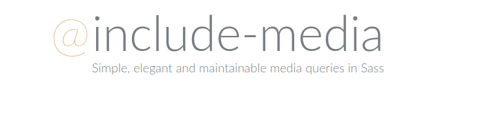
Include media
A Sass library that offers an easy way for writing media queries. It has a list of default breakpoint for phone, tablet and desktop, that can be customized the way you like. The library allows you to write media queries with em and rem units and create aliases for often used expressions.
Writing Sass in Bootstrap Studio
Bootstrap Studio, our powerful app for building websites, offers an easy way to write and edit Sass files. You can use drag and drop to build your design visually, style it with CSS and SASS and see the result in real time. Find out more about writing Sass in Bootstrap Studio over at bootstrapstudio.io.
Bootstrap Studio
The revolutionary web design tool for creating responsive websites and apps.
Learn more