Creating Apple's Website with Bootstrap 4
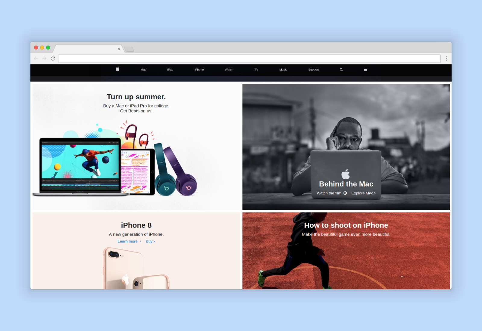
Apple's home page is an example for a lightweight and modern design that looks good on any screen size. In this lesson we will recreate it using our powerful web design tool - Bootstrap Studio.
Watch the step-by-step video below, and learn how to use the Bootstrap framework and write mobile-first CSS to make your website responsive.
Some of the highlights of the video are the way we customize the navbar to make it fixed to the top and all links evenly spaced out. Also, you can watch us use Bootstrap's rows and columns to construct a responsive product grid.
You can watch the video on YouTube, where we've linked to the images we used and the final bsdesign file. For more videos like this, visit and subscribe to our channel. Happy learning!
Bootstrap Studio
The revolutionary web design tool for creating responsive websites and apps.
Learn more
Comments 1
Nice tutorial for share with junior front end developers.