Quick Tip: Style Form Elements With Pseudo Selectors
Ever since CSS was invented, web developers everywhere have wished for a way to style the built-in browser controls. This is straightforward for simple elements like buttons and text inputs, but difficult for some of the more complex elements like select and range. In this quick tip, we will show you how to do it.
Why pseudo selectors?
There is no standard way for customizing the appearance of the built-in browser elements yet. For example, the search input shows a small "x" witch you can press to cancel your search. This is implemented as a separate element internally, but you can't reach it with regular CSS. Browser makers have taken notice, and they've added vendor specific selectors that you can use. For that "x", the selector to use is input[type=search]::-webkit-search-cancel-button.
There is a huge list of the known selectors here. All browsers provide some selectors for customizing built in elements, but the bad news is that support is all over the place. Hopefully in the future there will be a standard that brings consistency to this mess. For now though, we have to target each browser individually.
If you use Google Chrome, there is an easy way to find out which selector you're supposed to be using. After you enable Shadow DOM support, you can see the internal structure of the built in browser elements. Here is how to do it, as taken from our Chrome DevTools Tips and Tricks article:
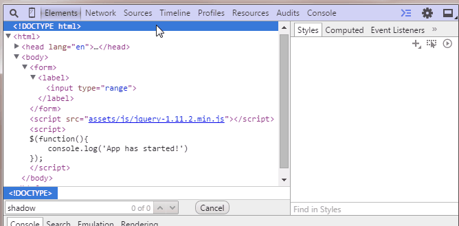
Open up the developer tools and go to Settings. There, in General, under Elements check Show user agent shadow DOM. Now when you inspect elements you will see their #shadow-root. When you select an element in the #shadow-root, in the Styles tab you will see which selectors are used by the user agent stylesheet to style them. Most of the time this is the selector you are looking for.
Keep in mind that most of the following experiments only work in Chrome and Safari. Firefox and IE don't support many of the pseudo selectors that are necessary to customize built-in elements, so they show the regular versions. Someday when we have standards in place, customizations like these will work everywhere.
1. Checkboxes
There is not a lot you can do with checkboxes in CSS, apart from giving them a width and height. But Chrome and Safari support :before and :after pseudo elements on inputs, so you can have some fun. Notice that the check mark is made entirely with CSS and is even animated with a fade in transition.
By setting -webkit-appearance to none, we prevent the default browser style from being applied, which leaves the doors open to our custom CSS. Also thanks to the em units, we made the checkbox scale with the font size of its parent. Try increasing it.
body {
    font: 13px sans-serif;
    color:#444;
}

label {
    padding: 10px;
    display: block;
}

input[type=checkbox].styled {
    -webkit-appearance: none;
    height: 1em;
    position: relative;
    background-color: #276FF4;
    width: 1em;
    border-radius: 3px;
    outline: none;
    font-size: 16px;
    /* try this: */
    /* font-size: 36px; */
    vertical-align: middle;
    box-shadow: 0 1px 1px rgba(0, 0, 0, 0.2);
}

input[type=checkbox].styled:active {
    box-shadow: 0 0 0.8em rgba(0, 0, 0, 0.2) inset;
}

input[type=checkbox].styled:before,
input[type=checkbox].styled:after {
    content: '';
    background-color: inherit;
    position: absolute;
    transition: 0.1s background-color;
}

input[type=checkbox].styled:after {
    width: 0.19em;
    height: 0.65em;
    -webkit-transform: rotate(36deg) translate(0.52em, -0.16em);
}

input[type=checkbox].styled:before {
    width: 0.2em;
    height: 0.4em;
    -webkit-transform: rotate(-58deg) translate(-0.2em, 0.48em);
}

/* We use the checked selector to make the pseudo elements visible */

input[type=checkbox].styled:checked:after,
input[type=checkbox].styled:checked:before {
    background-color: #fff;
}
<label>
    <input type="checkbox" /> Regular Checkbox
</label>

<label>
    <input type="checkbox" class="styled" />
    Styled Checkbox
</label>
2. Radio Buttons
We can use the same technique on radio buttons. Here it is simpler, as we don't need to make a check mark out of CSS. This still only works in Chrome and Safari. Other browsers display the regular radio button.
body {
    font: 13px sans-serif;
    color:#444;
}

label {
    padding: 10px;
    display: block;
}

input[type=radio].styled {
    -webkit-appearance: none;
    height: 1em;
    position: relative;
    background-color: #276FF4;
    width: 1em;
    border-radius: 50%;
    outline: none;
    font-size: 14px;
    box-shadow: 0 1px 1px rgba(0, 0, 0, 0.2);
}

input[type=radio].styled:checked:before {
    content: '';
    height: 0.4em;
    width: 0.4em;
    background-color: #FFF;
    position: absolute;
    border-radius: 50%;
    top: 0.3em;
    left: 0.3em;
}
<label>
    <input type="radio" name="test" /> Regular Radio
</label>

<label>
    <input type="radio" class="styled" name="test" /> Styled Radio
</label>
3. Select Elements
The select element is notoriously difficult to style with CSS. Even today we are limited to what we can change. To customize the downward arrow, we can use a background image and a bit of padding. For the dropdown list you can specify a font size and a background on the option elements, but not much more.
body {
    font: 13px sans-serif;
    color:#444;
}

label {
    padding: 10px;
    display: block;
}

select.styled {
    -webkit-appearance: none;
    -moz-appearance: none;
    -ms-appearance: none;
    appearance: none;
    border: 1px solid #aaa;
    padding: 2px 15px 2px 5px;
    background-image: url(data:image/png;base64,iVBORw0KGgoAAAANSUhEUgAAABMAAAAICAQAAACxSAwfAAAAUklEQVQY02P4z0AMRGZGMaShwCisyhITmb8huMzfEhOxKvuvsGAh208Ik+3ngoX/FbBbClcIUcSAw21QhXxfIIrwKAMpfNsEUYRXGVCEFc6CQwBqq4CCCtU4VgAAAABJRU5ErkJggg==), linear-gradient(#EDEDED, #EDEDED 38%, #DEDEDE);
    background-position: right center;
    background-repeat: no-repeat;
    border-radius: 2px;
    box-shadow: 0 1px 1px rgba(0, 0, 0, 0.1);
    color: #333;
}

/* Required to disable the default IE styles */
select.styled::-ms-expand {
    display: none;
}

select.styled:hover {
    border-color: #909090;
}

/* You have limited control on the drop down list. Uncomment this: */
/* select.styled option{
    background-color:green;
    color:#fff;
    font-size:20px;
} */
<label>
    <select>
        <option>Cheeze</option>
        <option>Bacon</option>
        <option>Pasta</option>
        <option>Pizza</option>
        <option>Ice Cream</option>
    </select> Regular Select
</label>

<label>
    <select class="styled">
        <option>Cheeze</option>
        <option>Bacon</option>
        <option>Pasta</option>
        <option>Pizza</option>
        <option>Ice Cream</option>
    </select> Styled Select
</label>
4. Range elements
Range is one of the newer form elements supported by browsers. It also is one of the most customizable. Chrome, Safari and Firefox all give us a large number of CSS pseudo selectors that we can use to style specific parts of the element. Even IE has support for some, although we haven't implemented them in our example. See this list to learn what is available.
body {
    font: 13px sans-serif;
    color:#444;
}

label {
    padding: 10px;
    display: block;
}

input[type=range].styled {
    -webkit-appearance: none;
    outline: 0;
    width: 300px;
    transition: 0.2s;
}

/* Chrome */

input[type=range].styled::-webkit-slider-runnable-track {
    height: 2px;
    background: #9DA0A6;
    border: none;
    border-radius: 3px;
}

input[type=range].styled::-webkit-slider-thumb {
    -webkit-appearance: none;
    height: 16px;
    width: 16px;
    border-radius: 50%;
    background: #FFF;
    margin-top: -7px;
    vertical-align: middle;
    border: 5px solid #276FF4;
    transition: 0.15s;
}

input[type=range].styled::-webkit-slider-thumb:active {
    height: 20px;
    width: 20px;
    margin-top: -9px;
}

/* Firefox */

input[type=range].styled::-moz-range-track {
    height: 2px;
    background: #9DA0A6;
    border: none;
    border-radius: 3px;
}

input[type=range].styled::-moz-range-progress {
    background: #276FF4;
}

input[type=range].styled::-moz-range-thumb {
    height: 16px;
    width: 16px;
    border-radius: 50%;
    background: #FFF;
    margin-top: -7px;
    vertical-align: middle;
    border: 5px solid #276FF4;
    transition: 0.15s;
    box-sizing: border-box;
}

input[type=range].styled::-moz-range-thumb:active {
    height: 20px;
    width: 20px;
    margin-top: -9px;
}

input[type=range].styled::-moz-focus-outer {
    border: 0;
}
<label>
    <input type="range" /> Regular Range
</label>

<label>
    <input type="range" class="styled" /> Styled Range
</label>
5. Progress Bars
The progress element also gives us a good deal of customizability. Although for a simple element like this, you could just as easily nest two divs and make your own version.
body {
    font: 13px sans-serif;
    color:#444;
}

label {
    padding: 10px;
    display: block;
}

progress.styled {
    margin-top: 15px;
    width: 200px;
    height: 12px;
    background-color: #ddd;
    border: none;
}

/* Chrome */

progress.styled::-webkit-progress-bar {
    background-color: #ddd;
}

progress.styled::-webkit-progress-value {
    background-color: #266FF4;
}

/* Firefox */

progress.styled::-moz-progress-bar {
    background-color: #266FF4;
}
<label>
    <progress value="22" max="100"></progress> Regular Progress
</label>

<label>
    <progress value="22" max="100" class="styled"></progress> Styled Progress
</label>
Conclusion
It is great that we can finally modify the built-in browser controls, but there is still a long way to go in terms of standardization. Google Chrome is a clear leader here, and if you write Chrome apps or extensions you can go ahead and use everything that we showed here. But if you want consistent cross-browser support, the best solution is still relying on JavaScript libraries and jQuery plugins like Chosen.
Bootstrap Studio
The revolutionary web design tool for creating responsive websites and apps.
Learn more
Nice, but it's missing the peskiest of all: type="file".
Thanks Danny! It's wonderful!
Can you show us an example with the input[file] style visible as a button or input?
I found a bit of trouble ... d'oh!
input[type=file]::-ms-browse{}
input[type=file]::-webkit-file-upload-button{}
input[type=file]:focus::-webkit-file-upload-button{}
input[type=file]:active::-webkit-file-upload-button{}
input[type=file]:active:disabled::-webkit-file-upload-button{}
input[type=file] > input[type=button]::-moz-focus-inner{}
The file input doesn't allow for much styling. The only thing I managed to do is style the button on Chrome, didn't find a way to access the text part. Couldn't do anything on other browsers, sorry.
https://jsfiddle.net/csz664ae/1/
Nice. You should check customize.css framework that make these things compatible with all browsers