5 Beautiful Image Effects With CSS Shapes and Filters
Today we've prepared for you five background images showcasing the power of modern CSS. They can be used as desktop wallpapers, eye-catching landing pages, and even as printed posters. In the article below we'll also go over some of the key CSS techniques, so that you can customize them to your liking or make your own ones from scratch.
The Designs
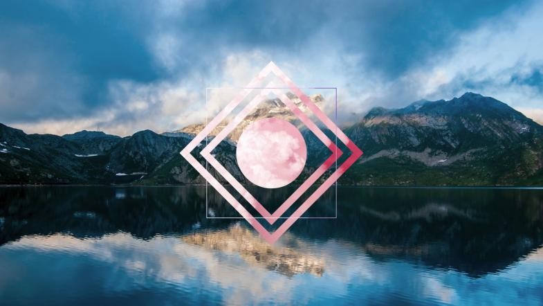
A Polyscape (poly = many, scape = scenery) is an image that contains multiple pictures mixed into one, creating very pleasing surrealistic visuals. Usually such design are made in Photoshop or other image editing software, but thanks to the ever growing arsenal of CSS properties, awesome polyscapes can now be created using nothing but simple web technologies!
You can view the designs in a demo app we created. The full source code plus all the polyscapes exported into HD images can be downloaded as a .zip archive from the Download button near the top of this page.
The demo uses some experimental CSS properties which might not work in all browsers. For the full experience, it's best to open it in Chrome.
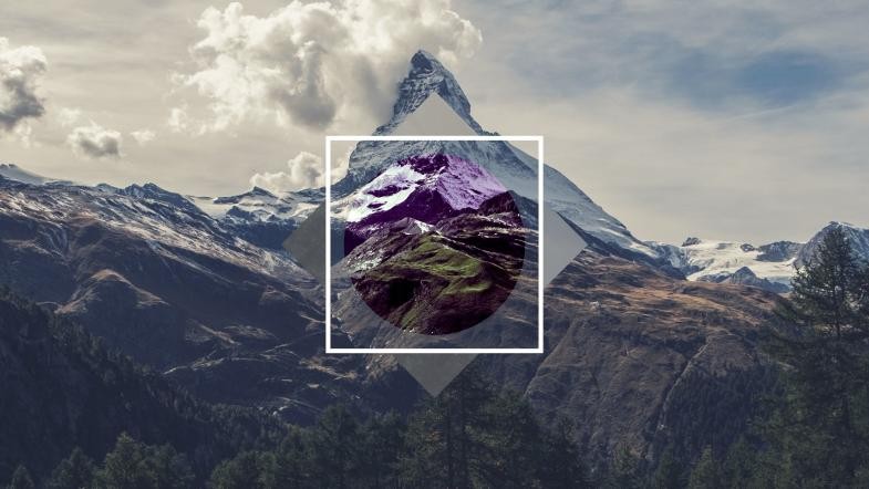
Making these polyscapes was very easy and we had a lot of fun in the process. For the backgrounds we used images from Unsplash. Everything else is done via various CSS shapes, transforms, and filters.
CSS Shapes
The designs use a variety of geometrical shapes made out of CSS. Here is how they are done:
- Squares - HTML blocks are rectangular by default. Just choose
heightandwidth. To turn them sideways we usetransform: rotate(45deg);. - Circles - Circular shapes in CSS can be created by adding
border-radius: 50%;to a square shape. - Triangles and Diamonds - Possible thanks to
clip-path. We've recently wrote about this in detail in our article CSS Triangles Without Ugly Hacks. Check it out!
Another interesting CSS shape we wanted to make is a square that is transparent inside but has an image as its border:
It turns out there is a CSS spec that does exactly that - it's called border-image and takes as parameters the path to an image, the border size, and how to place the image.
background: transparent;
border: 25px solid transparent;
border-image: url(clouds.jpg) 25 stretch;
CSS Filters
Since we are adding images on top of an image background, in many cases we need to apply some filters to make the two views stand out. Most modern browsers freely support this feature under the filter property.
It allows us to shift the hue from one color to another, boost the contrast, make everything black-and-white, and others. Here is a list of all the available CSS filters:
- grayscale
- hue-rotate
- invert
- contrast
- blur
- brightness
- opacity
- saturate
- sepia
- drop-shadow
We can combine as many filters as we like until we get the desired result:
filter: hue-rotate(60deg) contrast(200%) blur(2px);
Conclusion
We hope you've enjoyed our little CSS experiment. The demo and all of the code is 100% free, and you have all rights to use, share, and change the designs (our license).
Bootstrap Studio
The revolutionary web design tool for creating responsive websites and apps.
Learn more
Comments 5
Thank You,It's useful to me !
Interesting Article..........
Great and awesome effects with CSS!!!
have a bug on microsoft edge, or this is not compatible with microsoft edge.
bug on firefox when scroll using mouse
Hi, nice article but I am looking for showing overlay on an image and yet zoom in/out to fit the actual image in the overlay? Is it possible and if yes then can you please give some guidelines/references ?