CSS Grid VS Flexbox: A Practical Comparison
Not too long ago, the layout for all HTML pages was done via tables, floats, and other CSS properties that were not well suited for styling complex web pages.
Then came flexbox - a layout mode that was specifically designed for creating robust responsive pages. Flexbox made it easy to properly align elements and their content, and is now the preferred CSS system of most web developers.
Now we have a new contender for the best-system-to-build-html-layouts trophy (trophy title is a work in progress). It is the mighty CSS Grid, and by the end of this month, it will be available natively in Firefox 52 and Chrome 57, with other browsers (hopefully) following soon.
A Basic Layout Test
To get a sense of what it's like to build layouts with each system, we've build the same HTML page twice - once with flexbox, and another time with the CSS grid. You can download both projects from the Download button near the top of the article, or inspect them in this online demo:
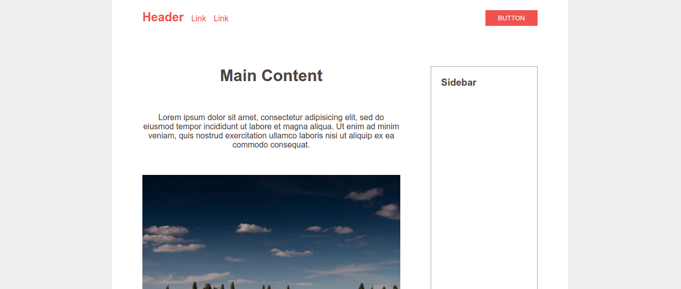
The design is pretty basic - it consists of a centered container, inside of which we have a header, main section, sidebar, and a footer. Here are the main "challenges" that we'll have to solve, while keeping CSS and HTML as clean as possible:
- Position the four major sections of the layout.
- Make the page responsive (the sidebar goes below the main content on smaller screens).
- Align the contents of the header - navigation to the left, button to the right.
As you can see, for the sake of the comparison we've kept everything very simple. Let's start with problem number one.
Challenge 1: Position The Page Sections
Flexbox Solution
We'll start off with the flexbox solution. We add display: flex to the container and direction its children vertically. This will position all the sections one under another.
.container {
    display: flex;
    flex-direction: column;
}
Now we need to make the main section and the sidebar stand next to each other. Since flex containers are generally one-directional, we will need to add a wrapper element.
<header></header>
<div class="main-and-sidebar-wrapper">
    <section class="main"></section>
    <aside class="sidebar"></aside>
</div>
<footer></footer>
We then make the wrapper display:flex and flex-direction it in the opposite direction.
.main-and-sidebar-wrapper {
    display: flex;
    flex-direction: row;
}
The last step is to set the size of the main section and the sidebar. We want the main content to be three times the size of the sidebar, which isn't hard to do with flex or percentages.
.main {
    flex: 3;
    margin-right: 60px;
}
.sidebar {
   flex: 1;
}
As you can see flexbox did pretty well, but we still needed quite a lot of CSS properties + an additional HTML element. Let's see how the CSS grid will do.
CSS Grid Solution
There are a couple of different ways to use the CSS grid, but we will go with the grid-template-areas syntax, as it seems most suitable for what we are trying to accomplish.
First we will define four grid-area-s, one for each page section:
<header></header>
<!-- Notice there isn't a wrapper this time -->
<section class="main"></section>
<aside class="sidebar"></aside>
<footer></footer>
header {
    grid-area: header;
}
.main {
    grid-area: main;
}
.sidebar {
    grid-area: sidebar;
}
footer {
    grid-area: footer;
}
Then we can set up our grid and assign the placement of each area. The code below may seem quite complicated at first, but once you get to know the grid system it becomes really easy to grasp.
.container {
    display: grid;

    /*  Define the size and number of columns in our grid.
    The fr unit works similar to flex:
    fr columns will share the free space in the row in proportion to their value.
    We will have 2 columns - the first will be 3x the size of the second.  */
    grid-template-columns: 3fr 1fr;

    /*  Assign the grid areas we did earlier to specific places on the grid.
        First row is all header.
        Second row is shared between main and sidebar.
        Last row is all footer.  */
    grid-template-areas:
        "header header"
        "main sidebar"
        "footer footer";

    /*  The gutters between each grid cell will be 60 pixels. */
    grid-gap: 60px;
}
And that's it! Our layout will now follow the above structure, and because of the way we've set it up we don't even have to deal with any margins or paddings.
Challenge 2: Make Page Responsive
Flexbox Solution
The execution of this step is strongly connected to the previous one. For the flexbox solution we will have to change the flex-direction of the wrapper, and adjust some margins.
@media (max-width: 600px) {
    .main-and-sidebar-wrapper {
        flex-direction: column;
    }

    .main {
        margin-right: 0;
        margin-bottom: 60px;
    }
}
Our page is really simple so there isn't much to rework in the media query, but in a more complex layout there will be lots and lots of stuff to redefine.
CSS Grid Solution
Since we already have the grid-areas defined, we just need to reorder them in a media-query. We can use the same column setup.
@media (max-width: 600px) {
    .container {
    /*  Realign the grid areas for a mobile layout. */
        grid-template-areas:
            "header header"
            "main main"
            "sidebar sidebar"
            "footer footer";
    }
}
Or, we can redefine the entire layout from scratch if we think that's a cleaner solution.
@media (max-width: 600px) {
    .container {
        /*  Redefine the grid into a single column layout. */
        grid-template-columns: 1fr;
        grid-template-areas:
            "header"
            "main"
            "sidebar"
            "footer";
    }
}
Challenge 3: Align Header Components
Flexbox Solution
Our header includes some links for navigation and a button. We want the nav to be on the left and the button on the right. The links inside the nav have to be aligned properly next to each other.
<header>
    <nav>
        <li><a href="#"><h1>Logo</h1></a></li>
        <li><a href="#">Link</a></li>
        <li><a href="#">Link</a></li>
    </nav>
    <button>Button</button>
</header>
We've already done a similar layout with flexbox in one of our older articles - The Easiest Way To Make Responsive Headers. The technique is really simple:
header {
    display: flex;
    justify-content: space-between;
}
Now the navigation list and the button are properly aligned. All that is left is to make the items inside the <nav> go horizontally. It's easiest to use display: inline-block here, but since we are going full flexbox, let's apply a flexbox-only solution:
header nav {
    display: flex;
    align-items: baseline;
}
Only two lines! Not bad at all. Let's see how CSS grid handles it.
CSS Grid Solution
To split the nav and the button we will have to make the header display: grid and set up a 2-column grid. We will also need two extra lines of CSS to position them at the respective borders.
header{
    display: grid;
    grid-template-columns: 1fr 1fr;
}
header nav {
    justify-self: start;
}
header button {
    justify-self: end;
}
As for the inline links inside the navigation - we couldn't get it quite right with CSS grid. Here is how our best try looks:

The links are inline but they can't be properly aligned, since there isn't a baseline option like in flexbox's align-items. We also had to define yet another subgrid.
header nav {
    display: grid;
    grid-template-columns: auto 1fr 1fr;
    align-items: end;
}
It's clear that the CSS grid struggled with this part of the layout, but that isn't too surprising - it's focus is on aligning containers, not so much the content inside them. It just isn't meant for doing finishing touches.
Conclusion
If you've made it through the whole article (in which case great job!), the conclusion shouldn't come as a surprise to you. The truth is, there isn't a better system - both flexbox and the CSS grid are good at different things and should be used together, not as alternatives to one another.
For those of you who skip directly to the conclusion of articles (no worries, we do it too), here is a summary of the comparison:
- CSS grids are great for building the bigger picture. They makes it really easy to manage the layout of the page, and can even handle more unorthodox and asymmetrical designs.
- Flexbox is great at aligning the content inside elements. Use flex to position the smaller details of a design.
- Use CSS grids for 2D layouts (rows AND columns).
- Flexbox works better in one dimension only (rows OR columns).
- There is no reason to use only CSS grids or only flexbox. Learn both and use them together.
Bootstrap Studio
The revolutionary web design tool for creating responsive websites and apps.
Learn more
Comments 17
a
baselineoption like in flexbox'salign-itemsis supported in grid https://developer.mozilla.org/en-US/docs/Web/CSS/CSS_Grid_Layout/Box_Alignment_in_CSS_Grid_LayoutSuppose you want to use CSS Grid for the layout -- is it possible to use Bootstrap 4 (or other framework) UI elements, but not their layout? Or are Bootstrap's UI components somehow dependent on their Flexbox-based "grid"?
Or are there just UI component libraries out there that are layout system agnostic? Or maybe even frameworks that use CSS Grid?
Thanks
Great article! I can see how css grid and flexbox comes hand to hand. Would be super awesome if you can include some detail information such as the performance between css grid and flexbox.
How both of these relate to Bootstrap? How each one of them relates to Bootstrap?
Is Bootstrap better?
In Bootstrap the main layout building tool is the grid, and in the newest version (Bootstrap 4) under the hood that grid is powered by flexbox. Probably in the future we can expect the framework to switch to CSS grid, but it will take a while for all browsers to support it - browser compatibility is very important for Bootstrap users.
As to your question if Bootstrap is better, we're really comparing apples and oranges here. Bootstrap is a full featured framework, flexbox and the CSS grid are simply CSS properties. It really depends on what you are trying to do. I've explained a bit more in this comment.
Ok, but browser support is not production ready yet - right?
Thanks for the article. It can be very valuable to do such parallel examples. One totally minor typo/grammar issue, though: it's <> its
We're glad you enjoyed the article! Sorry about the its/it's issue, I always check but it's difficult to find all mistakes.
Dunno why but that made me laugh lol
Great article btw, keep it up :)
my professor once suggested us to read backword to spot typos, and then read it again ( not backwords this time) to spot grammatical errors.
I confess I was a bit surprised when I came to the end of your article to read your conclusions. I agree with your conclusions but did not expect it after browsing through and looking at the example layouts.
I think the most valuable lesson I have learned is that Flexbox is a 1D solution (row or column) and Grid is a 2D solution (row and columns). But also understanding that you can use them together. I would have used Grid for the overall layout and then used Flexbox in the header. I just wrote a similar article on my blog where I highlighted the use of both Flexbox and Grid to solve different problems on a Sonic menu page.
I liked your comparison even though I was not quite sure where you were headed with your conclusions. It is good to have an understanding of both tools in their strengths and weaknesses.
Nice post, clear and concise with a concrete use-case and block-level comparisons for all levels to understand.
One regret though, I would have used by default a Mobile 1st approach for your RWD example as it's now commonly regarded as a best practice since it was first coined by Luke W in 2009.
A
You don't have to setup display: flex for the .container, divs will stack nicely by default
OMG I just finished learning HTML5 and CSS3 where I thought float property was the latest and greatest; then now everything out the door. Relearn all over! If I read this right I should learn both Flexbox and CSS Grid. But I too am confused now about what to think about Bootstrap. I know you said apples and oranges, but I dont have the experience to know why--could you explain in more detail. And I have to wonder how there will be changes to Java Scrip instruction down the line--everything is beginning to move quickly.
Yes very great job you did here with the examples. Thank you for taking the time and doing it in the only sensible way it could be done
Hi David, glad you enjoyed the article and thanks for the awesome question!
As I said in the other comment, I really believe it comes down to personal preference and what projects you are planning to work on. For most beginners, however, I'd say Bootstrap is the way to go. CSS frameworks aren't that difficult to learn, yet they provide some great advantages:
They give you components you can use as building blocks to fasten development. Instead of worrying about every single part of the interface, Bootstrap will give you a good base of styles that you just have to add finishing touches on.
Provides a set of rules that you need to follow, which prevents conflicts when many developers are working on the same project.
On the other hand, learning Flexbox and CSS grids will give you the freedom to build any interface you like just how you want it. It will also give you a more in-depth understanding of how CSS works and when eventually you face a problem Bootstrap can't fix, you'll have the perfect solution.
I hope I've been helpful :)
I believe you are using flex wrong. For example, you do not need a container to create the layout. <body> acts naturally as a container. You make body a flex container and then just play with flex in the elements.
flex-basis is where the magic happens in the flexbox model but you didn't use that anywhere.
body: flex, flexflow: row wrap;
header, footer: flex 1 1 100%
main: flex 1 1 70%;
sidebar: flex 1 1 30%
You will have the same effect without a container.
Concise and Awesome! Thanks.