Quick Tip: Get to Know the CSS Object Fit and Position Properties
In this post we are going to talk about two CSS properties that not a lot of web developers know about. They are called object-fit and object-position and both have to do with styling images and video.
First, we'll show you how to use them and go into detail covering all the important specs. After that, we've prepared for you a tiny demo app, in which you can play around with the properties and see them in action. Let's begin!
Object-fit
With object-fit we can address how an image (or video) stretches or squeezes itself to fill it's content box. This is needed when a photo we have has a different size or aspect ratio from the place we've designated for it in a layout.
Traditionally, to solve this problem one would create a div and set background-image and background-size. Modern CSS, however, allows us to simply add an image tag, set it's source as usual, and then apply object-fit directly to the image selector:
img {
    width: 100%;
    object-fit: cover;
}
The possible values it receives are:
- fill (default) - The width and height of the image match those of the box. Most of the times this will mess up the aspect ratio.
- cover - The image keeps its aspect ratio and fills the whole box, parts of it are cropped and won't be shown.
- contain - The image keeps it aspect ratio and enlarges/shrinks to fit inside the box.
- none - Original size and aspect ratio.
- scale-down - Displays like one of the above, depending on which produces the smallest sized image.
Object-position
This property defines where inside the container the image will be positioned. It takes two numerical values, one for the top-bottom axis and another for the left-right axis. These numbers can be in percentages, pixels or other measuring units, and can be negative. Some keywords such as center, top, right, etc. can be used as well.
By default an image is positioned in the center of a container, so the default value is:
img {
    object-position: center;
    /* which equals */
    object-position: 50% 50%;
}
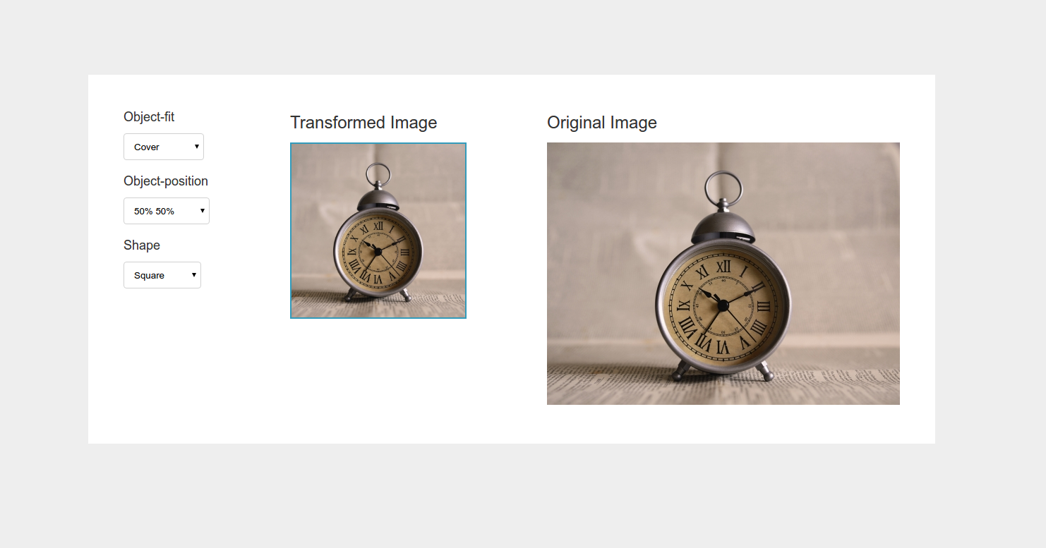
Playground Demo
Reading about CSS properties is one thing, testing them out for yourself is a whole different story. Below is a demo page which will help you get the hang of object-fit and object-position in no time. In it you can test the properties and give them different values to see how they can transform a media object. Don't be afraid to open up DevTools as well.
Browser Support
Following the tradition of all cool CSS features, the browser support for object-fit and object-position is rather inconsistent and in this case it's IE and Edge that offer no support at all. While waiting for all Microsoft browsers to adopt the two properties you can use this polyfill which fixes the issue nicely. Also, it's always a good idea to set a background color to all image containers as a fallback.
Conclusion
The object-fit and object-position properties can be of great help when building responsive web pages. They are easy to use and remember, and do their job perfectly. We are sure that once IE and Edge adopt them, they will quickly become a part of every web developer's CSS toolbox.
Thanks for reading!
Bootstrap Studio
The revolutionary web design tool for creating responsive websites and apps.
Learn more
Comments 5
Thank you Danny! Great article and very simple to understand.
Another polyfil... no thanks!
Polyfill or not, we'll have to understand it. But I can't seem to grasp the difference between object-fit: scale-down and object-fit: contain. To the rescue, please!
Just used
object-fillfor the first time in a new project. So useful! Great little tutorial :-)Polyfill doesn't quite work in IE11.