Quick Tip: The Best Way To Make Sticky Footers

Demo Download

While developing web layouts, at some point you've probably run into this issue:

broken_layout.png

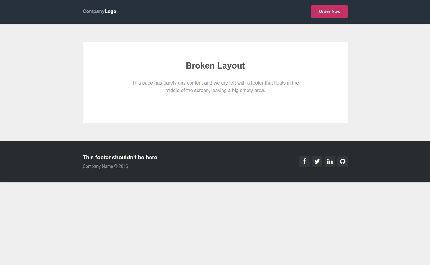
This obviously broken layout happens when a footer is positioned statically at the end of the body, but the page doesn't have much content. There is nothing to push the footer down enough and it stays in the middle of screen, leaving a huge area of whitespace below it.

In this quick tutorial we're going to take a look at a modern technique for building footers that are guaranteed to stick to the bottom of the page at all times.

The Technique

To prevent the above from happening we will be building our page using flexbox, the most advanced tool CSS3 has to offer for building adaptive layouts. For those of you not familiar with the flexbox model and its properties, we will leave a couple of links at the end of the article.

Our simple demo page will have a header, main section, and a footer. Here is the HTML, nothing extraordinary there.

<body>
    <header>...</header>
    <section class="main-content">...</section>
    <footer>...</footer>
</body>

To enable the flex model we add display: flex to the body, and change the direction to column (the default is row, which is a horizontal layout). Also, the html and body will need 100% height to fill up the whole screen.

html{
    height: 100%;
}

body{
    display: flex;
    flex-direction: column;
    height: 100%;
}

Now we need to adjust how much space each section will take up. We've done this via the flex property, which bundles together three flex- specs into one:

  • flex-grow - Defines how much of the available free space in the container goes to an element.
  • flex-shrink - How much an element will shrink when there isn't enough space for everything.
  • flex-basis - The default size for an element.

We want our header and footer to take up just as much space as they need, and everything else to be reserved for the main content section. The CSS for such layout looks like this:

header{
   /* We want the header to have a static height, 
   it will always take up just as much space as it needs.  */
   /* 0 flex-grow, 0 flex-shrink, auto flex-basis */
   flex: 0 0 auto;
}

.main-content{
   /* By setting flex-grow to 1, the main content will take up 
   all of the remaining space on the page. 
   The other elements have flex-grow: 0 and won't contest the free space. */
   /* 1 flex-grow, 0 flex-shrink, auto flex-basis */
   flex: 1 0 auto;
}

footer{
   /* Like the header, the footer will have a static height - it shouldn't grow or shrink.  */
   /* 0 flex-grow, 0 flex-shrink, auto flex-basis */
   flex: 0 0 auto;
}

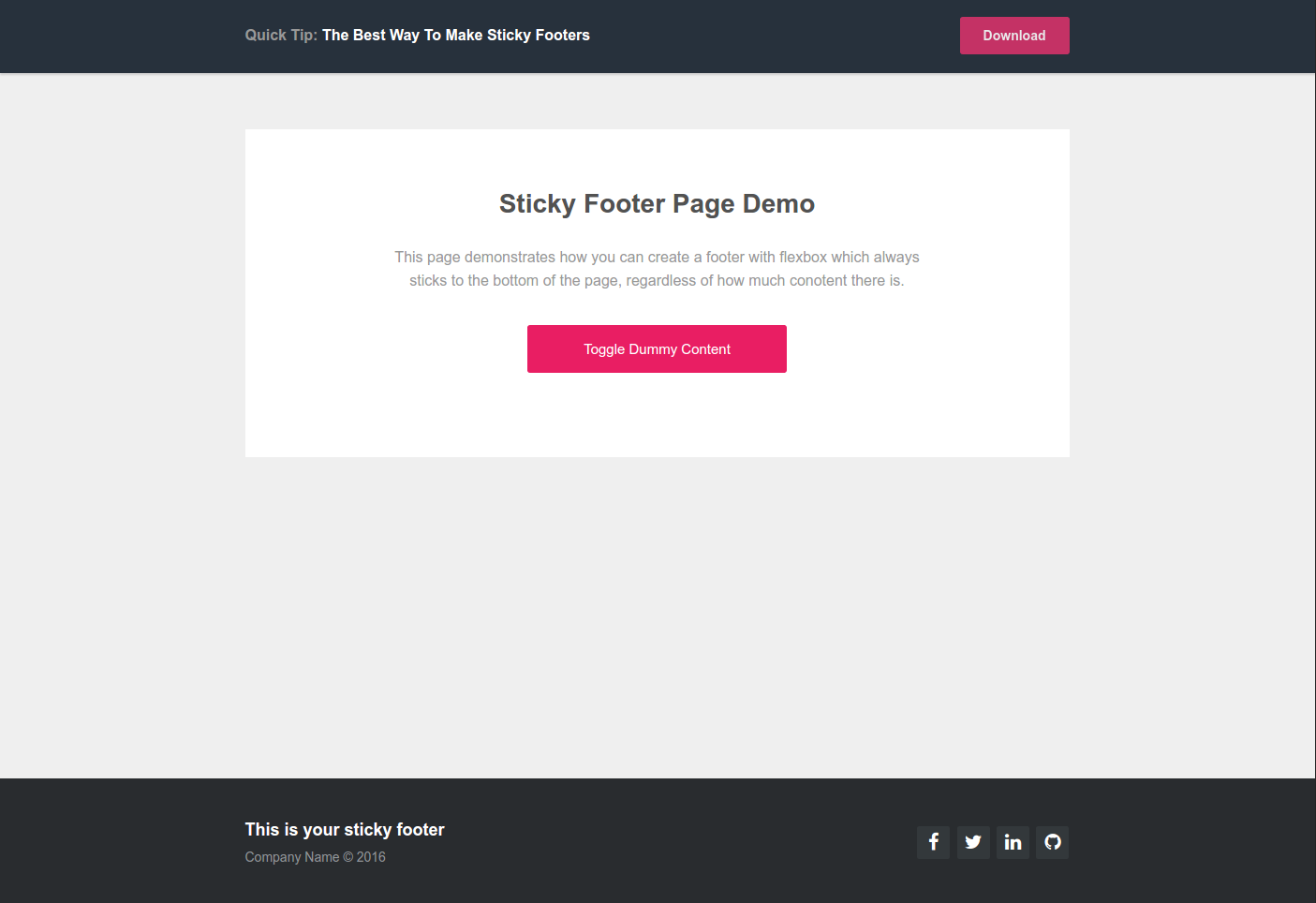
To see this technique in action, check out our demo page by clicking the image below. Using the big pink button you can change the amount of content to help you observe how the layout adapts and pushes the footer to the bottom at all times.

correct_layout.png

Conclusion

As you can see flexbox is a powerful ally when building layouts from scratch. All mainstream browsers support it, with a few minor exceptions, so its pretty much safe to use it in all IE9+ projects - Can i use flexbox.

Here are a some awesome lessons and cheatsheats for learning more about the flexbox layout model:

  • A quick guide to flexbox by CSS-Tricks - here.
  • Solved by Flexbox, a website dedicated to cool flexbox techniques - here.
  • 5-minute interactive lesson - here.

We hope you liked our way of creating sticky footers and that you've picked up something new and useful from the article. Leave us a comment if you have a cool flexbox trick of your own!

Bootstrap Studio

The revolutionary web design tool for creating responsive websites and apps.

Learn more

Related Articles

Comments 3

  • Hi.

    I'm trying to use your code. If I put everything in one page with my imports everything works great, but I'm trying to make a thymeleaf composition where I have three sections like you do. The problem is I define three section with three divs that breaks my composition.

    <!DOCTYPE html>
    <html lang="es" xmlns:th="http://www.thymeleaf.org">
    <head th:fragment="common-header">
    <meta charset="utf-8" />
    <meta http-equiv="X-UA-Compatible" content="IE=edge" />
    <meta name="viewport"
        content="width=device-width, user-scalable=no, initial-scale=1.0, maximum-scale=1.0 minimum-scale=1.0" />
    <!-- The above 3 meta tags *must* come first in the head; any other head content must come *after* these tags -->
    <meta name="description" content="" />
    <meta name="author" content="" />
    
    <title>Sticky Footer</title>
    
    <!-- Bootstrap CSS -->
    
    <link rel="stylesheet"
        href="https://maxcdn.bootstrapcdn.com/bootstrap/4.0.0-alpha.6/css/bootstrap.min.css" />
    
    <link rel="stylesheet" th:ref="@{/css/styles.css}"
        href="/css/styles.css" />
    
    <script src="https://code.jquery.com/jquery-1.12.4.min.js"></script>
    
    </head>
    <!-- NAVBAR
    ================================================== -->
    <body>
        <div th:fragment="navbar">
    
            <header>
                <div class="header-limiter">
    
                    <h1>
                        <a
                            href="https://tutorialzine.com/2016/03/quick-tip-the-best-way-to-make-sticky-footers/"><span>Quick
                                Tip:</span> The Best Way To Make Sticky Footers</a>
                    </h1>
    
                    <nav>
                        <a
                            href="https://tutorialzine.com/2016/03/quick-tip-the-best-way-to-make-sticky-footers/">Download</a>
                    </nav>
                </div>
            </header>
    
        </div>
    
        <div th:fragment="footer">
            <footer>
    
                <div class="footer-limiter">
    
                    <div class="footer-right">
    
                        <a href="#"><i class="fa fa-facebook"></i></a> <a href="#"><i
                            class="fa fa-twitter"></i></a> <a href="#"><i
                            class="fa fa-linkedin"></i></a> <a href="#"><i
                            class="fa fa-github"></i></a>
    
                    </div>
    
                    <div class="footer-left">
    
                        <p class="footer-links">This is your sticky footer</p>
    
                        <p>Company Name © 2016</p>
                    </div>
    
                </div>
    
            </footer>
    
        </div>
    
        <div th:fragment="body-bottom-scripts">
            <!-- Bootstrap core JavaScript
        ================================================== -->
            <!-- Placed at the end of the document so the pages load faster -->
            <script th:src="@{/js/jquery-3.2.1.min.js}"
                src="/js/jquery-3.2.1.min.js"></script>
            <script th:src="@{/js/popper.js}" src="/js/popper.js"></script>
            <script th:src="@{/js/bootstrap.min.js}" src="/js/bootstrap.min.js"></script>
    
        </div>
    
    </body>
    </html>

    In your example you have a body -> header->div
    In my example I have body->div->header->div
    I have a div after body because of thymeleaf tag and break all. The same for the section.

    This will be a typical page:

    <!DOCTYPE html>
    <html lang="es" xmlns:th="http://www.thymeleaf.org">
    
    <head th:replace="common/header::common-header" />
    <!-- NAVBAR
    ================================================== -->
    <body>
    
        <div th:replace="common/header::navbar"></div>
    
        <section class="main-content">
            <div class="card">
                <h1>Sticky Footer Page Demo</h1>
                <h3>This page demonstrates how you can create a footer with
                    flexbox which always sticks to the bottom of the page, regardless of
                    how much conotent there is.</h3>
                <a href='#' id="add-content">Toggle Dummy Content</a>
    
                <div class="dummy-content">
                    <p>Lorem ipsum dolor sit amet, consectetur adipiscing elit.
                        Vivamus id orci sapien. Donec tincidunt fringilla fermentum. Cras
                        cursus dictum tellus. In hac habitasse platea dictumst. Nulla
                        facilisi. Vestibulum aliquet accumsan libero vitae semper.
                        Pellentesque felis velit, semper vitae arcu lobortis, placerat
                        sollicitudin risus. Cum sociis natoque penatibus et magnis dis
                        parturient montes, nascetur ridiculus mus.</p>
                    <img src="satelite.jpg" alt="Satelite Image"/>
                    <p>Lorem ipsum dolor sit amet, consectetur adipiscing elit.
                        Vivamus id orci sapien. Donec tincidunt fringilla fermentum. Cras
                        cursus dictum tellus. In hac habitasse platea dictumst. Nulla
                        facilisi. Vestibulum aliquet accumsan libero vitae semper.
                        Pellentesque felis velit, semper vitae arcu lobortis, placerat
                        sollicitudin risus. Cum sociis natoque penatibus et magnis dis
                        parturient montes, nascetur ridiculus mus.</p>
                </div>
            </div>
    
        </section>
    
        <div th:replace="common/header::footer"></div>
    
        <div th:replace="common/header::body-bottom-scripts"></div>
    </body>
    </html>

    Any idea to fix this in my example.

    Thanks for the example

    David

Just a quick note, your comment that all IE9+ browsers support this is misleading as IE9 does not support it at all and IE10, while supporting it, requires vendor prefixes. Unless using a polyfill, the comment should have read IE10+. Otherwise, thanks for the quick tip on a common problem.

Andrei Popa

Flexbox is definitely amazing, but, as Brian said, it won't cut it for < IE10.

For older browsers or just as a backup I use this technique
http://codepen.io/deioo/pen/pydaBV?editors=1100

Hope it helps.