Using Flexbox to Create a Responsive Comment Section
Flexbox is a powerful new way for building layouts that makes some of the most challenging aspects of web development trivial. Nearly all browsers that are used today support it, so it is a good time to see how it can fit in your typical day-to-day frontend work.
This is why in this quick tutorial we're going to build a comment section using flexbox. We'll take a look at some of the more interesting properties that the flexbox layout mode has to offer and show you how to take full advantage of it.
What We're Going to Use
Flexbox consists of a number of CSS properties, some of which we are going to use today:
display: flex- This activates the flex layout mode and makes the element's children follow flexbox rules.justify-content- This property defines where the children of a flexbox element will align to (this is similar to text-align, read more here).order- Flexbox gives us control on the exact position elements are displayed at. We use this powerful tool in our comment section to switch the text and photo around (find out more here).flex-wrap- Controls the wrapping of the elements within the flex element. We use this to force the avatars to show beneath the comment text on small screens (flex-wrap on MDN).
The Layout
We want our comment section to meet the following requirements:
- Each comment should have an avatar, name, time and comment body.
- There should be two comment types - those written by the author (colored in blue and having the avatar on the right) and those written by everyone else.
- The HTML markup for both types of comments has to be as similar as possible, so it is easy to generate comments through code.
- The whole thing has to be fully responsive.
All of this can be made with a few lines of CSS with flexbox. Let's move on the the code!
The HTML
Our HTML is pretty straightforward. We'll have a list of comments with a basic form for writing new comments at the end.
<ul class="comment-section">

    <li class="comment user-comment">
        <div class="info">
            <a href="#">Anie Silverston</a>
            <span>4 hours ago</span>
        </div>
        <a class="avatar" href="#">
            <img src="images/avatar_user_1.jpg" width="35" alt="Profile Avatar" title="Anie Silverston" />
        </a>
        <p>Suspendisse gravida sem?</p>
    </li>

    <li class="comment author-comment">
        <div class="info">
            <a href="#">Jack Smith</a>
            <span>3 hours ago</span>
        </div>
        <a class="avatar" href="#">
            <img src="images/avatar_author.jpg" width="35" alt="Profile Avatar" title="Jack Smith" />
        </a>
        <p>Lorem ipsum dolor sit amet, consectetur adipiscing elit. Suspendisse gravida sem sit amet molestie portitor.</p>

    </li>

    <!-- More comments -->

    <li class="write-new">

        <form action="#" method="post">
            <textarea placeholder="Write your comment here" name="comment"></textarea>
            <div>
                <img src="images/avatar_user_2.jpg" width="35" alt="Profile of Bradley Jones" title="Bradley Jones" />
                <button type="submit">Submit</button>
            </div>
        </form>

    </li>

</ul>
If you look closely at the above code, you'll notice that apart from having different classes, the HTML for the user comments and the author comments are practically the same. All of the stylistic and layout differences between the two, will be handled solely by CSS applied to the .user-comment and .author-comment classes.
The CSS
Here we're going to look at flexbox-related techniques we've used when building the layout. If you want to examine the stylesheet in full detail, download the whole CSS file from the button near the top of the article.
First off, we are going to give all comments display: flex, which will enable us to use the flexbox properties on the comments and their child elements.
.comment{
    display: flex;
}
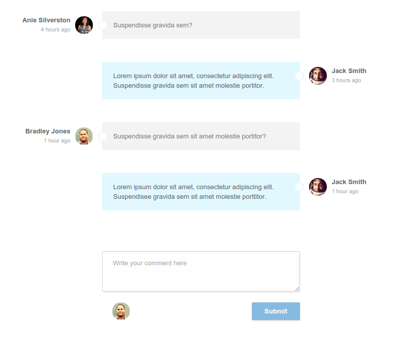
These flex containers span the full width of our comment section and hold the user info, avatar and message. Since we want the comments written by the author to be aligned to the right, we can use the following flex property and align everything towards the end of our container.
.comment.author-comment{
    justify-content: flex-end;
}
This will leave the comments looking like this:
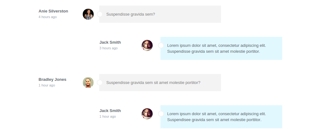
Now we have the author comment aligned on the right, but we also want to have the elements inside the container in reverse order, so that the message comes first, then the avatar and the info on the far right. To do this we will take advantage of the order property.
.comment.author-comment .info{
    order: 3;
}

.comment.author-comment .avatar{
    order: 2;
}

.comment.author-comment p{
    order: 1;
}
As you can see, with the help of flexbox, the whole thing couldn't be any easier.
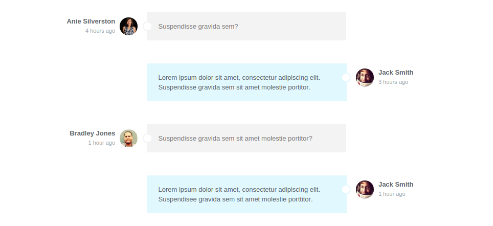
Our comment section looks just like we wanted it to. The only thing left to do is make sure that it looks good on smaller devices as well. Since there won't be as much available space on a narrower screen, we'll have to do some rearrangements to the layout and make our content more easily readable.
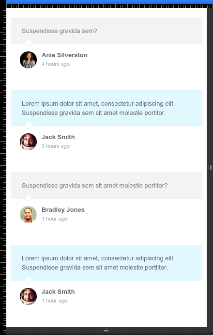
We set up a media query that makes the comment paragraphs expand, taking up the whole width of the container. This will lead to the avatar and user info moving to the next line, since the comments have their flex-wrap property set to wrap.
@media (max-width: 800px){
    /* Reverse the order of elements in the user comments,
    so that the avatar and info appear after the text. */
    .comment.user-comment .info{
        order: 3;
    }

    .comment.user-comment .avatar{
        order: 2;
    }

    .comment.user-comment p{
        order: 1;
    }

    /* Make the paragraph in the comments take up the whole width,
    forcing the avatar and user info to wrap to the next line*/
    .comment p{
        width: 100%;
    }

    /* Align toward the beginning of the container (to the left)
    all the elements inside the author comments. */
    .comment.author-comment{
        justify-content: flex-start;
    }
}
The difference can be spotted right away by comparing this screen capture with the one above. You can also try opening the demo and resizing your browser to watch the comment section adapt accordingly to the size of the window.
Conclusion
This sums up our tutorial. We hope that this gave you a practical example on how to use flexbox when building real layouts. If you're curious what else is possible, here are a few great resources that you'll like:
- CSS-Tricks' guide to flexbox - here.
- An in-depth MDN article - here.
- A website with easy flexbox solutions for classic CSS problems - here.
Bootstrap Studio
The revolutionary web design tool for creating responsive websites and apps.
Learn more
Hi there, why did you opt for the width property over flex-basis?
Hi Morgan, and thanks for the great question!
The truth is, it was originally done using
flex-basis, but I decided our readers would follow the code more easily, if it waswidth: 100%;, since that element already had it's size inwidthand not in any of theflexproperties.Flex-basis would do just fine, but isn't necessary in this case (although it's probably a better practice).
Hi Danny, it works pretty much the same but seems a bit out of place with all the other flex properties.
There's possibly some fallback benefit from using width.
I'm gonna stick to flex-basis until I find something I don't like about it - haven't thus far ;)
Cheers