Simplify Your Stylesheets With The Magical CSS Viewport Units
Viewport units have been around for a few years now but we really haven't seen them getting used much. They're now supported by all major browsers (caniuse) and offer unique functionality that can be very helpful in specific situations, especially ones involving responsive design.
Introducing the viewport units
The viewport is the area of your browser where actual content is displayed - in other words your web browser without its toolbars and buttons. The units are vw, vh, vmin and vmax. They all represent a percentage of the browser (viewport) dimensions and scale accordingly on window resize.
Lets say we have a viewport of 1000px (width) by 800px (height):
- vw - Represents 1% of the viewport's width. In our case 50vw = 500px.
- vh - A percentage of the window's height. 50vh = 400px.
- vmin - A percentage of the minimum of the two. In our example 50vmin = 400px since we are in landscape mode.
- vmax - A percentage of the bigger dimension. 50vmax = 500px.
You can use these units anywhere that you can specify a value in pixels, like in width, height, margin, font-size and more. They will be recalculated by the browser on window resize or device rotation.
1. Taking up the full height of the page
Every frontend developer has struggled with this at one point or another. Your first instinct is to do something like this:
#elem{
    height: 100%;
}
However, this won't work unless we add a height of 100% to the body and html as well, which isn't very elegant and might break the rest of your design. With vh that's pretty easy. Just set its height to 100vh and it will always be as tall as your window.
#elem{
    height: 100vh;
}
This is perfect for those full screen hero images that seem to be trendy these days.

2. Child size relative to the browser, not the parent
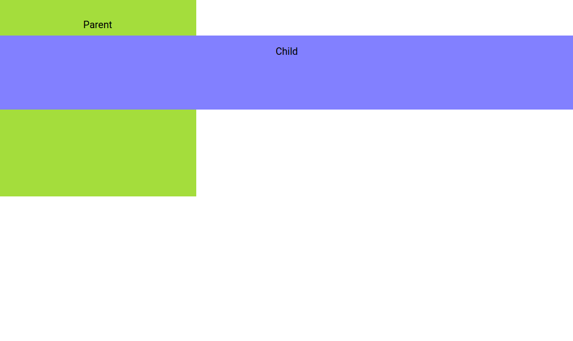
In certain situations, you'd want to size a child element relative to the window, and not its parent. Similarly to the previous example, this won't work:
#parent{
    width: 400px;
}
#child{
    /* This is equal to 100% of the parent width, not the whole page. */
    width: 100%;
}
If we use vw instead our child element will simply overflow it's parent and take up the full width of the page:
#parent{
    width: 400px;
}
#child{
    /* This is equal to 100% of page, regardless of the parent size. */
    width: 100vw;
}

3. Responsive font size
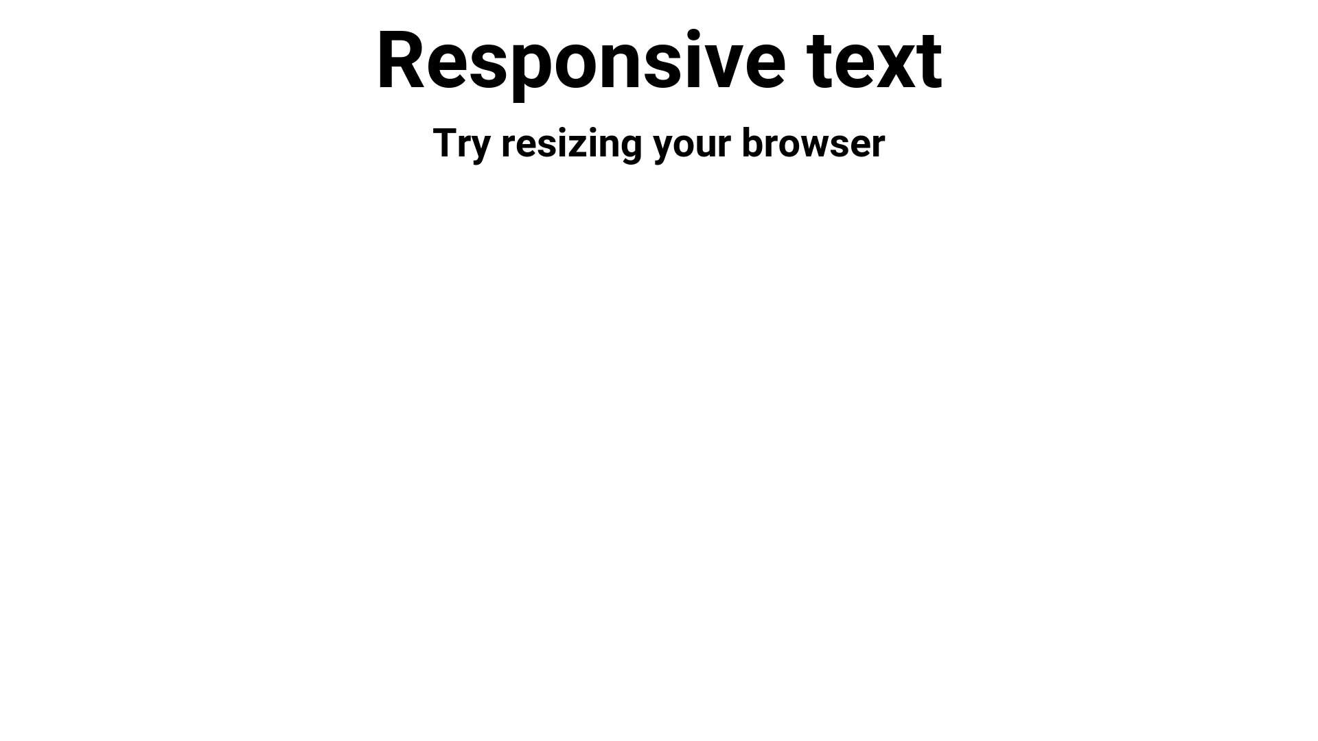
Viewport units can be used on text too! In this example we've set the font size be in vw creating awesome text responsiveness in one line of CSS. Goodbye Fittext!
h2.responsive-text{
    font-size: 6vw;
}
h4.responsive-text{
    font-size: 3vw;
}

4. Responsive vertical centering
By setting an element's width, height and margins in viewport units, you can center it without using any other tricks.
Here, this rectangle has a height of 60vh and top and bottom margins of 20vh, which adds up to a 100vh (60 + 2*20) making it always centered, even on window resize.
#rectangle{
    width: 60vw;
    height: 60vh;
    margin: 20vh auto;
}

5. Equal width columns
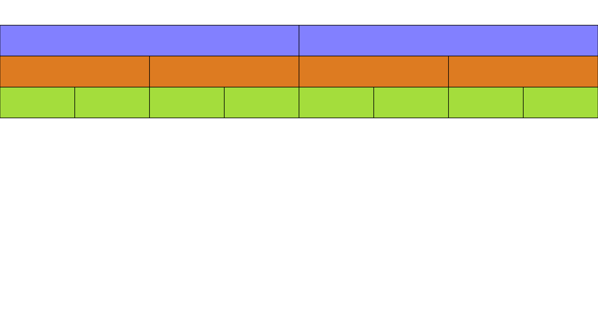
You can use the viewport units for making responsive grids. They behave similarly to percentage-based ones, but will always be sized relative to the viewport. So for example you could place them in a parent element that is wider than the window, and still have the grid retain its proper width. This can come handy when building full screen sliders.
This technique requires the elements to have float: left; to align the elements next to each other:
.column-2{
    float: left;
    width: 50vw;
}
.column-4{
    float: left;
    width: 25vw;
}
.column-8{
    float: left;
    width: 12.5vw;
}

Conclusion
Viewport units have their uses and are worth experimenting with. They are straightforward to understand and can be extremely helpful in certain scenarios, where solutions with alternative CSS techniques will be more difficult or impossible to implement.
Bootstrap Studio
The revolutionary web design tool for creating responsive websites and apps.
Learn more
As someone who has tried to use these units in several projects, I strongly encourage any dev to test extra thoroughly. Whilst browser support is good, I've come across numerous issues especially on Safari and especially on mobile. It's just worth being extra vigilant, and also having some form of fallback e.g. a min-height.
Thanks for the input Mike! In iOS8 the viewport issues have been fixed, but you are right - testing is the only way to be sure that everything works as expected.
Also take into account that 100vw will negate the scrollbar, so the element will actually appear partially behind it.
Usually not a big deal, but good to be aware of.
i experienced that badly it is really important to know...also there is quite no way to add some heights because of box-sizing: border-box for example...its really tricky. display flex works well on mobile but in combination with vw it can mess up...
Well I made some search about responsive usage for vw units and font-size property. For me it's more relevant to do just the opposite of "body { font-size: 3vm; }" because I think the best case scenario is when the font-size just get more bigger on smaller viewport.
Unfortunately I haven't found a way to reproduce this scheme :(
IE also doesn't support vmax, and in IE9 you have to use vm instead of vmin.
The other thing to bear in mind is how different mobile devices handle the keyboard - in Android, the keyboard takes up window space, so the leftover visible space is then the viewport height. So you're elements will change height when the keyboard is present. In iOS however, the keyboard sits on top of the window, so if you had a 100vh fixed element for instance, the keyboard would cover the bottom section of it and prevent it from ever before accessible when the keyboard is visible.
Also worth noting, in mobile Chrome and Firefox, the nav bar also occupies window space, so whether the nav bar is present or not will also affect your vh value. But when you scroll and the nav bar disappears, they don't calculate the change until the user stops scrolling. So if you have several 100vh elements, when you scroll and your nav bar appears or disappears, the page will have a slight jump when the browser repaints everything. This doesn't happen in Safari though.
In short, these values are really inconsistent between browsers! So if you value browser consistency on your site, it's probably best not to use them.
I know this is an ancient post, but it's still irks me so much that I need to bring it up, and speak.
This is where I tell you to learn how to design with responsive in mind, instead of, once again, proclaiming that "it's different in different browsers!"
IT WILL ALWAYS BE DIFFERENT IN DIFFERENT BROWSERS.
Get over it. Learn to design with flexibility in mind.
Good to be known as Reinier Kaper said.
Not units of choice today :(
However, thanks for your article,
Frédéric
Good info thanks.
Would be better if the examples were actual code examples instead of images though :)
When I stumbled upon this new possibility of setting container's size relative to viewport in CSS, I thought it was one of the best, more useful things for web designing, but I had a lot of compatibility troubles when displaying the web in, for instance, a safari device, and I had do a lot of extra work by adding fallbacks. So 100% agree with Mike.
Nevertheless, I really believe this compatibility issues will be fixed soon in the future, as I think it's a powerful thing to define a container's size relative to the viewport size instead of its parents, so I will be looking forward to this thing's evolution, but for now I would not recommend.
It's still not working on safari.