Here Is The Easiest Way To Create Equal Height Sidebars
For a long time we have been forced to create the interfaces of our web apps using CSS layout modes which were originally designed for laying down documents. No wonder it is such a pain for beginners! Luckily, things are changing - we now have the flexbox layout mode. If you can afford to ignore IE < 10 (which is a big if), you can use it today! The spec is finalized, and most browsers already support it unprefixed.
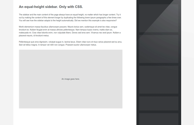
In this quick tutorial, I will show you how to use flexbox to create something basic that has been surprisingly tricky to do until now - a sidebar that has equal height to your main content. The tricky part lies in that you want both your sidebar and main page element to have content with varying lengths, but at the same time they should have equal heights. With flex box, this is very easy. Here is how to do it.
Say hello to Flexbox
There are plenty of guides to give you an overview of flexbox. Here, we will take a more practical approach, and jump right into using it. First, here is the HTML:
<section id="page">

    <div id="main">
        <!-- The content of the page will go here -->
    </div>

    <aside>
        <!-- This is the sidebar -->
    </aside>

</section>
We want to make the #main div and the aside show next to each other, and be of equal heights, regardless of the content that they hold. We also want to make the page responsive, so that the sidebar has a fixed width, but the main element shrinks/expands to fill the available space. Lastly, on small screens, we want the sidebar to go beneath the main content.
Here is how to do it. First, we will activate flexbox:
#page {
    display:flex;
}
This will turn the #page element into a flex container. It will be displayed as a block level element (it will take the full width of the page), and will turn all the elements inside it into flex items. This is the important bit - we want our main content and sidebar to be flex items, so they take the full height of the page.
But we also want to make the #page element 1200px wide as a maximum, and we want it to be centered. It is still a normal block element, so we can center it as such:
#page {
    display:flex;

    /* Centering the page */
    max-width:1200px;
    margin:0 auto;
}
Perfect! Now we have to give widths to the #main element and the sidebar:
#main {
    /* This makes the element grow and take all available space, not taken by the sidebar */
    flex-grow:1;
}

aside {
    /* Give the sidebar a default width, and prevent it from shrinking */
    flex-shrink:0;
    width:280px;
}
Done! Our layout is nearly finished. When the content of the #main element causes it to become longer, it will enlarge the #page, which in turn would also grow the aside (and the other way around). The last thing to do is make the sidebar go beneath the main content on small screens, which can be done with a simple media query:
@media all and (max-width: 800px) {

    #page {
        flex-flow:column;
    }

    /* Make the sidebar take the entire width of the screen */

    aside {
        width:auto;
    }

}
By default flex containers have a flex-flow value of row, which shows elements side-by-side. On small screens we are switching it to vertical orientation, which pushes the sidebar below the main content.
I've omitted some of the CSS that does not pertain to the layout for brevity. You can download the entire example from the button near the top of this article. It is worth mentioning that I have not provided fallbacks for IE 10, which implements a slightly older version of the flexbox spec, so it only works in Firefox, Chrome, Safari, Opera and IE 11.
With this our sidebar is ready!
Conclusion
There is more to learn about flexbox, but I hope that this article gives you a quick start. Flexbox is by no means the only way to create this layout, but it is the way forward for building web interfaces. If you can afford to drop support for older IE, you can use it today.
Bootstrap Studio
The revolutionary web design tool for creating responsive websites and apps.
Learn more
Since a year or so I build all my sites with Foundation and version 5 has this really cool equalizer script that you can use for sidebars, but also for footer widgets or basically anything in a site that needs to have matching heights.
Check it out at: http://foundation.zurb.com/docs/components/equalizer.html
Flexbox is love, Flexbox is LIFE!
thanks for this quick tutorial! just what i was looking for! flexbox is a life saver!!!!