Creating an Animated 404 Page
It is bound to happen. Sooner or later, somebody is going to type in a wrong URL or follow a broken link to your site. This is when the notorious 404 page is displayed. To make the experience less frustrating, you can take the time and design a friendly error page, which will encourage your user to stay at your web site.
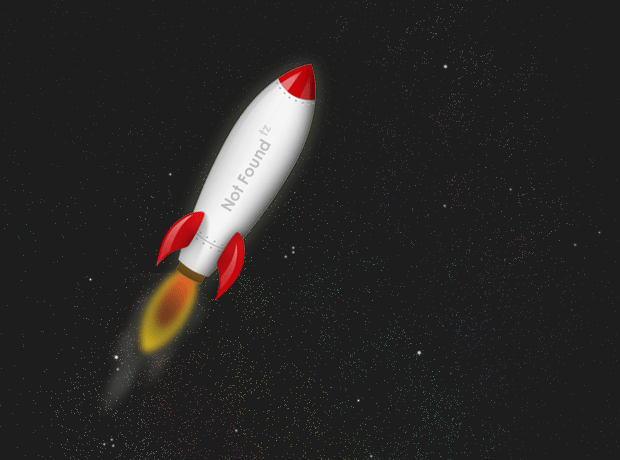
Today we are making just that. We are going to create an animated 404 page, which you can easily customize and improve.
The HTML
As usual, we start off with the HTML markup. Here we are using the new HTML5 doctype and the new hgroup tag. In the head section, we are including the HTML5 enabling script for IE inside a conditional comment. This script will help Internet Explorer understand the new HTML5 tags.
404.html
<!DOCTYPE html>
<html>
<head>
<meta http-equiv="Content-Type" content="text/html; charset=utf-8" />
<title>Creating an Animated 404 Page | Tutorialzine Demo</title>

<!-- Internet Explorer HTML5 enabling script: -->

<!--[if IE]>
    <script src="http://html5shiv.googlecode.com/svn/trunk/html5.js"></script>
<![endif]-->

<link rel="stylesheet" type="text/css" href="styles.css" />

</head>

<body>

<div id="rocket"></div>

<hgroup>
    <h1>Page Not Found</h1>
    <h2>We couldn't find what you were looking for.</h2>
</hgroup>

<script src="http://ajax.googleapis.com/ajax/libs/jquery/1.4.2/jquery.min.js"></script>
<script src="script.js"></script>
</body>
</html>
After the HTML5 enabling script, we include the stylesheet, an excerpt of which is given in the next section. Inside the body tag, you can see the #rocket div and the aforementioned hgroup. The #rocket div has rocket.png as its background, and it has a number of styles applied, including relative positioning, which is needed for the animation, as you will see in a moment.
Lastly we have the jQuery library and our script.js file, also discussed in the next sections.
The page is minimalistic and presents only basic information to the user. You could improve it by including a more site-specific message and a link to your homepage (or other resources you find suitable).

The CSS
Now lets move on to the styling. As mentioned in the HTML part of the tut, the #rocket div's positioning is set to relative. This allows us to insert the absolutely positioned spans, which form the exhaust gases coming out of the engine, and offset them with regards to the rocket.
body{
    background:url('img/bg.png') no-repeat center center #1d1d1d;
    color:#eee;
    font-family:Corbel,Arial,Helvetica,sans-serif;
    font-size:13px;
}

#rocket{
    width:275px;
    height:375px;
    background:url('img/rocket.png') no-repeat;
    margin:140px auto 50px;
    position:relative;
}

/*  Two steam classes. */

.steam1,
.steam2{
    position:absolute;
    bottom:78px;
    left:50px;
    width:80px;
    height:80px;
    background:url('img/steam.png') no-repeat;
    opacity:0.8;
}

.steam2{

   /*   .steam2 shows the bottom part (dark version)
    *   of the background image.
    */

    background-position:left bottom;
}

hgroup{

    /* Using the HTML4 hgroup element */

    display:block;
    margin:0 auto;
    width:850px;
    font-family:'Century Gothic',Calibri,'Myriad Pro',Arial,Helvetica,sans-serif;
    text-align:center;
}

h1{
    color:#76D7FB;
    font-size:60px;
    text-shadow:3px 3px 0 #3D606D;
    white-space:nowrap;
}

h2{
    color:#9FE3FC;
    font-size:18px;
    font-weight:normal;
    padding:25px 0;
}
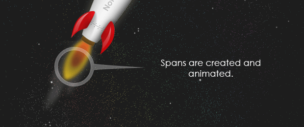
Each steam span is 80px wide by 80px high, and is assigned steam.png as its background. This image is twice the height of the spans, and actually contains two versions of the steam - white and black.The steam1 and steam2 classes show the respective version of the image. The light version of the steam creates the illusion of smoke, whereas the black one makes the flames of the rocket engine flicker.
jQuery creates and inserts the steam spans into the #rocket container, and moves them in the opposite direction of the movement of the rocket with the animate method, as you will see in a few moments.
The jQuery
As we discussed above, jQuery's part is to create the animation of the exhaust gases. Lets take a closer look at how this is achieved.
The script begins with attaching an event listener to the window load event. This differs from the document ready event we usually target, in that window.load is fired when not only the DOM, but images as well are loaded. This way we can be sure that the user is not going to see the smoke of the rocket before rocket.png is loaded.
$(window).load(function(){

    // We are listening for the window load event instead of the regular document ready.

    function animSteam(){

        // Create a new span with the steam1, or steam2 class:

        $('<span>',{
            className:'steam'+Math.floor(Math.random()*2 + 1),
            css:{
                // Apply a random offset from 10px to the left to 10px to the right
                marginLeft  : -10 + Math.floor(Math.random()*20)
            }
        }).appendTo('#rocket').animate({
            left:'-=58',
            bottom:'-=100'
        }, 120,function(){

            // When the animation completes, remove the span and
            // set the function to be run again in 10 milliseconds

            $(this).remove();
            setTimeout(animSteam,10);
        });
    }

    function moveRocket(){
        $('#rocket').animate({'left':'+=100'},5000).delay(1000)
                    .animate({'left':'-=100'},5000,function(){
                setTimeout(moveRocket,1000);
        });
    }

    // Run the functions when the document and all images have been loaded.

    moveRocket();
    animSteam();
});
The animSteam() function is what creates the smoke effect. When called, the function runs an animation, which, when complete, uses setTimeout to schedule the same function to be run again in 10 milliseconds. This prevents build ups - starting a second animation before the first has completed.
The script chooses randomly between the steam1 and steam2 classes on line 10 and offsets the span horizontally with a random value of margin-left. In the animate() method, later in the chain, we tell jQuery to start an animation from the current position of the steam div (which is exactly over the nozzle of the rocket) and move the element 58 pixels to the left and 100 pixels to the bottom.

After this we pass the duration of the animation - 120 milliseconds, and a callback function, which will be executed after the animation completes.
The other animation function - moveRocket() slowly moves the rocket to the left and right by modifying the left CSS property. Both functions are called once at the end of the file. If you want to disable one of the animations, just comment out the respective function call.
With this our Animated 404 Page is complete!
Conclusion
Remember, that to make the page show up when a 404 error actually occurs, you need to add this line to your .htaccess file:
ErrorDocument 404 /404.html
This will output the page with the appropriate headers, given that you've placed it in your root folder. You can also add more helpful information to the page, such as links to your home page, a more personalized message or even a way for users to report the errors they've encountered.
Bootstrap Studio
The revolutionary web design tool for creating responsive websites and apps.
Learn more
But it's better to use a php file to send a 404 header
PHP won't have to send 404 header, Apache is there for that ;)
Great article! The Twitter button is not working.
I like the fact that you're thinking outside of the box. It's nice and short article and the end result is pretty cool. I do have one problem with this though. I just don't see room for something like this on professional pages. Sure.. the end users are going to say, "OH COOL!", maybe. In the end though, they are going to want a nice, clean, consistent, and informative page that gives them different options. You want to present the end user with the ability to not hit the back button and to also give them different links to browse.
Good thought behind it, you can jQuery for more subtle effects to give your users a more enjoyable experience.
Good job and I liked how you showed how to set the 404 page at the end. Many bloggers might forget something crucial like that.
Keep up the good work.
Agree, one of the main purposes behind a 404 page is to let users (especially novices) know that they've come to a dead end. But, you also want to help them find what they are looking for. Maybe place a search box, or most commonly accessed areas of the site.
For a business website, this kind of interactive page wouldn't be very appropriate (depends on the business though), so you'd better go with something static and user friendly.
Great tutorial! +1
What happened with the plans for the redesign this week?
Awesome tut, nice work!
why don't u give tutorials more frequiently...
means 2/3 times per week...
I wish I could. Unfortunately I am afraid that the quality will drop.
I have also wonder the same thing. However, I'd rather have great content and 'just content' for content posting sake.
Keep up the great work Martin!
I agree with that. The quality of the content much more important than the quantity of it.
Whatever you've posted here are worth it to be waiting for.
Thank you for all of you've sharing. Keep up the great work Martin!
Awesome!!!!
very nice work thanks a lot
Interesting tutorial, I would have loved to see 2-3 layers of stars moving in the background at different speeds to give the illusion of depth and speed
nice one!!
Cool idea, an amplified 'you done messed up'
Great job on the redesign :)
Martin, may I ask which host you're with? Many thanks.
nice example
Good job, Angelov. Nice tutorial and thank's for sharing.
I wonder often how you can create all these items of quality and free. I thank you for it because with this action you are creating a friendly internet to everyone. Again thank you very much.
Great tutorial. In IE there are issues with .png . add the pngfix to the css. http://www.snipplr.com/view/40006/ie-png-fix/
Thanks.
Great 404 page. I believe it is using only loop for animation. Some other site's i found is using drag-able jquery animations. And some even better is interactively with the hovering mouse. Anyway, still this site is featuring impressive 404 page. One of my favorite. :D
super. thank you very much
Very cute 404.
I found it though :)
Thanks for sharing.
Didn't know that not to find something could be a rocket science too :)
This is so great, You made a boring page so creative and nice.
So people don't get angry when page not found