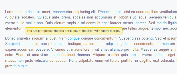
Colortip - a jQuery Tooltip Plugin
In this tutorial we are going to write a simple jQuery tooltip plugin. It is going to convert the title attributes of elements withing your page, into a series of colorful tooltips. Six color themes are available, so you can easily match it with the rest of your design.
Step 1 - XHTML
The plugin we are about to write today, works by converting the title of an element on the page to a structure of three spans, which form a tooltip, displayed on hover. So if you start with a regular link like this one:
<a href="https://tutorialzine.com/" class="blue" title="Go to Tutorialzine">Tutorialzine</a>
jQuery will convert it to the markup you can see below.
<a class="blue colorTipContainer" href="https://tutorialzine.com/">Tutorialzine
<span class="colorTip" style="margin-left: -60px;">Go to Tutorialzine
<span class="pointyTipShadow"></span>
<span class="pointyTip"></span>
</span>
</a>
Notice that the first block of code above specifies a "blue" class name. This is because we are overriding the default color of the tip (yellow). You can choose from red, blue, green, yellow, white and black, or you can create your own colors in the plugin stylesheet.
Users which have JavaScript disabled are still going to see the regular title tooltips on the page, so the script degrades gracefully.
Step 2 - CSS
To display the colorful tips on your page, you first need to include the plugin stylesheet file in the head section of the html document.
<link rel="stylesheet" type="text/css" href="colortip-1.0/colortip-1.0-jquery.css"/>
You could also just copy the styles from the file and paste them directly in your main stylesheet, if you do not want to keep a separate include file. This stylesheet defines both the positioning and the design of the tooltips. It comes with six color themes, and you can easily add more.
colortip-1.0-jquery.css - Part 1
.colorTipContainer{
    position:relative;
    text-decoration:none !important;
}

.colorTip{
    /* This class is assigned to the color tip span by jQuery */

    display:none;
    position:absolute;
    left:50%;
    top:-30px;
    padding:6px;

    background-color:white;
    font-family:Arial,Helvetica,sans-serif;
    font-size:11px;
    font-style:normal;
    line-height:1;
    text-decoration:none;
    text-align:center;
    text-shadow:0 0 1px white;
    white-space:nowrap;

    -moz-border-radius:4px;
    -webkit-border-radius:4px;
    border-radius:4px;
}

.pointyTip,.pointyTipShadow{
    /* Setting a thick transparent border on a 0x0 div to create a triangle */
    border:6px solid transparent;
    bottom:-12px;
    height:0;
    left:50%;
    margin-left:-6px;
    position:absolute;
    width:0;
}

.pointyTipShadow{
    /* The shadow tip is 1px larger, so it acts as a border to the tip */
    border-width:7px;
    bottom:-14px;
    margin-left:-7px;
}
The .colorTipContainer class is assigned to the elements to which the color tips are added. It sets their positioning to relative, so that the tips can be centered above them.
A neat CSS trick is used to create the triangular pointy tips. As you know, divs and spans can only take a rectangular shape (or an ellipse / rounded rectangle if you apply border-radius). However, if you apply a thick border to a 0 by 0 element, the only way the borders are going to fit is to take up a triangular space on each side. Then, by setting the default border color to transparent, you can make visible any of the four triangular shapes.
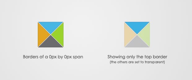
This is actually done on both the .pointyTip and the .pointyTipShadow spans, in order to give an impression that the pointy tip has a border applied so it matches the rest of the colortip design. Now lets take a closer look at the six color themes.
colortip-1.0-jquery.css - Part 2
/* 6 Available Color Themes */

.white .pointyTip{ border-top-color:white;}
.white .pointyTipShadow{ border-top-color:#ddd;}
.white .colorTip{
    background-color:white;
    border:1px solid #DDDDDD;
    color:#555555;
}

.yellow .pointyTip{ border-top-color:#f9f2ba;}
.yellow .pointyTipShadow{ border-top-color:#e9d315;}
.yellow .colorTip{
    background-color:#f9f2ba;
    border:1px solid #e9d315;
    color:#5b5316;
}

.blue .pointyTip{ border-top-color:#d9f1fb;}
.blue .pointyTipShadow{ border-top-color:#7fcdee;}
.blue .colorTip{
    background-color:#d9f1fb;
    border:1px solid #7fcdee;
    color:#1b475a;
}

.green .pointyTip{ border-top-color:#f2fdf1;}
.green .pointyTipShadow{ border-top-color:#b6e184;}
.green .colorTip{
    background-color:#f2fdf1;
    border:1px solid #b6e184;
    color:#558221;
}

.red .pointyTip{ border-top-color:#bb3b1d;}
.red .pointyTipShadow{ border-top-color:#8f2a0f;}
.red .colorTip{
    background-color:#bb3b1d;
    border:1px solid #8f2a0f;
    color:#fcfcfc;
    text-shadow:none;
}

.black .pointyTip{ border-top-color:#333;}
.black .pointyTipShadow{ border-top-color:#111;}
.black .colorTip{
    background-color:#333;
    border:1px solid #111;
    color:#fcfcfc;
    text-shadow:none;
}
Remember that only the borders are the only visible part of the pointy tips. You can add your own color themes by following the same structure.
Step 3 - jQuery
First you need to include the jquery library and the plugin files to the page, after which our script.js file, which is going to utilize the plugin and add colortips to the links on the page.
<script type="text/javascript" src="http://ajax.googleapis.com/ajax/libs/jquery/1.4.2/jquery.min.js"></script>
<script type="text/javascript" src="colortip-1.0/colortip-1.0-jquery.js"></script>
<script type="text/javascript" src="script.js"></script>
For performance reasons, I've put this code at the bottom of the colortips.html file. This allow for the page design to be rendered before the browser blocks for the loading of the js files.
Now lets take a look at the colortip the plugin.
colortip-1.0-jquery.js - Part 1
(function($){
    $.fn.colorTip = function(settings){

        var defaultSettings = {
            color       : 'yellow',
            timeout     : 500
        }

        var supportedColors = ['red','green','blue','white','yellow','black'];

        /* Combining the default settings object with the supplied one */
        settings = $.extend(defaultSettings,settings);

        /*
        *   Looping through all the elements and returning them afterwards.
        *   This will add chainability to the plugin.
        */

        return this.each(function(){

            var elem = $(this);

            // If the title attribute is empty, continue with the next element
            if(!elem.attr('title')) return true;

            // Creating new eventScheduler and Tip objects for this element.
            // (See the class definition at the bottom).

            var scheduleEvent = new eventScheduler();
            var tip = new Tip(elem.attr('title'));

            // Adding the tooltip markup to the element and
            // applying a special class:

            elem.append(tip.generate()).addClass('colorTipContainer');

            // Checking to see whether a supported color has been
            // set as a classname on the element.

            var hasClass = false;
            for(var i=0;i<supportedColors.length;i++)
            {
                if(elem.hasClass(supportedColors[i])){
                    hasClass = true;
                    break;
                }
            }

            // If it has been set, it will override the default color

            if(!hasClass){
                elem.addClass(settings.color);
            }
When you call the plugin, you can pass a configuration object, which holds the default color and the timeout after which the tooltips disappear on mouseleave.
You can choose from six possible colors and assign them as a class name to the element. The plugin would check if a color class is present, and if it is not, it will apply the default one you've passed in the config object. If you've not passed a config object, yellow will be used instead.
colortip-1.0-jquery.js - Part 2
          // On mouseenter, show the tip, on mouseleave set the
            // tip to be hidden in half a second.

            elem.hover(function(){

                tip.show();

                // If the user moves away and hovers over the tip again,
                // clear the previously set event:

                scheduleEvent.clear();

            },function(){

                // Schedule event actualy sets a timeout (as you can
                // see from the class definition below).

                scheduleEvent.set(function(){
                    tip.hide();
                },settings.timeout);

            });

            // Removing the title attribute, so the regular OS titles are
            // not shown along with the tooltips.

            elem.removeAttr('title');
        });

    }

    /*
    /   Event Scheduler Class Definition
    */

    function eventScheduler(){}

    eventScheduler.prototype = {
        set : function (func,timeout){

            // The set method takes a function and a time period (ms) as
            // parameters, and sets a timeout

            this.timer = setTimeout(func,timeout);
        },
        clear: function(){

            // The clear method clears the timeout

            clearTimeout(this.timer);
        }
    }
In the second part of the plugin code, we bind event listeners to the hover event (combination of a mouseenter and a mouseleave event).
Notice the event scheduler class. It is used to set a function to be executed after a predetermined period of time. At its heart lays a call to setTimeout. A clear() method is also provided as a part of the class, so previously scheduled events can be destroyed (useful when you move your mouse away from a tooltip and then move it back over before it has disappeared).
colortip-1.0-jquery.js - Part 3
  /*
    /   Tip Class Definition
    */

    function Tip(txt){
        this.content = txt;
        this.shown = false;
    }

    Tip.prototype = {
        generate: function(){

            // The generate() method returns either a previously generated element
            // stored in the tip variable, or generates and saves it in tip for
            // later use, after which returns it.

            return this.tip || (this.tip = $('<span class="colorTip">'+this.content+
                                             '<span class="pointyTipShadow"></span><span class="pointyTip"></span></span>'));
        },
        show: function(){
            if(this.shown) return;

            // Center the tip and start a fadeIn animation
            this.tip.css('margin-left',-this.tip.outerWidth()/2).fadeIn('fast');
            this.shown = true;
        },
        hide: function(){
            this.tip.fadeOut();
            this.shown = false;
        }
    }

})(jQuery);
In the last part of the code we define the tip class. It has a generate, show and hide methods. An object from this class is created for each of the tooltips. The generate method is called first, and the tooltip is stored in the local this.tip variable. The show and hide methods operate on this variable to run fade in/out animations.
Now we are only left with calling the plugin and adding colortips to all the links on the page.
script.js
$(document).ready(function(){

    /* Adding a colortip to any tag with a title attribute: */

    $('[title]').colorTip({color:'yellow'});

});
The configuration object here might as well be omitted, because yellow is the default value anyway. But you could specify a different color for the tooltips. If you apply red, green, blue, white, yellow or black as a class name of the element, the design of the tooltip will be overridden.
With this our Colortip plugin is complete!
Wrapping it up
Using the plugin we wrote today is really easy, as it does not require any specific configuration. It just takes a series of elements and replaces their title attributes with colorful tooltips. You can also easily create your own tooltip designs by just including three additional style classes to your stylesheet and adding an element to the supported colors array in colortip-1.0-jquery.js.
What do you think? How would you improve this plugin?
Bootstrap Studio
The revolutionary web design tool for creating responsive websites and apps.
Learn more
Awesome . Gr8 work
Haha, this is awesome. I never knew that it was possible to create a triangular div with css.
so great as always. neat effect. the triangular div is awesome!
Great work guys, thanks!
Another great inclusion. Can the transition fade out be altered. We use tooltips on a menu, for sport team sprite, with the the tooltips approx 10px apart, so that when you pan across the team logos, the fade out of each tool tip creates an unsightly blur effect.
good work
Great work, thanks!
Great tutorial as always ;) The triangle div is awesome, thanks!
This is looks great in all browsers except for IE6 :(
Any chance of re-releasing this with IE6 hacks [if needed] included?
I love your site, keep up the great work!
I don't plan releasing an IE6 compatible version. However you could detect the visitor's browser and run the plugin only if the browser is not IE6. It will still fall back to the regular titles.
triangle divs has to be one of the greatest tip ever! Great, great job!
Don't you think it would be wise to use jQuery to add the additional html markup?
Fantastic work as always Martin!
Would recommend taking the contents of script.js and sticking it in the head (or footer) of your page though, instead of making an extra request just for that.
awesome!!!!!
cool plugin
Hello Martin.
Thank's make it free.
Question: I do post your on my blog, to preview see my blog, tell me Do I violate the rules of your site?
Thank's again.
Nice plugin.
Is there any way I could trigger the tooltip programmatically or change maybe change the event something other than "hover"?
Thanks
Thanks. This will help me learn jquery
@ xychazs
You are free to put an excerpt of the tutorial on your site, alongside a backlink, so everything is fine with your use.
@ Bruno
To trigger the tooltip programmatically, you can use the mouseenter/mouseleave methods:
$('a:eq(1)').mouseenter();This will show the tooltip of the second hyperlink in the demo.
Like!
longer texts do not break automatically ... any suggestions for implementation?
Pretty nice script here. Great job! I really like this!
Great tut! :D
I took it up a notch by modifying the colortip-1.0-jquery.js and script.js to use the attribute "tooltip" instead of "title". This way one can have complete control over witch tooltips one wants to show while hovering over a link and still have a valid markup for browsers with javascript disabled.
Is it possible to show tooltips on words that have been in some database ?
So, in situation like this: I have database with word "foo" and explanation for foo is "this is foo".
Then, on my site, when visitor load webpage, script underline all "foo" words and then, when visitor hover mouse over that word, he god explanation from database.
I've been looking for this type of jquery tooltip. At last i found it. Surely i will see how i can implement it in my website. Anyway, good initiative for sharing the knowledge. Very grateful. Thanks a lot!
Hey Martin,
i think there might be a bug with your site. everytime i open a post in Google Chrome it defaults to the comments section - just where the subscribe to rss banner is. I had a look in firefox and safari and it works fine there.
I'm using chrome 5.0.3 on OSX snow leopard.
Kerron
p.s. dont wanna be too much of a kiss ass but your tutorials are great! cheers
so fancy...full coloranywhere...hihihihi :D
Nice work, thanks..
Good Work!
Beautiful Tooltip!
Fantastic! Thanks for sharing...
Nice script. It could have more attractive if color tooltip move with mouse movement.
Hi,
tnx for this tooltip. However i had a unexpected error in ie wich i managed to fix by editing the script.js code.
instead of $('[title]').colorTip({color:'yellow'}); (which works in FF and Chrome)
type this
$('a[title]').colorTip({color:'yellow'});
Now the title attribute can somehow be found by specifying the a
it took me 6 hours of my life ;)
thanx for sharing, Joost! I had the same problem wiht a wordrpess theme and the prettyphoto plugin. Now, it works!
@ kerron
Thank you for reporting this bug. It is fixed in the new Tzine design that is going live next month.
@ Sasa
When generating the text, you can scan it on the server side and enclose all the words that are in the database in a span with a title.
Something like this:
Foo bar <span title="Title you want shown" class="tooltip">baz</span> foobar.

<script type="text/javascript">
$('span.tooltip').colorTip();
</script>
The aforementioned replacement of the words themselves can be done with a regular expression:
<?php
$text = preg_replace('/(foos?)/i','<span title="Your title">\1</span>',$text);
echo $text;
?>
This will replace both foo and foos with or without capitalization.
It is a bit slow in Opera 10. This is a nice plugin and thanks for the tutorial.
This is great!!! Thanks so much!
How can one have the Tooltip on the right or left side?
Great article! One thing though, that I think most people developing tooltips forgets is that the tooltip appears off-page. There should be some way to tell if the tooltip is going to display outside of the viewport and if so change the location accordingly. Be great to see an update with this feature.
Awesome plug-in! One thing though, is there a way to stop the tooltip popup from lagging behind or looping? When you hover over something lots of times in a row very quickly, the tooltip will keep showing and hiding to keep up.
Is there a way of stopping this? .stop() doesn't work...
@ Clinton
It is supposed to be a simple tooltip implementation. If you'd like to implement this check, I'd be happy to provide a link to your page in the article.
@ Nacremedia
The tooltips shouldn't have this problem, because the script checks whether the tooltip is already visible before showing it.
IE6 fix. for fixing, change css like as:
.pointyTip,.pointyTipShadow{
/ Setting a thick transparent border on a 0x0 div to create a triangle /
border:6px solid transparent;
bottom:-12px;
height:0;
left:50%;
margin-left:-6px;
position:absolute;
width:0;
}
/* for IE6 fix by [email protected] begin */
.pointyTip{
_bottom:-17px;
_border-bottom:0;
}
/end/
.pointyTipShadow{
/ The shadow tip is 1px larger, so it acts as a border to the tip /
border-width:7px;
bottom:-14px;
margin-left:-7px;
}
Ey, beautiful plugin. but i have a trouble with a slider the i put in the site www.pixo.webuda.com
When i implement the tooltip, the slider stop working. it show me all the images together, without any scroll.
Slider use jquery too... but when i implement the tooltip and take off the call to jquery.min.js doesn't work the tooltip =\
My code knowledge is very poor xD What can i do?
Thanks!!
Hey there,
You may be having a jQuery library conflict...I've had this problem before. Sometimes, especially on platforms like Wordpress, you have to include the $.noConflict(); function to compensate. Check out: http://api.jquery.com/jQuery.noConflict/
I am implementing this on a wordpress theme and not running into any conflicts right now but I am still in an early development stage.
Will using the .noConflict serve as a QA mechanism if I add it to avoid future issues?
I'm able to get this to work with every any HTML tag I've tried except , which is the one I really need it for. Am I missing something, or is this just not supported for some reason?
Thanks.
Looks like the tag I included got stripped out. The tag in question is "input".
Thanks.
@Martin,
Great work. I love the programming abstraction that you used to create this. I used to use mb_toolip (another jQuery tooltip plug-in), but this is cleaner and easier to modify. Thanks tons.
I add some hacks so this plugin can work with IE6, and I think my code is simpler than @Sirus'
.pointyTip,.pointyTipShadow{
/ Setting a thick transparent border on a 0x0 div to create a triangle /
border:6px solid transparent;
_border:6px solid #123456; /use a specific color for using chroma filter/
bottom:-12px;
height:0;
left:50%;
margin-left:-6px;
position:absolute;
width:0;
font-size:0; /empty tags have height in IE6, set font-size:0 to remove the height/
_filter:chroma(color=#123456); /chroma filter, #123456 changes to transparent/
}
.pointyTipShadow{
/ The shadow tip is 1px larger, so it acts as a border to the tip /
border-width:7px;
bottom:-14px;
_bottom:-15px; /fix the position in IE6/
margin-left:-7px;
}
.colorTipContainer{
position:relative;
text-decoration:none !important;
_zoom:1; /use this so .pointyTip,.pointyTipShadow{left:50%} works, but I don't know why, sigh~/
}
another excellent tutorial .. great works guys
Hello,
I added a color scheme for 'silver'. While it requires CSS3 for the full effect, it degrades decently, and looks good.
Add the following lines to colortip-1.0jquery.css:
.silver .pointyTip { display:none; }
.silver .pointyTipShadow { display:none; }
.silver .colorTip {
color:#333;
font:10px arial;
background: #fefefe;
background: -moz-linear-gradient(top, #fefefe 0%, #e5e3ee 100%);
background: -webkit-gradient(linear, left top, left bottom, color-stop(0%,#fefefe), color-stop(100%,#e5e3ee));
background: -webkit-linear-gradient(top, #fefefe 0%,#e5e3ee 100%);
background: -o-linear-gradient(top, #fefefe 0%,#e5e3ee 100%);
background: -ms-linear-gradient(top, #fefefe 0%,#e5e3ee 100%);
filter: progid:DXImageTransform.Microsoft.gradient( startColorstr='#FEFEFE', endColorstr='#E5E3EE',GradientType=0 );
background: linear-gradient(top, #fefefe 0%,#e5e3ee 100%);
padding:5px;
-moz-border-radius:2px;-webkit-border-radius:2px;border-radius:2px; border:1px solid #696969;
box-shadow:2px 2px 3px #696969; -moz-box-shadow:2px 2px 3px #696969; -webkit-box-shadow:2px 2px 3px #696969;
}
Then modify line 9 of colortip-1.0-jquery.js to this:
var supportedColors = ['red','green','blue','white','yellow','black','silver'];
Now silver becomes one of your coloration options.
These tooltips don't work properly in FF11. If you have them in a div that overlaps another, or have the tooltips attached to images in said div, the tooltips will appear behind the images next to it. Z-index doesn't work to change this.
I think it could be because I have a ulist where the li elements are displayed horizontally using display: inline and no-style, and maybe this messes up the display/parent-child relationship.
how to control the tooltip width and heigh?
What should I have to change if I want to see the right triangle instead of the top one??
A very nifty tooltip. The only issue with this tooltip is that it shows all the text in one line. If a title is very long, the one line rendering does not work. The white-space: nowrap is causing this issue. If this is changed to normal and a width for the CSS element colorTip is defined the text wraps within the boundary of the tooltip. However the colorTip CSS has top:-30px;. This forces the tip to start -30px from the height of the tooltip. If this expands due to more number of lines, it no longer starts from the center of the href element.
What would be interesting is that the tooltip takes in one more parameter - the max width of the tip. Then the JQuery function can set the start dynamically to start -30px or greater based on the length of the text and account for the number of wrapped lines.
Hi there, thanks for this, it's just what I need. :)
I am using these tooltips as speech bubbles for cartoons that are aligned right after one another.
My problem is that the tooltips overlap each other in their fade ins and fade outs. It looks sort of confusing.
How can I make the fade outs be instantaneous?
Thanks in advance,
Roselle
qTip is the best one .
I found some other tool tip plugins on http://www.jqplanet.com/2017/04/top-jquery-tooltip-plugins-2017.html May be some one its will help