CSS3 Animated Bubble Buttons
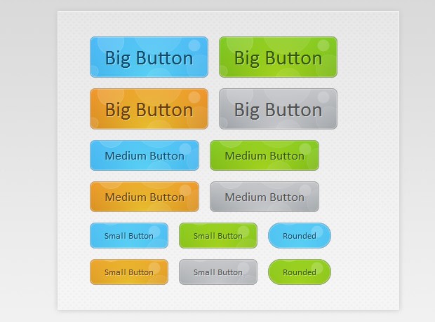
This week we are creating a useful set of animated buttons with the power of CSS3's multiple backgrounds and animations. With this button pack, you can easily turn any link on your page into an animated button by just assigning a class name. No JavaScript necessary. Four color themes and three sizes are also available by assigning additional class names.
The HTML
To turn a regular link on your page into a fancy animated CSS3 button, you just need to assign the .button class and one of the supported colors. See some examples below:
<a href="#" class="button blue big">Download</a>
<a href="#" class="button blue medium">Submit</a>
<a href="#" class="button small blue rounded">Submit</a>
There are four color classes available - blue, green, orange and gray. The rest of the classes, which you see assigned to the links above, are optional. You can choose a size from small, medium and big, and one more class - rounded, which creates a more rounded version of the button.
The class names are chosen so they are straightforward and easy to remember, but this raises the possibility of a clash with some of the classes on your page.
If, when implementing the buttons, you notice that they don't look right, try changing the class names from "blue", "big", "rounded" etc. into something more unique. You'd need to modify buttons.css to do this.
Now lets take a closer look at the CSS classes that make this possible.
The CSS
All the CSS code for the animated buttons resides in buttons.css. This makes it easy to just drop it into an existing project and use it.
Notice that throughout the the code below, I've defined two versions of the same property in a number of places. This has to do with the way browsers handle CSS definitions. They parse the rules one by one and apply them, ignoring the ones they do not understand. This way we can have a plain version of the rule which is understandable by all, and a CSS3 enabled one which will be ignored by the older ones.
buttons/buttons.css
.button{
    font:15px Calibri, Arial, sans-serif;

    /* A semi-transparent text shadow */
    text-shadow:1px 1px 0 rgba(255,255,255,0.4);

    /* Overriding the default underline styling of the links */
    text-decoration:none !important;
    white-space:nowrap;

    display:inline-block;
    vertical-align:baseline;
    position:relative;
    cursor:pointer;
    padding:10px 20px;

    background-repeat:no-repeat;

    /* The following two rules are fallbacks, in case
       the browser does not support multiple backgrounds. */

    background-position:bottom left;
    background-image:url('button_bg.png');

    /* CSS3 background positioning property with multiple values. The background
       images themselves are defined in the individual color classes */

    background-position:bottom left, top right, 0 0, 0 0;
    background-clip:border-box;

    /* Applying a default border radius of 8px */

    -moz-border-radius:8px;
    -webkit-border-radius:8px;
    border-radius:8px;

    /* A 1px highlight inside of the button */

    -moz-box-shadow:0 0 1px #fff inset;
    -webkit-box-shadow:0 0 1px #fff inset;
    box-shadow:0 0 1px #fff inset;

    /* Animating the background positions with CSS3 */
    /* Currently works only in Safari/Chrome */

    -webkit-transition:background-position 1s;
    -moz-transition:background-position 1s;
    -o-transition:background-position 1s;
    transition:background-position 1s;
}

.button:hover{

    /* The first rule is a fallback, in case the browser
       does not support multiple backgrounds
    */

    background-position:top left;
    background-position:top left, bottom right, 0 0, 0 0;
}
The first thing we need to do is to define the button class. This is the backbone of the buttons as it applies positioning, font and background styles.
First are the font-related styles, after which follows the display property. It is set to inline-block, which allows it to sit on the same line as its surrounding text (like an inline element would), but also behave like a block in regard to the paddings and margins.
As you will see in a moment, each button has four background images applied to it. Although this sounds intimidating, only one file is actually requested from the server. The first two backgrounds are the bottom left and top right part of the bubble image, which you can see in the illustration below, and the other two are pure CSS gradients.

As I mentioned above, the bubble background is displayed as two individual images, offset with the background-position property. Using the CSS3 transition property, we define an animation in which the two versions of the background image slide to the top or bottom respectfully, which creates the bubble effect you see when hovering over the buttons.
Now lets say a few words about the size and rounded classes.
/* The three buttons sizes */

.button.big        { font-size:30px;}
.button.medium    { font-size:18px;}
.button.small    { font-size:13px;}

/* A more rounded button */

.button.rounded{
    -moz-border-radius:4em;
    -webkit-border-radius:4em;
    border-radius:4em;
}
Here are the three size classes - small, medium and big, and the rounded class. The buttons scale according to their text size. This way no explicit width and height has to be specified.
Now lets move on with the interesting part - the colors. Only the definition for the blue button is given below, as the rest are nearly identical.
/* BlueButton */

.blue.button{
    color:#0f4b6d !important;

    border:1px solid #84acc3 !important;

    /* A fallback background color */
    background-color: #48b5f2;

    /* Specifying a version with gradients according to */

    background-image:    url('button_bg.png'), url('button_bg.png'),
                        -moz-radial-gradient(    center bottom, circle,
                                                rgba(89,208,244,1) 0,rgba(89,208,244,0) 100px),
                        -moz-linear-gradient(#4fbbf7, #3faeeb);

    background-image:    url('button_bg.png'), url('button_bg.png'),
                        -webkit-gradient(    radial, 50% 100%, 0, 50% 100%, 100,
                                            from(rgba(89,208,244,1)), to(rgba(89,208,244,0))),
                        -webkit-gradient(linear, 0% 0%, 0% 100%, from(#4fbbf7), to(#3faeeb));
}

.blue.button:hover{
    background-color:#63c7fe;

    background-image:    url('button_bg.png'), url('button_bg.png'),
                        -moz-radial-gradient(    center bottom, circle,
                                           rgba(109,217,250,1) 0,rgba(109,217,250,0) 100px),
                        -moz-linear-gradient(#63c7fe, #58bef7);

    background-image:    url('button_bg.png'), url('button_bg.png'),
                        -webkit-gradient(    radial, 50% 100%, 0, 50% 100%, 100,
                                            from(rgba(109,217,250,1)), to(rgba(109,217,250,0))),
                        -webkit-gradient(linear, 0% 0%, 0% 100%, from(#63c7fe), to(#58bef7));
}
Each color class defines a unique unique set of properties - the color of the buttons' textual label, a text-shadow and a set of background images. Notice that we use the background property to add multiple images to the button. They are layered one on top of the other, with the ones defined first appearing on the top.
Only Mozilla and Webkit browsers support CSS gradients at the moment, but with quite different syntaxes. The rest of the browsers will display the fallback background color. You may have noticed that we are not including a prefix-free version of the gradient rules. This is due to the fact that gradients are not an official part of the CSS specification as of yet, and there is no agreement on the preferred syntax.
In the fragment above, you can see that we are defining a linear gradient and a radial one on top of it. To make the gradients blend more smoothly, in both the webkit and mozilla syntaxes we are defining the radial one with RGBA, which makes the outer color of the gradient completely transparent.
With this our CSS3 animated bubble buttons are complete!
Parting words
These buttons are entirely CSS based and integrating them is extremely simple - just drop the buttons folder somewhere in your project. You can create your own colors and shapes by modifying the CSS file.
Bootstrap Studio
The revolutionary web design tool for creating responsive websites and apps.
Learn more
It's an interesting button effect.
A bokeh animated background could be made with a few additions into your code.
Thank you for this tutorial.
Martin, another great tutorial.
I really like how you always make fallback solution for non browsers.
Man, That's Soo cool ! ...I'm shifting in to CSS3
hi..
great… you really kill me …amazing amazing….
At the moment you are really doing one of the best webdesign tutorials on the internet!
But .. Why in the previous code, we find the percentage difference between the engines (mozilla and webkit)
Big>>>>>>>>> respect!
"Looks best in Safari & Chrome". Actually, Chrome has this odd bug which makes inset shadow combined with rounded corners a mess.
True. But better "ruin" it for Chrome users and let Safari do its thing (at least until the Chrome team fixes this annoying bug). You can also just disable the inset box-shadow as I advised Andy below.
True that. :-)
Nevertheless it's a great tutorial with a great outcome.
very nice!
too bad css3 is not yet supported by all browsers...esp ie U_U
Just want to add a word (or question, really) about the rounded corners of the buttons as displayed in Chrome. In my version (6.0.472.63) there is a tiny but noticeable squared-off background bit of white showing on every corner, though not as much on the big buttons. Yet this is not detectable in my version of Opera (10.62). I think the Opera version looks much better. But my question is: is there a way to not show those bits of white at the corners when they are rounded?
What you've noticed is a really annoying Google Chrome bug on Windows. It has been around for some time and for unknown reasons hasn't been fixed yet (see the entry in their bugtrack here).
The only way to fix it is by commenting this line of buttons.css:
Unfortunately this also affects the only browser that displays the buttons in their full glory - Safari, so it is your choice. If you are using a white background it would be best to leave it as is.
Another great tutorial. This little animation can be added to an ads to give it a kick.
Thank you for the wonderful comments folks!
how'd you know all that......
you are amazing....... i can't belive...
amazing
Very nice animation..
Great tutorial, thanks for sharing it!!
very nice woork thanks a lot
Great utilization of CSS 3 and graceful degradation. This tutorial show the wonderful things we can create with a little of interest in CSS.
very nice animation,
hi Martin
Thanks again for sharing it
With reading the topic again .. and the search was to find a solution to my question
>Differences in the way began and the emergence of the colors in browsers is the reason for the difference
so thanks for that, never would have guessed. Very helpful.
Regards
I think I'm just about ready to start and go full on with css3. This is a pretty nice effect (could be animated with a little jQuery as well)
Thanks for these buttons. These are really cool
This is real schnazzy. I always love your tutorials, especially this one. This just shows how you can go from that boring rounded blue thing to something so amazing that doesn't even use JavaScript of Flash. Oh, how I love CSS 3 :P
great tutorial but why i cannot see rounded corners on ie8?
yeah thats really cool...
WOW! THANK you
It's so cool:)
awesome! I like the bubble animated effect.
Great tutos and css3 !
thanks
Awesome effect, I love your tutorials they are super high quality. Thank you again!
very good, I am really impressed, thanks for sharing such a good tutorial.
Looks HOT in Firefox 11—nice!
This is amazing !!! The button is super cool. Thanks a lot, good work :-)
Thanks for sharing. Very helpful info.
Hi David,
Is it possible to keep the bubbles animation in a loop? On my blog, in the footer, I have 2 Dinos. One is in the water and the other one is on the island. I want to make the bubbles animate near the place where the Dino in the water is. Is there a way I can use your technique to accomplish what I am trying to do?
Here's my blog: Insurance & more
Thanks in advance.
oh nice and creative button , I will try to make this button , thx martin :-)
How could I design my own button_bg.png. In other word what are its specifications?
I don't know how it could possibly look better in Chrome when it already looks exactly the same in Firefox?