10 Things That Drive Me Mad When Visiting A Website
There is a lot of hate on the internet. Most of the time, it is only because people find it easier to vent their real-life frustration online. But sometimes it is the websites you visit that drive you mad. Here are 10 usability failures that are guaranteed to piss your users off. If you are a web developer/designer, read the how to fix tips to make sure you are not part of the problem!
1. Forms that lose your input on error
As far as infuriating usability issues go, this has to rank at the top. You spend all that time filling in a form, making sure everything is perfect, and then, suddenly, all is gone forever. A habit that probably most of you have developed is to copy the contents of the field that took you the most time to fill, just in case everything goes to waste.
How to fix it:
If you are a web developer, simply add some JavaScript to your forms, use a validation library or submit via AJAX. Something that is a bit more involving, if you wish to keep the logic of your forms entirely in the server side, is to make sure that the contents of the inputs is populated again by placing everything in the session on submit.
2. Captchas
I am sure I am not the only one that hates them. Some of these horrible inventions are simply impossible to discern. Combine it with #1, and you get a maddening combination.
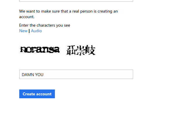
How to make it better:
Spam bots are getting more and more sophisticated, so some kind of proof that you're human will still be required. Some captchas are better than others. reCAPTCHA only shows house numbers, so they are easy to guess by humans (and you also aid the correctness of Google Streetview).
3. Sending spam
Don't you just hate it when a website tries to engage you by flooding you with useless, spammy emails that are impossible to unsubscribe from? I know I do.
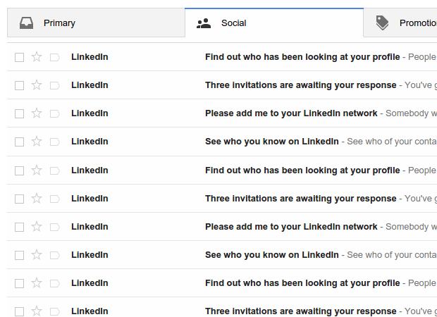
How to fix it:
STOP SPAMMING. Also, close your LinkedIn account. Who needs that anyway.
4. Using negative setting names
Another hair-pulling mistake that web developers make, is to build settings panels with overly creative setting names. Don't do this:
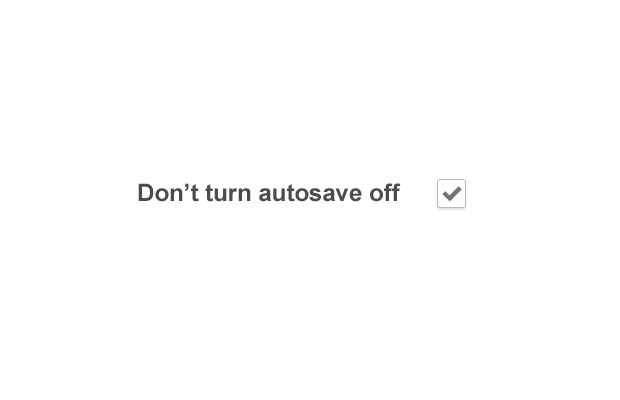
How to fix it:
Aim for clarity and use simple phrasing. Use checkboxes for on/off. Prefer select boxes over radio groups for more than three options. Organize your settings in logically connected groups.
5. Long forms
Out of all the ways you could be spending your time online, I bet that filling out forms is the one you hate the most. Here is how I usually react when I see a long registration form:
What's this!? I only wanted to try out your todo list!
How to fix it
Only ask for information you absolutely need. Even then, don't do it during sign up, or you risk people leaving.
6. Interstitial ads
Those horrible ads are the first thing you see on some websites. Some of these ads don't even let you dismiss them for a few seconds.

How to fix it
By using these ads you:
- Make everybody hate you
- Piss off your users. And what is the first thing a pissed off user does when they eventually visit the page they were headed to? They write a hate comment. That is right - you are breeding trolls.
- Give people a reason to install AdBlock which in turn hurts all the hardworking web owners out there.
So don't.
7. On close dialogs
I loathe these from the bottom of my heart. When I've made my mind that I don't want to spend any more time on your website, and you still prompt me to stay once I close the tab, I am tempted to unleash 4chan upon you.
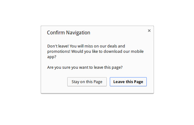
How to fix it:
Delete your website from the internet. You are a bad person.
8. Placing things where I don't expect them to be
User interfaces should be logically organized. Related actions give people context and allow them to navigate your web app easily. So don't move things around where they clearly don't belong. Here is a horrible navigation menu:
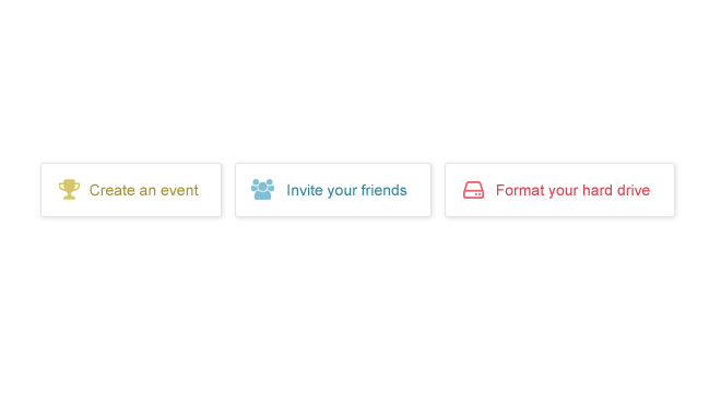
So first, people should create an event, then invite their friends, and finally format their hard drives. The perfect conclusion to a productive day!
Of course, this is a fictional example, but you get the point. To fix this category of issues:
- Read a bit about UX and interface design. This will help you spot and fix usability problems.
- Ask out friends or relatives to use your web apps while you observe. If they are confused, you have more work to do.
9. Sites broken on mobile
I remember the time when web designers couldn't wait to drop the dreaded 1024x768 resolution that constrained their web sites. But just as this became a fact, mobile happened, and with it came all kinds of screen sizes that we have to support. Making a site responsive is not that hard to do. But if you don't it will drive visitors away. This is bad:
How to fix:
For existing sites - add some media queries. This can go a long way towards being more usable on mobile. For new sites, you can go with a framework like Bootstrap, which has a responsive grid that is easy to use.
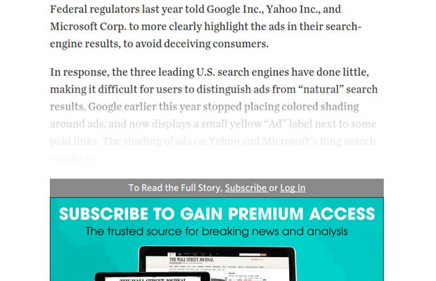
10. Paywalls
I realize that some sites offer quality content that can't be supported with ads alone, so it makes a sane business decision to lock it up behind a pay wall. But boy can this drive you mad when you've been sent a link that you want to read.
So there you have it, that is 10! What would you add?
Bootstrap Studio
The revolutionary web design tool for creating responsive websites and apps.
Learn more
Comments 39
Ich finde es nice, das es mal jemand für uns alle ausgesprochen hat !
Danke :-)
Well, for the listing #7 (7. On close dialogs), I may agree with you, but don't forget where those scenarios where they are actually useful. If you were using a website or a web-app and you had to fill in something in a form, or if you had unsaved changes, you'd probably get mad if you happened to close the site by mistake (that happens). By telling the user that there are unsaved changes or forms that are filled in but not yet submitted, he will be aware of that before either closing the page, or doing any actions that redirects him (i.e. clicking a link).
Yes, WordPress has saved me lots of times thanks to these dialogs. It is sad that a genuinely useful feature is abused in such a way.
Couldn't agree more. I guess some AdBlockers prevent them from showing up though, or am I mistaken?
Nice article Martin :) Tuesday is indeed a great day to format your hard drive! Those gifs you've included were really slick btw, how did you make them?
Thanks! Everyday is a great day to format your hard drive :D. The gifs are actually embedded HTML5 pages - couldn't find a tool to produce them that I liked, so I made the animations by hand.
nice article :) totally agree :)
For producing gif, did you tryed GifCam ? (http://blog.bahraniapps.com/gifcam/)
Looks cool! Waiting for a Linux version :)
Hey Martin! You can use vlc to record your desktop in linux, or recordmydesktop (although you may need to install the gtk or kde gui for it) - love the work man, dont stop!
How about websites that have some background tune that plays on loading with no way of turning off the damn thing.
I agree! Ditto for video. Auto-playing media on page load is bad.
Abusers of this technique should be cast into the fiery bowels of hell!
(In case you can't tell... I'm not a fan of pages with music.)
This is a great list. There are a lot of these "invisible" problems. You should continue this list.
Great article! We should all have a brainstorming an come up with some more.
Haha, you're a little extremist here Martin, but I can't blame you. These are all horrible things indeed.
About the captchas, when you see an example like that one it's usually made by one CG word, and a scanned word. It's important you match the generated one, and you can insert whatever you want for the other part.
Close dialogs should be used only when the user started compiling some form. Stack Overflow makes a decent use of it.
Am I spotting FontAwesome on #8? :P
There's another thing that... well, I don't hate it, but it's annoying when textareas don't have the resizing handle... like this one! Remove that resize: none style rule, plz! :)
I wasn't even going to reply, but MaxArt is 100% right.
I hate this textarea box I'm typing in for not having resizing handles available... Talk about irony with this article on a site where the comments box takes away control from the user...
Better wrap up my sentence here before it gets cut off in the box and I have to scr...
Fixed! You are right - fixed size text inputs are annoying, given that browsers have a perfectly usable way of resizing them. Ironically I don't use the comment form on my site so wasn't aware of the pain I was causing the world :)
it's not a big deal, it's not as if you couldn't scroll, could you?
the person who designed it was probably a neat freak who didn't like the idea of something being stretched and breaking the style! :-P
Infinite scrolling. I think it's bad for usability. Many times, I'll scroll down several times and then read an article.
But when you navigate back to the list, you start again at the top and have to scroll down again to get to where you were. It's tedious.
One of my pet peeves is when I visit a page, and it is immediately grayed out, and I am presented with a modal dialog begging me to subscribe to the newsletter...
I juat came to your site... I'd like to see what it is about, before I make a decision on the news letter!
You're wrong about reCaptcha. It does not only show house numbers, Google cycles through House Numbers and word/dictionary word pairings. The word captcha helps them with their scanlated ebook accuracy.
Also I don't particularly enjoy helping Google with their tracking and surveillance - so I refresh the captcha until I get a word option or I purposefully enter an incorrect number into the captcha (which works roughly half the time)
Autoplaying video.
I don't care what you are offering on your site, but that's the quickest way to get me to close the browser and add you to 127.0.0.1 in my hosts file.
My additions would be
Autostarting (Ad-)videos with sound, especially when they start somewhere out of sight.
Ads that mimic system notifications - especially when they try to scare you
(we have found 45 viruses on your system)
Inputfields that get focus at entering the page, but while you are typing some iframe takes it away
Downloadbuttons on downloadsites that have nothing to do with the file that you want but are actually ads for other stuff
Sites that detect your adblocker and don't let you get access to the content until you switch it off. I NEVER did that, always left immediately. And never returned. I think most of the people don't want to be forced to do something.
Bad typography - hard to read fonts, wrong font-sizes, too many different fonts, bad contrast to the background color.
Comic sans
Text that looks as if its a link - but is not
I am not sure which is the ranking on those, and there sure is more...
Ah - one more thing (I think to me it tops it all)... :
Content (or software) that is advertised as free but then after spending some time you realize it is not - I pay a lot for good stuff, but never after a deceit like that.
Nice Idea, Martin, you really should continue that as a series.
Great list!
Oh lord... Comic.... freaking.... sans.... shoot me in the face.
My old boss used Comic Sans for our company letterhead.
I quit shortly thereafter.
Oh Come On! In this web-world with typefaces like Roboto and Raleway, people don't want to read your content in Comic Sans... It really sucks, I'd prefer Consolas that Comic Sans lol.. Anywas, Nice list, Martin!
I would recommend a Bootstrap version from http://bootswatch.com/ even for a existent website. It fits anyways if you know how to use. My gold tip is for you guys to use and abuse of SASS and COMPASS, and the result is a productive and funny day of coding at your project!
For me:
New horrible trend:
When scrolling towards the end of page a popup shows with a form. Mostly they want you to describe to their newpaper. Still: I didn't ask for this interuption.
Solution: if you want to loose your visitors continue with bothering them with this unwanted stuff.
ARRGGHH!!
AGREE to all of these 100%.... 200% with the responsive design issue (#9).
I can't tell you how hard I've had to fight with some of my clients to impress upon them the importance of a mobile-friendly site. Even after I show them how horrible it is to try to use one of these sites on a phone they still just don't see the need. ("It's not that big of a deal- You just have to scroll around a little and zoom in and out.")
Bravo and another awesome article, Martin. Keep it up!
Really impressed with this article, Martin -- love your openness (and humor)!
Oh, and them animations...
Solid list. Could be even longer, I know. Most bugs are usability. Glad my changing minds site passed most of these, despite being 12 years old and still flat html (it's all about content!). I struggled with monetization but eventually decided to make it all free and easy rather than grabbingly annoying. It's kinda worked, too.
Text that is 1) too small or 2) too close to the background color to be legible. You're going to make me have to change the zoom level on my browser or highlight the text to be able to read it? (or look at the source code). hmmmm...
Fantastic article! I truly enjoyed the read! And as has been said multiple times already... Nice animations!
Popups asking if you want to be redirected into "mobile-version" of the page. Its 2014, make it responsive!
I laughed so hard when I read damn you in the captcha block. Being one who needs a magnifying glass to read those things, and then still gets it wrong, I was blessed to laugh out loud today. I'm a horticulturist, and often look at the USDA Plant Zone Hardiness Map (newly done and digital a few years back) and you cannot find out your zone for your zipcode without filling that in. Why? Why? Thank you, fun article.
Infinity scroll + fixed bottom footers is an endless chase, smh.
Another one I've seen that's gaining some traction is the social subscribe dialog box that appears not even 5 secs into opening a blog site. UGHCK! those irritate me to no end. I want to read an article but instead, I get this annoying html popup, so my browser can't do anything about that, and I close the tab instead.