Create inline help tips for your site with a bit of CSS
When creating a web app, you often need to present people with friendly help prompts that explain parts of your interface. One of the ways to do it is to have separate pages with help topics that you link to. However, this causes people to lose context of what they are doing and is not very user friendly.
A better way is to show help text right where it is needed. Here is how to do it only with a few CSS rules and a tiny bit of HTML!
The HTML
The first step is to write the markup of the tooltip. Here is what it looks like:
<div class="help-tip">
    <p>This is the inline help tip! It can contain all kinds of HTML. Style it as you please.</p>
</div>
The <p> element is displayed as the black tooltip, and the .help-tip div is the blue circle with a question mark.
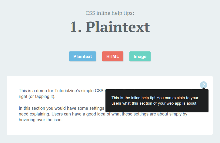
The paragraph is hidden by default and is only revealed on hover. It can contain links, images and other kinds of HTML. It is revealed with a smooth CSS animation, as you can see from the demo.
The CSS
All of this is possible with the help of a bit of CSS (you can find it in style.css in the downloadable zip, linked to from the buttons in the beginning of the article):
.help-tip{
    position: absolute;
    top: 18px;
    right: 18px;
    text-align: center;
    background-color: #BCDBEA;
    border-radius: 50%;
    width: 24px;
    height: 24px;
    font-size: 14px;
    line-height: 26px;
    cursor: default;
}

.help-tip:before{
    content:'?';
    font-weight: bold;
    color:#fff;
}

.help-tip:hover p{
    display:block;
    transform-origin: 100% 0%;

    -webkit-animation: fadeIn 0.3s ease-in-out;
    animation: fadeIn 0.3s ease-in-out;

}

.help-tip p{    /* The tooltip */
    display: none;
    text-align: left;
    background-color: #1E2021;
    padding: 20px;
    width: 300px;
    position: absolute;
    border-radius: 3px;
    box-shadow: 1px 1px 1px rgba(0, 0, 0, 0.2);
    right: -4px;
    color: #FFF;
    font-size: 13px;
    line-height: 1.4;
}

.help-tip p:before{ /* The pointer of the tooltip */
    position: absolute;
    content: '';
    width:0;
    height: 0;
    border:6px solid transparent;
    border-bottom-color:#1E2021;
    right:10px;
    top:-12px;
}

.help-tip p:after{ /* Prevents the tooltip from being hidden */
    width:100%;
    height:40px;
    content:'';
    position: absolute;
    top:-40px;
    left:0;
}

/* CSS animation */

@-webkit-keyframes fadeIn {
    0% {
        opacity:0;
        transform: scale(0.6);
    }

    100% {
        opacity:100%;
        transform: scale(1);
    }
}

@keyframes fadeIn {
    0% { opacity:0; }
    100% { opacity:100%; }
}
Chrome still needs the -webkit prefix for keyframe animations, so we supply both versions. This animation scales the element from the top right corner (thanks to the transform-origin on line 23) and animates the opacity. It is triggered on hover, so while you have your mouse over the tooltip, it will stay on the screen.
It is important to note that the container element that the blue circle with the question mark is displayed in, must be set to position:relative, in order for the circle to appear in the top-right corner.
I hope that you found this quick tip helpful and that you will find a use for it in your web apps!
Bootstrap Studio
The revolutionary web design tool for creating responsive websites and apps.
Learn more
Thats so simple but really effective, going to give this a try!
Great to hear that you like it!
Hey this is great! Thanks for sharing.
I've been looking for a way to create something like this. This gonna help. Thanks for the tutorial....
beautiful and simple.
Awesome! Thank you.
Wow this is great :)
Lets make the user experience more and more pleasureous -- i don't know if this is the right word haha
Very nice and simple. Many thanks for sharing!
Is there any way to position the tool tip so that it's not the top right corner? Thanks!
Hi! Thanks for this, but I had a problem when the tooltip was hovering on top of a link. I had to fix the CSS so the link wouldn't disturb the tooltip, I had to add z-index: 999:
.help-tip:hover p{
display:block;
transform-origin: 100% 0%;
}
You saved my day sirar thanks a lot.
Thanks for the tips. Great read.
Is it possible to have more than one tip per page?
Is it possible to have the "?" placed like this "What is a transaction?" (?)
How do I modify your code to do this?
Thank you - just what I was looking for
Doesn't work on mobile, and obviously its important to make things work on mobile nowadays.... I will be experimenting to see if changing the hover option to on:click makes it work on mobile.
Thank you so much! Simple and beautiful - all I needed!