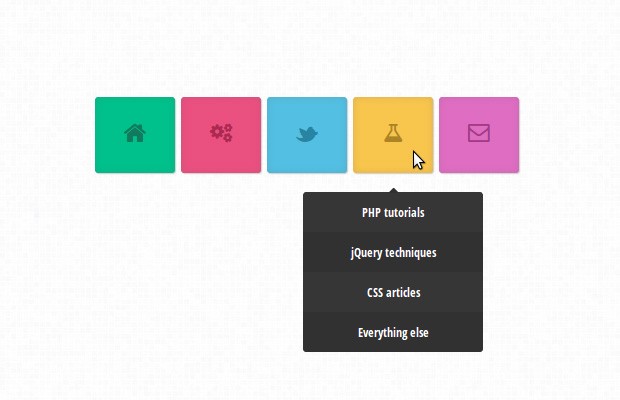
Colorful CSS3 Animated Navigation Menu
In this short tutorial, we will be creating a colorful dropdown menu using only CSS3 and the Font Awesome icon font. An icon font is, as the name implies, a font which maps characters to icons instead of letters. This means that you get pretty vector icons in every browser which supports HTML5 custom fonts (which is practically all of them). To add icons to elements, you only need to assign a class name and the icon will be added with a :before element by the font awesome stylesheet.
The HTML
Here is the markup we will be working with:
index.html
<nav id="colorNav">
    <ul>
        <li class="green">
            <a href="#" class="icon-home"></a>
            <ul>
                <li><a href="#">Dropdown item 1</a></li>
                <li><a href="#">Dropdown item 2</a></li>
                <!-- More dropdown options -->
            </ul>
        </li>

        <!-- More menu items -->

    </ul>
</nav>
Each item of the main menu is a child of the topmost unordered list. Inside it is a link with an icon class (see a complete list of the icon classes here), and another unordered list, which will be displayed as a drop down on hover.
The CSS
As you see in the HTML fragment above, we have unordered lists nested in the main ul, so we have to write our CSS with caution. We don't want the styling of the top UL to cascade into the descendants. Luckily, this is precisely what the css child selector '>' is for:
assets/css/styles.css
#colorNav > ul{
    width: 450px;
    margin:0 auto;
}
This limits the width and margin declarations to only the first unordered list, which is a direct descendant of our #colorNav item. Keeping this in mind, let's see what he actual menu items look like:
#colorNav > ul > li{ /* will style only the top level li */
    list-style: none;
    box-shadow: 0 0 10px rgba(100, 100, 100, 0.2) inset,1px 1px 1px #CCC;
    display: inline-block;
    line-height: 1;
    margin: 1px;
    border-radius: 3px;
    position:relative;
}
We are setting a inline-block display value so that the list items are shown in one line, and we are assigning a relative position so that we can offset the dropdowns correctly. The anchor elements contain the actual icons as defined by Font Awesome.
#colorNav > ul > li > a{
    color:inherit;
    text-decoration:none !important;
    font-size:24px;
    padding: 25px;
}
Now we can move on with the drop downs. Here we will be defining a CSS3 transition animation. We will be setting a maximum-height of 0 px, which will hide the dropdown. On hover, we will animate the maximum height to a larger value, which will cause the list to be gradually revealed:
#colorNav li ul{
    position:absolute;
    list-style:none;
    text-align:center;
    width:180px;
    left:50%;
    margin-left:-90px;
    top:70px;
    font:bold 12px 'Open Sans Condensed', sans-serif;

    /* This is important for the show/hide CSS animation */
    max-height:0px;
    overflow:hidden;

    -webkit-transition:max-height 0.4s linear;
    -moz-transition:max-height 0.4s linear;
    transition:max-height 0.4s linear;
}
And this is the animation trigger:
#colorNav li:hover ul{
    max-height:200px;
}
The 200px value is arbitrary and you will have to increase it if your drop down list contains a lot of values which do not fit. Unfortunately there is no css-only way to detect the height, so we have to hard code it.
The next step is to style the actual drop-down items:
#colorNav li ul li{
    background-color:#313131;
}

#colorNav li ul li a{
    padding:12px;
    color:#fff !important;
    text-decoration:none !important;
    display:block;
}

#colorNav li ul li:nth-child(odd){ /* zebra stripes */
    background-color:#363636;
}

#colorNav li ul li:hover{
    background-color:#444;
}

#colorNav li ul li:first-child{
    border-radius:3px 3px 0 0;
    margin-top:25px;
    position:relative;
}

#colorNav li ul li:first-child:before{ /* the pointer tip */
    content:'';
    position:absolute;
    width:1px;
    height:1px;
    border:5px solid transparent;
    border-bottom-color:#313131;
    left:50%;
    top:-10px;
    margin-left:-5px;
}

#colorNav li ul li:last-child{
    border-bottom-left-radius:3px;
    border-bottom-right-radius:3px;
}
And of course, we are going nowhere without some fancy colors! Here are 5 versions:
#colorNav li.green{
    /* This is the color of the menu item */
    background-color:#00c08b;

    /* This is the color of the icon */
    color:#127a5d;
}

#colorNav li.red{       background-color:#ea5080;color:#aa2a52;}
#colorNav li.blue{      background-color:#53bfe2;color:#2884a2;}
#colorNav li.yellow{    background-color:#f8c54d;color:#ab8426;}
#colorNav li.purple{    background-color:#df6dc2;color:#9f3c85;}
One neat aspect of using icon fonts, is that you can change the color of the icon by simply declaring a color property. This means that all customizations you might want to make can be done with CSS alone.
Done!
Icon fonts are a great addition to one's web development toolset. As they are regular fonts, you can use the font-size, color and text-shadow properties to customize them. This example doesn't use images nor JS, so it should be fairly easy to match it with your current design and use it within a few minutes.
Bootstrap Studio
The revolutionary web design tool for creating responsive websites and apps.
Learn more
Hi,
really nice menu :)
I'm having some strange effect after mouse hover (contact box) using Safari.
Link: http://i46.tinypic.com/10ru8nk.png
This looks like a rendering bug. Can somebody else confirm it?
Nope. All looks fine (with Safari 6.0.1)
I've also got this problem, some mouse hover effect:
http://i49.tinypic.com/2yxojd1.png
Works fine here too..
Safari 6.0.1 - OSX Mountain Lion 10.8.2
I see the same rendering bug in Safari, something I have also experienced on my own website with CSS3 transitions for changing background colour on hover.
It is indeed a rendering bug. It will probably be fixed in the next release of Safari, but until then I am afraid we will have to put up with it.
Yes,I agree with you Martin , there is a rendering bug, the hide or fadeOut shoudl be faster than show or fadeIn.
Work fine in Safari 9.1.1
Excellent Work !!
Impressive as usual!
I like the way you explain your tutorials. You make it easy to understand the technique without complicating it..
Really nice and simple.
Really nice..Thanx for such simple but powerful tutorial
how to set text instead of icon in menu.. ?? pls explain me with an example
Remove the icon- classes from the anchors and write your text inside them. After this, add the following CSS to your stylesheet:
#colorNav > ul > li > a {
    display:inline-block;
}
This should make it work. Remember to also increase the width of the UL so the menu items fit on one line.
Thanks, great tutorial. So simple. Love it!
Total awesomeness. Very clean design.
When, I completed the code, I ended up with the navigation stacked not side by side.
How to fix this?
I'm an idiot. Never mind.
A perefct example of colorful and responsive navigation i saw recently is this page http://flip.hr
Perfect ! as always :D
hi. It is so cool. tank you. ;)
Wow! Awesome....
Pure front-end delight plus totally usable too. Great job Martin!
Simple and Smart... great Tutorial.
You could add something to get the :hover submenu forground :
#colorNav li ul { z-index: 1000; } #colorNav li:hover ul { z-index: 1337; }Thank you for all the wonderful comments!
Hello,
Thank you very much for this useful tuto but I have a problem with those icons.
No icons appear on my square: http://cl.ly/image/1N2L413s3j3R
Someone can help me please ?
Thanks
I think that some browsers prevent you from including fonts from your local hard drive. Test the menu through xampp (or other apache+php package).
Hi, Martin.. why you don't use move to the left technique to hide the drop-down menu. So we have to move the ul to left..(ul{left:-99999px}.. and bring back by set the value to {left:auto} when we are hovering it.. so we don't have to worry to code the height of drop-down menu, because it is so not suitable to apply it on dynamic website such as WordPress
Hi Martin, nice to see this article.. I need a few help here.. I want to remove the rounded-rectangle behind the menu, which line of code in css should I modify?
If I want to create a website having 10 pages with the same layout how do I go about that?
And to create such menu's should I just keep on learning from tutorials(like yours) or first learn a lot about css and then try to learn via tutorials?
My knowledge so far:- basic webpages (2 coloumns with a sidebar ,etc).
Thank You very much.
Hi, Very nice work Martin, thanks.
Just wondering how to make this more accessible? I'm thinking of using a combination of text and/or icons to create my top level menu. Some links will only be the icon and I'm wondering how to cope with screen readers using your method. Any ideas?
Hey! thanks for this great tutorial! I've used this in my website, www.aravindvs.com. looks nice & clean. Thank you very much! Keep up the good work! :)
Nice man, how did you add the birds effect?
Though this is after a long time, this link may help somebody somewhere.
http://slicejack.com/creating-a-fullscreen-html5-video-background-with-css/
Hi,
Really great article, I was just wondering how you would go about making the list items appear above rather than below...?
Thanks
not working for internet explorer.
Thanks for the CSS drop down menu, it's looking great.
Really nice and simple.
Thanks, very inspirational. Might use this on my future projects.
With the awesomeness of CSS3, we don't need jquery to have those nice transition :D
Thanks for the CSS drop down menu, it's looking great.
Thanks for this. I've been struggling with creating an animated drop down menu at work all week but your tutorial made it simple to understand the concepts behind what you are doing. Thanks!
Hi there,
This tutorial is exactly what I was looking for.
I'm in the process of building my company website by myself (i'm a designer but no background in programming).
I've got some headlines on my webpage, that I'm hoping to mouse over and reveal a section with related details.
Question: I've drawn the icon for the mouseover using HTML5 Canvas element. Is it possible to use this instead of the custom font (I like the pixel perfect rendition)?
The example is not working in Internet explorer properly. if u click on demo and open it in IE it does not open as it opens in Chrome and mozilla.
Can anybody let me know the how to open it in IE properly?
Thank u so much for this menu... Its Really nice and simple.
First of all, I would like to say thanks for sharing this great post and valuable tips. This is really helpful to me and I am thinking that why not to use these tips on my blog also.
Regards
<a href="http://fiba2014livestream.com/">FIBA 2014 Live Stream</a>
Some links will only be the icon and I'm wondering how to cope with screen readers using your method. Any ideas? http://www.salomonchaussure.fr