Making a CSS3 Animated Menu
In this short tutorial, we will be using the power of CSS3 effects and transitions, to build a JavaScript-free animated navigation menu which you can use to add a polished look to your website or template. We will be using some neat features such as the :target pseudo selector and :after elements.
The HTML
The first step is to define the HTML backbone of the website. We are using HTML5 tags extensively, so we will need to include the HTML5 enabling script for IE in the head section of the document. As it is enclosed in a conditional comment, it is only going to be requested in IE browsers and will not affect the performance of the others:
index.html
<!DOCTYPE html>
<html>
<head>
<meta charset="utf-8" />
<title>CSS3 Animated Navigation Menu | Tutorialzine Demo</title>
<!-- Our CSS stylesheet file -->
<link rel="stylesheet" href="assets/css/styles.css" />
<!-- Including the Lobster font from Google's Font Directory -->
<link rel="stylesheet" href="http://fonts.googleapis.com/css?family=Lobster" />
<!-- Enabling HTML5 support for Internet Explorer -->
<!--[if lt IE 9]>
<script src="http://html5shiv.googlecode.com/svn/trunk/html5.js"></script>
<![endif]-->
</head>
<body>
<header>
<h1>CSS3 Animated Navigation Menu</h1>
<h2>« Read and download on Tutorialzine</h2>
</header>
<nav>
<ul class="fancyNav">
<li id="home"><a href="#home" class="homeIcon">Home</a></li>
<li id="news"><a href="#news">News</a></li>
<li id="about"><a href="#about">About us</a></li>
<li id="services"><a href="#services">Services</a></li>
<li id="contact"><a href="#contact">Contact us</a></li>
</ul>
</nav>
<footer>Looks best in Firefox 4, usable everywhere.</footer>
</body>
</html>
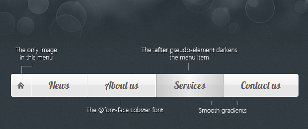
You can notice that we are including a stylesheet from Google APIs. It contains a code>@font-face declaration and includes the Lobster font into our page, from Google's Web Font directory, which has grown to include more than 100 wonderful open source fonts, generously hosted by Google.
In the body of the document, we have the header, nav and footer HTML5 tags, which divide the page into three sections with semantic value. We will be concentrating on the UL element inside the nav tag. This is our navigation menu.
The unordered list has a fancyNav class applied to it, which we will be using to limit the effect of the CSS styles that we will be writing in a moment. This will make the code more portable and limit any possible side effects. Another thing to point out is that each of the LI elements has an unique ID, linked to from the anchor elements inside them. This will enable us to use the :target pseudo-class to style the currently selected menu item.
So lets move on to the CSS styles.

The CSS
You might find it surprising that the navigation menu we are building does not use any images (except for the home icon - a transparent png). Everything is done with CSS3 gradients, box shadows, and multiple backgrounds.
As for browser support, the menu works in the latest versions of Firefox, Chrome, Safari and Opera, while it is still usable in every IE version from 7 onwards. However, it does look best in Firefox 4, as it supports animating :before and :after pseudo elements via the transition property (other browsers are expected to follow suite).
Our CSS styles are defined in assets/styles.css. I would suggest that you download the menu code from the button above, and open that file in a text editor. We will be focusing primarily on the navigation menu, so I will be skipping the boring parts of the file.
Lets start styling the navigation menu! We first write the rules for the unordered list - targeted with the fancyNav class, and the li items:
.fancyNav{
    /* Affects the UL element */
    overflow: hidden;
    display: inline-block;

    border-radius: 4px;
    -moz-border-radius: 4px;
    -webkit-border-radius: 4px;

    box-shadow: 0 0 4px rgba(255, 255, 255, 0.6);
    -moz-box-shadow: 0 0 4px rgba(255, 255, 255, 0.6);
    -webkit-box-shadow: 0 0 4px rgba(255, 255, 255, 0.6);
}

.fancyNav li{
    /* Specifying a fallback color and we define CSS3 gradients for the major browsers: */

    background-color: #f0f0f0;
    background-image: -webkit-gradient(linear,left top, left bottom,from(#fefefe), color-stop(0.5,#f0f0f0), color-stop(0.51, #e6e6e6));
    background-image: -moz-linear-gradient(#fefefe 0%, #f0f0f0 50%, #e6e6e6 51%);
    background-image: -o-linear-gradient(#fefefe 0%, #f0f0f0 50%, #e6e6e6 51%);
    background-image: -ms-linear-gradient(#fefefe 0%, #f0f0f0 50%, #e6e6e6 51%);
    background-image: linear-gradient(#fefefe 0%, #f0f0f0 50%, #e6e6e6 51%);

    border-right: 1px solid rgba(9, 9, 9, 0.125);

    /* Adding a 1px inset highlight for a more polished efect: */

    box-shadow: 1px -1px 0 rgba(255, 255, 255, 0.6) inset;
    -moz-box-shadow: 1px -1px 0 rgba(255, 255, 255, 0.6) inset;
    -webkit-box-shadow: 1px -1px 0 rgba(255, 255, 255, 0.6) inset;

    position:relative;

    float: left;
    list-style: none;
}
Notice the huge list of CSS3 gradient syntaxes. All recent versions of Firefox, Chrome and Safari support gradients. With Opera and IE 10 (currently in platform preview mode), also joining in with their latest versions. Initially there were two competing syntaxes, backed by Mozilla (Firefox) on one side and Webkit (Chrome and Safari) on the other, but Firefox's gradient syntax has been agreed on as the industry standard.
The next step is to use the :after pseudo element to create the dark shadows, displayed when you hover over a menu item:
.fancyNav li:after{

    /* This creates a pseudo element inslide each LI */

    content:'.';
    text-indent:-9999px;
    overflow:hidden;
    position:absolute;
    width:100%;
    height:100%;
    top:0;
    left:0;
    z-index:1;
    opacity:0;

    /* Gradients! */

    background-image:-webkit-gradient(linear, left top, right top, from(rgba(168,168,168,0.5)),color-stop(0.5,rgba(168,168,168,0)), to(rgba(168,168,168,0.5)));
    background-image:-moz-linear-gradient(left, rgba(168,168,168,0.5), rgba(168,168,168,0) 50%, rgba(168,168,168,0.5));
    background-image:-o-linear-gradient(left, rgba(168,168,168,0.5), rgba(168,168,168,0) 50%, rgba(168,168,168,0.5));
    background-image:-ms-linear-gradient(left, rgba(168,168,168,0.5), rgba(168,168,168,0) 50%, rgba(168,168,168,0.5));
    background-image:linear-gradient(left, rgba(168,168,168,0.5), rgba(168,168,168,0) 50%, rgba(168,168,168,0.5));

    /* Creating borders with box-shadow. Useful, as they don't affect the size of the element. */

    box-shadow:-1px 0 0 #a3a3a3,-2px 0 0 #fff,1px 0 0 #a3a3a3,2px 0 0 #fff;
    -moz-box-shadow:-1px 0 0 #a3a3a3,-2px 0 0 #fff,1px 0 0 #a3a3a3,2px 0 0 #fff;
    -webkit-box-shadow:-1px 0 0 #a3a3a3,-2px 0 0 #fff,1px 0 0 #a3a3a3,2px 0 0 #fff;

    /* This will create a smooth transition for the opacity property */

    -moz-transition:0.25s all;
    -webkit-transition:0.25s all;
    -o-transition:0.25s all;
    transition:0.25s all;
}
The :after declaration creates a real styleable element. It has a smooth horizontal gradient that darkens the menu item when hovered upon. As it is invisible by default (opacity is set to 0), we are using CSS3 transitions to animate it between zero and full opacity, triggered on hover. Unfortunately only Firefox supports animating pseudo elements at this moment, but other browsers are expected to soon introduce this feature.
Next we will be using the :first-child and :last-child pseudo selectors to target the first and last menu items.
/* Treating the first LI and li:after elements separately */

.fancyNav li:first-child{
    border-radius: 4px 0 0 4px;
}

.fancyNav li:first-child:after,
.fancyNav li.selected:first-child:after{
    box-shadow:1px 0 0 #a3a3a3,2px 0 0 #fff;
    -moz-box-shadow:1px 0 0 #a3a3a3,2px 0 0 #fff;
    -webkit-box-shadow:1px 0 0 #a3a3a3,2px 0 0 #fff;

    border-radius:4px 0 0 4px;
}

.fancyNav li:last-child{
    border-radius: 0 4px 4px 0;
}

/* Treating the last LI and li:after elements separately */

.fancyNav li:last-child:after,
.fancyNav li.selected:last-child:after{
    box-shadow:-1px 0 0 #a3a3a3,-2px 0 0 #fff;
    -moz-box-shadow:-1px 0 0 #a3a3a3,-2px 0 0 #fff;
    -webkit-box-shadow:-1px 0 0 #a3a3a3,-2px 0 0 #fff;

    border-radius:0 4px 4px 0;
}

.fancyNav li:hover:after,
.fancyNav li.selected:after,
.fancyNav li:target:after{
    /* This property triggers the CSS3 transition */
    opacity:1;
}
Applying different styles to the first and last items is necessary, as we don't want to display ugly borders that span outside the menu. We also round the appropriate corners of these elements.
Note: You can add class="selected" to a list item in order to make it selected/active by default. This is useful when building templates or generating the menu with a server-side language.
After this we need to apply a fix to the menu. It is to hide the currently selected element when we hover on the menu again:
.fancyNav:hover li.selected:after,
.fancyNav:hover li:target:after{
    /* Hides the targeted li when we are hovering on the UL */
    opacity:0;
}

.fancyNav li.selected:hover:after,
.fancyNav li:target:hover:after{
    opacity:1 !important;
}
And lastly all that is left is to style the anchor elements that reside in the LIs.
/* Styling the anchor elements */

.fancyNav li a{
    color: #5d5d5d;
    display: inline-block;
    font: 20px/1 Lobster,Arial,sans-serif;
    padding: 12px 35px 14px;
    position: relative;
    text-shadow: 1px 1px 0 rgba(255, 255, 255, 0.6);
    z-index:2;
    text-decoration:none !important;
    white-space:nowrap;
}

.fancyNav a.homeIcon{
    background:url('../img/home.png') no-repeat center center;
    display: block;
    overflow: hidden;
    padding-left: 12px;
    padding-right: 12px;
    text-indent: -9999px;
    width: 16px;
}
With this our animated CSS3 menu is complete!
To Wrap Up
Having your navigation menu built entirely with CSS gives you a great deal of control. You can customize every part of the design by swapping a color value or the font. The most of the bulk in the code came from having to supply a separate declaration for each browser, something that will soon be a thing of the past.
Did you like this tutorial? Be sure to share your thoughts in the comment section below.
Bootstrap Studio
The revolutionary web design tool for creating responsive websites and apps.
Learn more
Nice tutorial. It just gets better.
it would be cool to make this a css3 animated dropdown menu that has cross-browser fallbacks.
Very good tutorial, just missing the sub menus.
I have been thinking of developing a fully fledged multi-level navigation menu for a while. Stay tuned :)
very nice. its interesting idea for any.. )
Excellent tutorial. This is definitely something I will use. Thanks for sharing and keep up the great work.
Great tutorial - thank you for sharing this:)
Wow, this was looking awesome in FF4 either in other browsers, this is cool just transition is not there....
Anyways thanks...!
It doesn't quite pull off the effect in Chrome - have you thought about adding webkit transitions as well as moz transitions? Would make it nice in safari/chrome as well!
There are transition definitions for webkit browsers as well in the code. However they do not support animating :after pseudo-elements yet. They will be introducing such support soon.
I can't wait for the day that all browsers will be one. Thanks for shearing with us.
I think I will have a go at this on the client project. Great tutorial.
with CSS3 we can do more and more for the creativity...
thanks master for the tut's \m/
Wow, very nice menu, I'll have a play. Many thanks =)
Not working on Chrome 11.0.696.65
Very well explained tutorial!
Hope you keep on providing us with such high quality tutorials.
Bro it's really good and I will surely implement it on my next project. But it has only one problem that IE still doesn't support CSS3 and this really sucks :(
Great tutorial!
I have tried once this at my own but unfortunatelly unsuccessful try, lol.
Thanks!
Hi,
great menu and a great tutorial ;-).
I added this to a project, but I have a problem with "class=selected" to hover the selected menu item.
I include this in my index.php and the links are like "index.php?section=start" etc.
But the actual menu item shows no effect, even if I add the class to the li element.
Any ideas?
Can you give a link to your page?
He is right.
Class = selected just means that if you don't hover over the menu, the Home icon is default / selected on every page.
So you have two menu items selected at all times
It looks nice, but the demo needs to be more functional - I'd be happy to donate if a little more thought went in ;) :) :)
Thank you
A great tutorial but with a deficiency on the part of Target, dependenfo the point where the menu is placed on a page it just jumps to the bottom if the page contains scroll. the reason is that part of the target element (#) pound sign is called the di responssavel (ID) and does not work (?) mark.
Wow! nice tutorial, Thanks!
Hey, I was just wondering if you know of a good app/website to use to change the color scheme of this menu.
Thanks
P.S. Any word on that multi-level menu?
Hey, this is a sweet looking menu. I am currently trying to use it in a Contao CMS-based website. I left out the Home-Button (don't have that anchor, and have nothing specified), but for some reason it seems to start with a margin from the left that equals the space used by the Home-button. What am I missing here?
I have the same problem... anyone know why?
you need to add:
list-style-position:inside;
padding: 0;
to the fancynav class.
Thank you, excellent menu
Marvelous! Thank you for the effort!
Can you point out how can we change the height? I need to make it thinner :) decreasing font does some trick but thats not what I imagine.
thanx in advance
Modify css for change height menu and font size, font family, etc, :
/ Styling the anchor elements /
.fancyNav li a{
color: #FFFFFF;
display: inline-block;
font: 15px/1 Helvetica,Arial,sans-serif;
padding: 8px 14px 8px;
position: relative;
text-shadow: 2px 1px 0 rgba(35, 35, 35, 0.6);
z-index:2;
text-decoration:none !important;
white-space:nowrap;
}
I have changed the menu color to green:
.fancyNav li{
/ Specifying a fallback color and we define CSS3 gradients for the major browsers: /
background-color: #3B6B47; /green color for IE /
...
.fancyNav li:after{
background-image:-webkit-gradient(linear, left top, right top, from(rgba(36,61,42,0.5)),color-stop(0.5,rgba(87,124,96,0)), to(rgba(36,61,42,0.5)));
background-image:-moz-linear-gradient(left, rgba(36,61,42,0.5), rgba(87,124,96,0) 50%, rgba(36,61,42,0.5));
background-image:-o-linear-gradient(left, rgba(36,61,42,0.5), rgba(87,124,96,0) 50%, rgba(36,61,42,0.5));
background-image:-ms-linear-gradient(left, rgba(36,61,42,0.5), rgba(87,124,96,0) 50%, rgba(36,61,42,0.5));
background-image:linear-gradient(left, rgba(36,61,42,0.5), rgba(87,124,96,0) 50%, rgba(36,61,42,0.5));
...
Is it possible to combine <li> elements of different colors in the same menu?
Hi,
beautiful menu and great tutorial, thank you for that. Only problem is it doesn't work for me in IE9. If I open your website in IE9 and follow the "DEMO" button it renders quite fine. However that doesn't apply for the source file or any of my files in which I follow your instructions to overcome the IE/HTML5 problem.
My question is, is the downloaded source code supposed to render well in the IE9 or does it need any more tweaking?
Thank you
Hello,
Great tutorial!
I have ran into a slight issue and I do not seem to be able to figure out the problem. When i changed the <a href> links to some other files on the server (e.g. index.php), the buttons do nothing and the page does not change. Could someone tell me what is going wrong? I am suspecting something is blocking the actual link, maybe something with the CSS...
Many thanks!
This is fantastic! I wish it worked in IE 8 though :(
Any ideas on how to make it work in IE 8?
Thanks,
Can anyone give me a hint to get a shadow behind the menu?
With this:
-moz-box-shadow: 5px 5px 5px 1px #888;
-webkit-box-shadow: 5px 5px 5px 1px #888;
box-shadow: 5px 5px 5px 1px #888;
the shadow seams too be to long on the left site, because of the .fancyNavi Element.
I didn't have any idea.
But really great tutorial, it was really helpfully.
Okay, at this morning i found the code snipped :)
-webkit-padding-start: 0px;
Perfect! But I don't enable for IE =/
nicely done, thanks.
How can i center the whole menu?
nice looking menu easy to follow tutorial. If there is a multi level dropdown menu that would be great.
thanks
Has anyone been able to make it work with sub menu as well? I am having issues with mouse hover on sub menus. Please help.
Brilliant tutorial and menu!
btw, how can I change the menu to represent the active tab to dark like the :after?
Thank you in advance!
Very helpful thanks a lot for your work here :)
I've managed to change the text color on hover but I'm not able to chnaged it for the selected li element.Could someone advise how to do that?
can anyone suggest me how to add the sub-menu (child menu). I ve tried the following code but didnt work...
Hello, I can not create a submenu. Someone could do ?. regards !!