Apple-like Retina Effect With jQuery
Apple has long applied a winning strategy in marketing - create well designed products, have a dedicated fan base, and let the hype build up before every product release.
This is also the case with the latest version of their iPhone. But what I found interesting is the term they coined - "Retina display" and the promo image accompanying it.
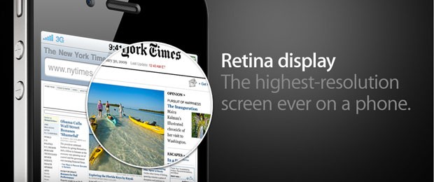
What made me wonder is if it was possible to turn this static image into a fully functional "Retina effect" with only jQuery and CSS. This is exactly what we are doing today. So grab the demo files from the button above and read on.
UPDATE: Seems Apple folks have also liked the idea, and they've implemented it at apple.com.
Step 1 - XHMTL
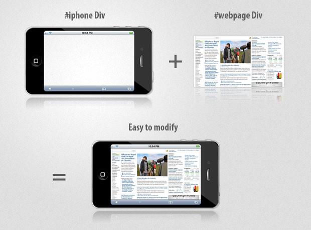
The markup for the effect is quite straightforward. You can see that we only have a number of divs and an image.
demo.html
<div id="main">

    <div id="iphone">
        <div id="webpage">
            <img src="img/webpage.png" width="499" height="283" alt="Web Page" />
            <div id="retina"></div>
        </div>
    </div>

</div>
The #iphone div displays the iphone frame. Inside it is the #webpage div with the screenshot of the webpage. The screenshot is actually displayed at half its original size, as we are using the same image for both the small version (displayed in the iPhone) and big version, which is shown in the rounded tooltip.
Lastly we have the retina div, which is rounded with CSS3 and displays the big version of the webpage screeshot as its background as it is moved around with the mouse.
Step 2 - CSS
Moving to the CSS part of the tutorial. We are going to style the iphone, webpage and retina divs, so we make the awesome effect possible.
styles.css
#iphone{
    /* The iphone frame div */
    width:750px;
    height:400px;
    background:url('img/iphone_4G.png') no-repeat center center;
}

#webpage{
    /* Contains the webpage screenshot */
    width:499px;
    height:283px;
    position:absolute;
    top:50%;
    left:50%;
    margin:-141px 0 0 -249px;
}

#retina{
    /* The Retina effect */
    background:url('img/webpage.png') no-repeat center center white;
    border:2px solid white;

    /* Positioned absolutely, so we can move it around */
    position:absolute;
    height:180px;
    width:180px;

    /* Hidden by default */
    display:none;

    /* A blank cursor, notice the default fallback */
    cursor:url('img/blank.cur'),default;

    /* CSS3 Box Shadow */
    -moz-box-shadow:0 0 5px #777, 0 0 10px #aaa inset;
    -webkit-box-shadow:0 0 5px #777;
    box-shadow:0 0 5px #777, 0 0 10px #aaa inset;

    /* CSS3 rounded corners */
    -moz-border-radius:90px;
    -webkit-border-radius:90px;
    border-radius:90px;
}

#retina.chrome{
    /* A special chrome version of the cursor */
    cursor:url('img/blank_google_chrome.cur'),default;
}

#main{
    /* The main div */
    margin:40px auto;
    position:relative;
    width:750px;
}
By specifying an absolute positioning on the webpage div, we can apply the vertical and horizontal centering technique, effectively putting the webpage screenshot in the middle of the iphone frame.
The retina div is also assigned an absolute positioning, so it is possible to move it in the jQuery part of the tutorial by just specifying a top and left offsets. This div also has the webpage screenshot as its background (in its original size). Offsetting the background with the movement of the div creates the illusion that it magnifies the small screenshot below it.
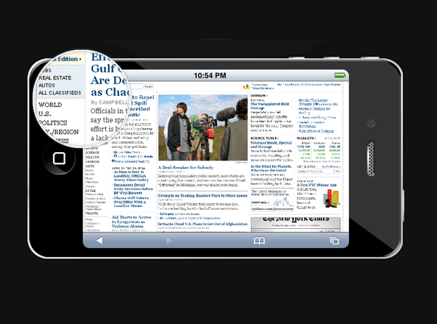
The retina div also has applied a border radius with a value of exactly half its width, which turns it into a perfect circle (at least in browsers which support the border-radius CSS3 property - Chrome, Safari, Opera & Firefox).
And finally we hide the mouse pointer by providing a blank cursor file (Google Chrome fails to render completely blank cursors, so we provide a special 1px white cursor for it - at least it is better than nothing). The Opera browser completely ignores custom cursors and there are no workarounds, so users using this browser might not enjoy the full experience.
Step 3 - jQuery
If you can remember, a few months ago we did a tutorial here at Tutorialzine, in which we used jQuery to create a photoshoot effect. This time we are using a similar technique to make the "retina effect", as seen on Apple's web site.
And since we have all the styling in place, it is a matter of some JavaScript coding with the help of the jQuery library.
script.js
$(document).ready(function(){

    /* This code is executed on the document ready event */

    var left    = 0,
        top     = 0,
        sizes   = { retina: { width:190, height:190 },
                webpage:{ width:500, height:283 } },
        webpage = $('#webpage'),
        offset  = { left: webpage.offset().left, top: webpage.offset().top },
        retina  = $('#retina');

    if(navigator.userAgent.indexOf('Chrome')!=-1)
    {
        /*  Applying a special chrome curosor,
            as it fails to render completely blank curosrs. */

        retina.addClass('chrome');
    }

    webpage.mousemove(function(e){

        left = (e.pageX-offset.left);
        top = (e.pageY-offset.top);

        if(retina.is(':not(:animated):hidden')){
            /* Fixes a bug where the retina div is not shown */
            webpage.trigger('mouseenter');
        }

        if(left<0 || top<0 || left > sizes.webpage.width ||
            top > sizes.webpage.height)
        {
            /*  If we are out of the bondaries of the
                webpage screenshot, hide the retina div */

            if(!retina.is(':animated')){
                webpage.trigger('mouseleave');
            }
            return false;
        }

        /*  Moving the retina div with the mouse
            (and scrolling the background) */

        retina.css({
            left                : left - sizes.retina.width/2,
            top                 : top - sizes.retina.height/2,
            backgroundPosition  : '-'+(1.6*left)+'px -'+(1.35*top)+'px'
        });

    }).mouseleave(function(){
        retina.stop(true,true).fadeOut('fast');
    }).mouseenter(function(){
        retina.stop(true,true).fadeIn('fast');
    });
});
In the mousemove function, the current coordinates of the mouse are passed as e.pageX and e.pageY, but they are absolute with relation to the document. Subtracting the position offset of the website div, we end up with relative coordinates for the mouse, which are later used to position the retina div.
This, combined with the blank cursor we set up in the CSS part of the tutorial, creates the retina effect in pure JavaScript and CSS.
Conclusion
As the Flash / HTML5 debate heated up recently, people started looking for ways to achieve the same level of functionality that flash provides, without depending on an external plugin. This is possible for simple interactions, but we still have to make sure that the solution is cross-browser compatible, which is sometimes rather impossible (think of IE here).
Hopefully, today we made something that would easily rival an equivalent Flash solution.
What do you think? How would you improve this effect?
Bootstrap Studio
The revolutionary web design tool for creating responsive websites and apps.
Learn more
Great tutorial !
just awesome - i try it soon ;)
That is very nice. What'd be REALLY cool is if instead of using a background image, you could load the page content into the 'retina' with hidden overflow, so that users could click the links they see in the retina image when they mouse over them?
@ Joss
It would be an interesting experiment, however there is a shortcoming to this technique - applying rounded corners to a div with overflow:hidden does not clip the contents of the div (it is still displayed outside of the rounded corners).
It would work if you use CSS3 masks, but these are only available in Safari and Chrome as far as I've researched.
Once again, excellent implementation!
"so we provide a special 1px white cursor for it – at least it is better than nothing"
Actually, it's not better than nothing. In this case, nothing would be the best scenario. Technically, it is better than something else. =)
Nice Tuts! Thx
One interesting addition would be to add some radial gradients with rgba so you could have some depth/distortion to the edges of the loupe.
Great tutorial ... but IE is still a problem
Very interesting article. Techniques for using jQuery Thanks for the article.
This is great, thanks a lot.
That's very cool. Makes for a nice zoom effect, and nice job on the retina idea, surely that can't help ;)
Excellent work, congrats mate :)
Thanks for the reply - very good point there.
I love this effect! I gotta find a way to integrate this on our website!
I don't see the point in this? So, this has nothing to do with the Retina display? It is basically just a zoom and an iphone div? Why not just make the picture bigger?
This is no less good with Zoom jQuery Plug-in...its a cool mate
thanks ^_^'
Well done Martin - really loved the implementation and the demo. Keep up the great work!
Stunning work bro. Thanks for sharing!
nice job, i want to use that for something..not sure what though..hmmm..
Great experiment.. I can only imagine the posibilities. Thank you for all your quality tutorials... I am not a web designer or good at coding but I have sucessfully designed and coded my website thanks to websites like yours. you will see the influence of your tuts when you take a look at my website. Thank you.
well informed ..keep it up..thanks
Very nice tutorial.
Great, thanks...
With a few tweeks to positioning and padding you could make the loupe reach the sides and corners of the webpage div too...
I didn't know you could declare a list of var's like that. At least I have come away with something new!
Thanks for the great tut, i will use it on my site soon.
If you haven't seen it, Apple has now implemented this effect (or a similar one) on their site here: http://www.apple.com/iphone/features/retina-display.html
Great effect, but not very dynamic the way you've written it. It'll only work with one div per page currently. Maybe you should consider adding a tweak to deal with classes and multiple divs?
@ Jaya
Cool. Looks like Apple guys have been reading my blog : )
@ Jesse
To make it work with multiple divs would require more of a rewrite than a tweak. It won't be too much work though - the ID's would need to be replaced with class names, and you will need an object or an array so you can associate an image to a container (or you could determine it dynamically from the background of the webpage).
Cool toy for sure :)
I wonder if it can be applied over html with links etc.
The only problem I see, is that the center of the magnifying glass is not centered over the correct position behind it (same problem at apple's website). So if the user wanted to click a link it would be way off.
I remember another guy back in 2006 made something similar in JavaScript using 2 images (one large and one small) instead, which worked really good and 100% centered.
very useful tutorial, thanks
Beautiful...Thanks
at least this doesnt have reception issues
Man, I'm impressed with the quality of the tutorials presented in this blog. This 'Retina Effect' is an example.
I found that it didn't play well with other javascript on my page, hiding and showing elements above the "#webpage" div invalidated the calculation of the offset.
I solved this by moving the offset calculation down in to the mousemove function...
var offset = { left: webpage.offset().left, top: webpage.offset().top };
There's no need to do this, unless you are dynamically changing the height of the web page in some way, but it doesn't seem to slow the performance down at all in any of the browsers I tested.
Very impressed with this effect and this tutorial, good work Martin
great work, but apple's one works with IE as well.
I'm write $.fn.retina plugin: http://ti.y1.ru/retina/
Correct work in IE!
Enjoy!
very usefull tutorial.... love it
Interesting method, really nice tutorial... thanks
awesome tut, very nice dude...
You are in smashing magazine again with this tut. Congratulations.
I was very happy to come across all these tutorials. I think they are very useful.
Thanks and more grease to your elbows.
These are really great!
Never seen such tutorials before !!!!!
Just a note: this should probably be called a 'loupe effect,' since it has little to do with the 'retina'-like high resolution screen on the iPhone 4.
Great tutorial!
But I have a problem with ajax loaded content. Once an image is loaded by ajax, the plugin must be reinitalized.
Anyone know how to edit it with .live() "that will inform the DOM that a new element will be added later and we have to handle the event" ?
Thank you!
Took about half an hour to put on my site with additional sidebar pics (spent more time fiddling with spacing than integrating your code). Awesome job, thank you for sharing.
http://kidswearhouse.net/kids-clothes
Very nice portfolio idea! Thank you for the article!
This is awesome, how can I modify this to compare to two magnifying images similar to apple's old and new ipad screen comparison? so two magniygin glasses moving simultaneously...
http://www.apple.com/ca/ipad/features/
This is excellent, the best tutorial i've found but I need help modifying the code to match some great settings, could somebody help me?
If you look at link the magnifying glass is always present, how can I do that? And the other great feature is that when you get to the edge the glass doesn't disappear instantly but it still shows you the last section when you are at the iPhone's border.
I don't know if I was clear but it would be great if someone that's good at doing this could help me out.
Thanks in advanced!
Hi, Thanks for this, its great, just one question, how do you edit the zoom factor?
Can you make this work with iPad or iPhone?
Excellent write-up. Just to see if it could be done, I have added some extra code to make the magnification rounded in IE:
http://www.useragentman.com/tests/magnify/
It doesn't use border-radius, but rather a combination of the Compositor and Chroma Visual Filters to do this effect. I'm seeing if I can add some more finessing, but I thought it may be of interest.
Z.
P.S. I mean IE 8 and lower. ;-)
Nice tutorial! I am using it for my project, I hope it's okay :) I love your tutorialz!! You guys rock!