Contextual Slideout Tips With jQuery & CSS3
By now, you've probably heard about Adobe's new CS5 software pack. Also, you've probably seen their product pages, where they present the new features of the suite. Apart from the great design, they've also implemented an interesting solution for showcasing the new features their products are capable of - using contextual slideout tips.
Knowing the importance of HTML standards, we are making a set of contextual slideout tips with jQuery & CSS3, which are ideal for product pages and online tours. As a bonus, they are SEO friendly, so all the content is visible to search engines.
The idea
The main idea is to create an easily configurable set of contextual slideouts. Each can be opened in one of four directions - bottom-right (default), bottom-left, top-left and top-right, and each can be in one of three colors - green (default), blue, and red.
To create a slideout element, you need to include a regular paragraph p tag to the page. This means that all the content is visible to search engines in a semantic way. The paragraphs are replaced with the markup for the slideouts by jQuery on page load, with the title, class and style attributes of the paragraph passed to the newly created element.
Step 1 - XHTML
Now lets take a look at the structure of the paragraph tags you should add to the page, and how they are configured.
demo.html
<div class="main">
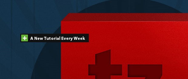
<p title="A New Tutorial Every Week" style="top:200px;left:120px;">
This slideout is going to open to the bottom-right (the default).
</p>
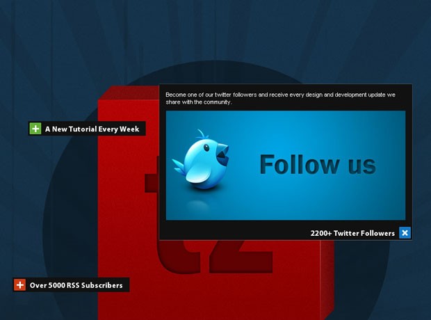
<p title="2200+ Twitter Followers" class="openTop openLeft blue" style="top:400px;left:650px;">
This slideout is going to open to the top-left.
</p>
<p title="Over 5000 RSS Subscribers" class="openTop red" style="top:500px;left:90px;">
This slideout is going to open to the top-right.
</p>
</div>
As you can see, each of the tags contains a style, a class (optional) and a title attribute. As discussed above, these are copied to the slideouts when jQuery replaces the markup.
The style attribute contains the coordinates relative to the parent div element, which means that the slideouts are positioned in exactly the same place as the paragraphs.
The class attribute is optional and specifies a number of options for the slideouts. You can choose the direction to which the slideouts open, and their color.
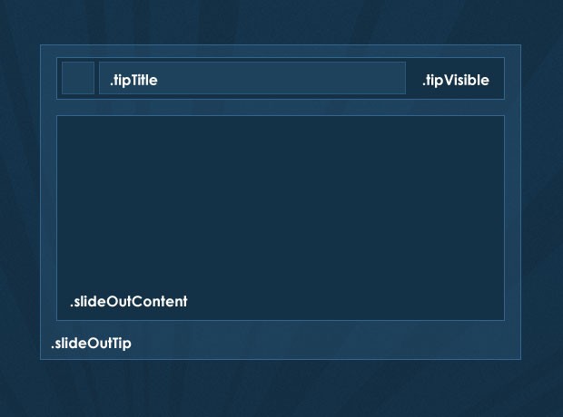
slideout markup
<div class="slideOutTip openLeft blue" style="left:100px;top:200px">

    <div class="tipVisible">
        <div class="tipIcon"><div class="plusIcon"></div></div>
        <p class="tipTitle">The title of the slideout</p>
    </div>

    <div class="slideOutContent">
        <p>Slideout Content</p>
    </div>
</div>
Step 2 - CSS
Now lets take a closer look at the styling. Only the styles directly used by the slideouts are presented here. You can see the rest of the styles in styles.css in the download archive.
styles.css - Part 1
.slideOutTip{
    /* The main wrapping div of the slideout tips */
    position:absolute;
    padding:3px;
    top:0;
    left:0;
    background-color:#111;
    font-size:13px;
    color:white;
    overflow:hidden;
    height:22px;
}

.slideOutTip:hover{
    /* Applying a CSS3 outer glow on hover */
    -moz-box-shadow:0 0 1px #999;
    -webkit-box-shadow:0 0 1px #999;
    box-shadow:0 0 1px #999;
}

/* The holder for the title and the icon: */
.tipVisible{ cursor:pointer; height:22px; }

.tipTitle{
    float:left;
    font-family:'Myriad Pro',Arial, Helvetica, sans-serif;
    font-size:15px;
    font-weight:bold;
    white-space:nowrap;
    line-height:22px;
    padding-right:5px;
}

.tipIcon{
    width:20px;
    height:20px;
    float:left;
    background-color:#61b035;
    border:1px solid #70c244;
    margin-right:8px;

    /* CSS3 Rounded corners */

    -moz-border-radius:1px;
    -webkit-border-radius:1px;
    border-radius:1px;
}
The tipVisible contains the tipTitle and tipIcon divs, floated to the left inside it. These are the only divs that are visible to the user when the page loads. In the jQuery step of the tutorial, you will see that we are also binding an event listener for the click event on tipVisible, which slide-opens the content.
styles.css - Part 2
/* Three color themes */
.green .tipIcon{ background-color:#61b035; border:1px solid #70c244; }
.blue .tipIcon{ background-color:#1078C7; border:1px solid #1e82cd; }
.red .tipIcon{ background-color:#CD3A12; border:1px solid #da421a; }

.plusIcon{
    /* The plus icon */
    width:13px;
    height:13px;
    background:url('img/plus.gif') no-repeat center center;
    margin:4px;

    /* Defining a CSS3 animation. Currently only works in Chrome and Safari */
    -webkit-transition: -webkit-transform 0.2s linear;
    -moz-transition: -moz-transform 0.2s linear;
    transition: transform 0.2s linear;
}

.slideOutTip.isOpened{ z-index:10000; }

.slideOutTip.isOpened .plusIcon{
    /* Applying a CSS3 rotation  to the opened slideouts*/
    -moz-transform:rotate(45deg);
    -webkit-transform:rotate(45deg);
    transform:rotate(45deg);
}

/* Special rules for the left and top - opening versions */

.openLeft .tipIcon{
    /* Floating the title and the icon to the right */
    margin:0 0 0 8px;
    float:right;
}
.openLeft .tipTitle{ float:right; padding:0 0 0 5px; }
.openLeft .slideOutContent{ margin-top:22px; }
.openLeft.openTop .slideOutContent{ margin-top:0; }

.slideOutContent{
    /* Hiding the div with the slide out content: */
    display:none;
    padding:10px;
    font-size:11px;
}

/* Hiding the original paragraphs if they have not been replaced (JS disabled): */

.main > p{ display:none; }
The default version of the slideout opens to the bottom-right. You can change this by assigning the openLeft or openTop class to the original p you add to the page (remember that the classes of the p tags are copied to the structure of the slideout). You can also change the color of the icon to blue or red by also assigning the respective class names.
A number of CSS3 rues are used here. Along the usual border-radius (for rounded corners) and box-shadow (for a outer-glow effect), I added the transform:rotate(45deg) property, which rotates the plus sign when the slideout is opened.
If you view the example in Safari/Chrome (or version 3.7 of Firefox, which is yet to be released), you can even see that the rotation is animated. This is done with the CSS3 transition property, inside which we specify the property that is going to be animated, the duration of the effect and the type of the animation.
Lastly, we use the .main > p to hide the p tags that are directly inside the main div, so if JavaScript is disabled, you will not see the paragraphs. You could alternatively style and incorporate them in your design for a proper fallback solution.
Step 3 - jQuery
When the page loads, jQuery loops through all the paragraph elements in the main div, and replaces them with the markup of the slideouts. It later binds event listeners for the click event and slides open the content in the direction that was specified with the class names when the event occurs. Lets see how this works.
script.js - Part 1
$(document).ready(function(){
    /* The code here is executed on page load */

    /* Replacing all the paragraphs */
    $('.main p').replaceWith(function(){

        /*
            The style, class and title attributes of the p
            are copied to the slideout:
        */

        return '\
        <div class="slideOutTip '+$(this).attr('class')+'" style="'+$(this).attr('style')+'">\
            \
            <div class="tipVisible">\
                <div class="tipIcon"><div class="plusIcon"></div></div>\
                <p class="tipTitle">'+$(this).attr('title')+'</p>\
            </div>\
            \
            <div class="slideOutContent">\
                <p>'+$(this).html()+'</p>\
            </div>\
        </div>';
    });

    $('.slideOutTip').each(function(){

        /*
            Implicitly defining the width of the slideouts according to the
            width of its title, because IE fails to calculate it on its own.
        */

        $(this).width(40+$(this).find('.tipTitle').width());
    });

    /* Listening for the click event: */

    $('.tipVisible').bind('click',function(){
        var tip = $(this).parent();

        /* If a open/close animation is in progress, exit the function */
        if(tip.is(':animated'))
            return false;

        if(tip.find('.slideOutContent').css('display') == 'none')
        {
            tip.trigger('slideOut');
        }
        else tip.trigger('slideIn');

    });
As of version 1.4 of the jQuery library, the replaceWith() method can take a function as a parameter. This is really handy, as it allows us to dynamically generate the markup. The this points to the element, so we can easily get the values of the different attributes and the contents of the paragraph.
script.js - Part 2
  $('.slideOutTip').bind('slideOut',function(){

        var tip = $(this);
        var slideOut = tip.find('.slideOutContent');

        /* Closing all currently open slideouts: */
        $('.slideOutTip.isOpened').trigger('slideIn');

        /* Executed only the first time the slideout is clicked: */
        if(!tip.data('dataIsSet'))
        {
            tip .data('origWidth',tip.width())
                .data('origHeight',tip.height())
                .data('dataIsSet',true);

            if(tip.hasClass('openTop'))
            {
                /*
                    If this slideout opens to the top, instead of the bottom,
                    calculate the distance to the bottom and fix the slideout to it.
                */

                tip.css({
                    bottom  : tip.parent().height()-(tip.position().top+tip.outerHeight()),
                    top     : 'auto'
                });

                /*
                    Fixing the title to the bottom of the slideout,
                    so it is not slid to the top on open:
                */
                tip.find('.tipVisible').css({position:'absolute',bottom:3});

                /*
                    Moving the content above the title, so it can
                    slide-open to the top:
                */
                tip.find('.slideOutContent').remove().prependTo(tip);
            }

            if(tip.hasClass('openLeft'))
            {
                /*
                    If this slideout opens to the left, fix it to the right so
                    the left edge can expand without moving the entire div:
                */
                tip.css({
                    right   : Math.abs(tip.parent().outerWidth()-(tip.position().left+tip.outerWidth())),
                    left    : 'auto'
                });

                tip.find('.tipVisible').css({position:'absolute',right:3});
            }
        }

        /* Resize the slideout to fit the content, which is then faded into view: */

        tip.addClass('isOpened').animate({
            width   : Math.max(slideOut.outerWidth(),tip.data('origWidth')),
            height  : slideOut.outerHeight()+tip.data('origHeight')
        },function(){
            slideOut.fadeIn();
        });
We are binding two custom events to the slideout - "slideIn" and "sldieOut". This way it is easier to initiate the opening and closing by just triggering the respective event.
Depending on whether one of the 'openLeft' or 'openRight' classes are assigned to the slideout, we apply some additional rules to the elements, so that they can slide-open properly.
After this we assign the isOpened class to the slideout. Not only it marks the slideout as opened, it also applies a z-index of 10000 so it shows on top of all the other elements on the page.
script.js - Part 3
  }).bind('slideIn',function(){ // Binding the slideIn event to .slideOutTip
        var tip = $(this);

        /* Hide the content and restore the original size of the slideout: */

        tip.find('.slideOutContent').fadeOut('fast',function(){
            tip.animate({
                width   : tip.data('origWidth'),
                height  : tip.data('origHeight')
            },function(){
                tip.removeClass('isOpened');
            });
        });

    });

}); /* Closing $(document).ready() */
The closing of the slideout consists of running an animation which returns the element to its original size (saved with the data() method) and removing the isOpened class.
With this our contextual slideouts are complete!
Conclusion
The slideouts are ideal for presenting only the highlights of a product, with the details neatly hidden away. You can easily incorporate images, videos, or any other rich multimedia content, to create a unique experience for your visitors.
Bootstrap Studio
The revolutionary web design tool for creating responsive websites and apps.
Learn more
I have seen most of your works. All the works are very impressive...
really nice what tutorial i really like your all tutorials thanks for sharing you knowledge
Реально красиво.!!!
Really nice effect. I've seen the demo and impressed with it. This idea, I think can be applied to navigation menu with multi-level (when we hover the first item or last item, the sub-menu should expand to bottom-left or bottom-right, etc.)
great work...really great tutorial
I enjoy reading your tutorials and also enjoy the aesthetic in all of your demos! Also, I am a big fan of your tutorial style - showing the code and commenting the code. Much easier to follow than showing the code and explaining it below.
SEO friendly... Is that correct?
Great tutorial though!
very nice working thanks tutorialzine
Dude, seriously, this is just awesome. It has been something I've wanted to do for a while, and now you've provided the means!
Thanks so much for such a detailed and excellent tutorial!
Excellent plugin. Thanks for sharing!
Simply superb.
wow its so smooth and full stylish
thanks a lot for it
Great tutorial. Thanks for sharing.
Awesome tutorials, great effect!
Gonna try it. Thanks for sharing.
Hi WEB Family,
Great tutorial & it´s very useful. I will try in my new project.
Thanks for sharing.
What if you wanted to display a block level element such as an unordered list in the div.slideOutContent p to make that content available after tip expands?
At the moment, such elements don't get included within the tip.
Thanks, great tut!
B
best website ever! Good design, picky on the displayed information, and well explained tutorials. Gongrats!
really great tutorial thanks
Wow that looks brilliant
Amazing tutorial, I just modified the replaceWith function because I didn't want every p-tag to open this. I just add another class to the paragraphs that I wanted to open this way:
$('.newOpenerClass').replaceWith(function(){
Maybe this way works too (I'll check later) just add rel=openParagraph:
$('p[rel=openParagraph]').replaceWith(function(){
Then add a little ajax to load content and title.
Looks pretty sweet I think I will work it into the web store for my site. Might be cool to use it to sell a hat, shirt and pants on the same image. I will post links when done. Thanks for the tutorial. Keep up the good work.
nice plugin
It's neat but the [X] icon is confusing. It would mean close in virtually every UI paradigm. I think you'd want to use a [-] icon instead, for minimize.
Good tutorial!
But it is a pity not to display php functions code since everything must be put in the file. Js
Solution?
Hi fab tutorial, How can i modify this so that i can load content from external sources into the boxes, such as information that contains live feed such as twitter timeline.
and is their a way which the boxes can auto size to fit the content?
This is really a great plugin! Something that I have been looking for.
But instead of text I want to use thumbnails, which also means that the slideout needs to cover the thumbnail.. I've been trying to figure out if I could do this on my own, but with no luck.
Does anyone know how?
I tried to get this working on my WordPress site and just couldn't figure out how to implement it - is there any chance this could be turned into a WordPress plugin?
Where do I start if I want a certain tab to auto size itself when people open the a webpage? You know, like those annoying ads on popular website that forces you to click close ads when entering a website.
LOve your design
Great tutorials..very useful…Thanks for providing such an amazing post…
Really cool concept...The best thing I like about them is the small green plus sign which turns into a cross sign haha... amazing :)
@Laneth I failed to get this to work on a WordPress site of mine as well. Anyone able to get this to work successfully on a WordPress site?
really great tutorial thanks
Nice easily accessible and understandable tutorial.
Amazing tutorial and download. Extremely well thought out and articulated. You have saved my day with this presentation. Thank you for the great stuff! Much appreciated...
Simply amazing. Great tutorial!
very good work - anybody got an idea, how to insert a complete gallery inside the p-tag?
Great stuff - is there a class control that can be added so that by default a specific tooltip is opened?
yeah, really amazing, it's totally the script i need for a project !
good job !
This is an incredible tutorial, thanks for sharing!
Hello Martin,
This is a really cool feature and I'm glad you've made it available to the public. However, I am having a small issue with it in Safari and Chrome (works fine in Firefox). When I click on each slideout, it moves really fast to a part of the page and then proceeds to open in its original spot. You can see it here: http://greenhomesupplier.com/how-to-be-green. The weird thing is that the one labeled "Structural" (at the top) doesn't do this. Can you provide any insight as to why this might be happening?
Thanks in advance!
Nevermind! I figured out what was causing the issue. I added a CSS3 transition effect which is what caused the issue. I'm all good now.
FYI: the REPLACE tip above works great!
/ $('.main p').replaceWith(function(){ /
$('.newOpenerClass').replaceWith(function(){
Then add: newOpenerClass to anything and it will work. I used DIVs instead of P so I could nest columns etc.
Example
text here
Script is amazing! But thank YOU Guest for this solution. This is what I was looking for. Good Job!!!!
GRRRR
the semi quotes should be changed to real semi quotes >>> ' <<<
Anyone have a suggestion on how to make this AWESOME tooltip work on a responsive site?
It's the 2nd one I've seen like this and is absolutely perfect for a project I'm working on, but they both rely on fixed anchor points & I need a fluid points for my responsive site.
Thank you!
Is there a wordpress plugin for this?
your tutorial works wonders for me! is there anyway I can get one slideout to be shown on load instead of having them all closed on load?
Thank you.
Hey Yoda
Did you work this out? I need the same.....
thanks
Adam
This is really cool. Thanks for taking the time to explain each step. Was looking all day for something like this!!
Hi, this is a great tutorial, but when I try it in IE 9 it just freezes when opening a box.
I can click on one box to open, but no content fills them, and everything freezes within that browser window after. I have to refresh the page to click on anything else.
Are there any known issues with IE, or perhaps this is a local issue with my computer?
Great work!
Just wondering if it's possible to have one slideout open by default when the page loads rather than having them all closed?
thanks in advance
Adam