Colorful Sliders With jQuery & CSS3
In this tutorial we are using jQuery and the new transformation features brought by CSS3 to create a three dimensional dynamic slider effect. The techniques presented here - for creating sliders, and CSS dynamic resizable bars, can be used together or in part for powering all sorts of jQuery goodness.
Also, be sure to go ahead and download the PSD, so you can create your own colors and shapes.
Step 1 - XHTML
We start off with the XHTML part of the tutorial. The markup defines the structure of both the sliders and the colorful bars. All the elements are grouped in the main div, which is centered on the page.
demo.html
<div class="main">

    <!-- The sliders -->

    <div class="colorful-slider blue">
        <div class="slider-handle"></div>
    </div>

    <div class="colorful-slider green">
        <div class="slider-handle"></div>
    </div>

    <div class="colorful-slider orange">
        <div class="slider-handle"></div>
    </div>

    <div class="cube-area">

        <!-- The colorful bars -->

        <div class="cuboid blue">
            <div class="cu-top"></div>
            <div class="cu-mid"></div>
            <div class="cu-bottom"></div>
        </div>

        <div class="cuboid green">
            <div class="cu-top"></div>
            <div class="cu-mid"></div>
            <div class="cu-bottom"></div>
        </div>

        <div class="cuboid orange">
            <div class="cu-top"></div>
            <div class="cu-mid"></div>
            <div class="cu-bottom"></div>
        </div>

        <!-- The perspective div is CSS3 transformed -->

        <div class="perspective">
        </div>
    </div>

    <!-- Old school float clearing -->
    <div class="clear"></div>
</div>
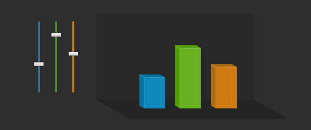
In the code above, you can see that we basically have only two structures, which are duplicated three times, once for every color. We have the slider structure, which is a div with two assigned class names - colorful-slider, and another one of three color choices. The latter one is later used by jQuery to determine which bar the slide movement affects.
Inside the slider is the slide-handle div, which is converted to a draggable jQuery UI control, the movements of which are later translated to changes in the size of the bars.
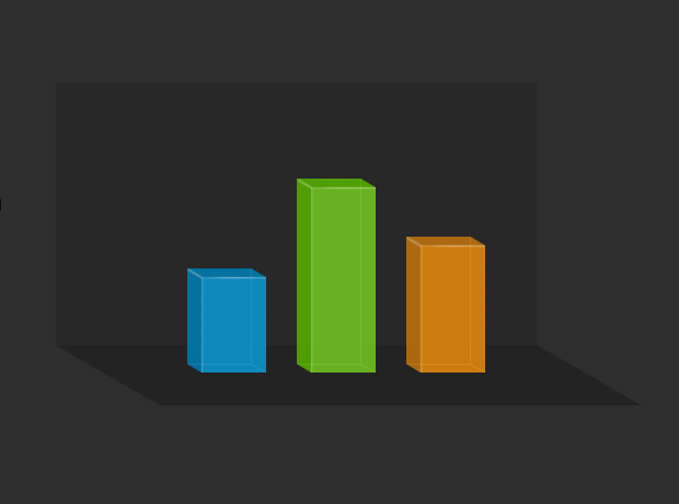
The second group is the one of the colorful bars. They share a common structure - a cuboid div, with three other divs inside it - for the top, middle and bottom sections. The structure is organized in such a way that resizing the middle div yields an increase in the height of the whole cuboid div, as you can see in the illustration below.
Lastly, we have the .perspective div. This is transformed with a set of CSS3 rules, so it is given a perspective feel which complements the 3D look of the bars.
Step 2 - CSS
You can find the code, given below, in styles.css, part of the download archive for the demo. The code is divided in two sections to make it easier to comprehend.
styles.css - Part 1
/* Styling the sliders */

.colorful-slider{
    width:6px;
    height:200px;
    border:1px solid #242424;
    position:relative;
    float:left;
    margin:20px 20px 0;

    -moz-border-radius:12px;
    -webkit-border-radius:12px;
    border-radius:12px;
}

/* Three sider colors: */

.colorful-slider.orange{ background:url("img/slider_orange_bg.png") repeat-y; }
.colorful-slider.green{ background:url("img/slider_green_bg.png") repeat-y; }
.colorful-slider.blue{ background:url("img/slider_blue_bg.png") repeat-y; }

.slider-handle{
    position:absolute;
    left:-11px;
    width:28px;
    height:12px;
    background:url("img/slider_handle.png") no-repeat;
    cursor:n-resize;
    top:44%;
}

.cube-area{
    width:400px;
    height:200px;
    background-color:#282828;
    float:left;
    margin:0 0 0 40px;
    padding:20px;
    position:relative;
}

.cuboid{
    /* The three resizable bar divs */
    width:72px;
    position:absolute;
    margin:20px;
    padding:12px 0 9px;
    float:left;
    bottom:-45px;
    z-index:10;
}
Positioning the slider-handle divs absolutely, while their parents (the colorful-slider divs) are positioned relative, allows us to specify a top and left property which are calculated in respect to the parents' positions. This way we can offset the handles 11 pixels to the left, which centers them perfectly in the slider, despite the latter actually being narrower.
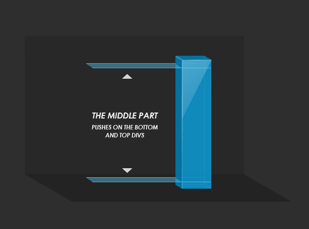
This same technique is used to fix the top and bottom parts of the cuboid to their respective positions in the top and bottom of the div, with the middle cu-mid part filling in between and having a direct effect to the height of the colorful bars, as you can see in the second part of the code.
styles.css - Part 2
.cu-top{
    /* The top section of the bars */
    position:absolute;
    width:100%;
    top:0;
    left:0;
    height:12px;
    background-repeat:no-repeat;
}

.cu-mid{
    /* The mid section, it is freely resizable */
    background-repeat:repeat-y;
    height:100px;
    width:72px;
}

.cu-bottom{
    /* The bottom part */
    position:absolute;
    width:100%;
    height:9px;
    bottom:0;
    left:0;
    background-repeat:no-repeat;
}

/* Three color themes for the bars */

.cuboid.blue { left:100px;}
.cuboid.blue .cu-top{ background-image:url("img/cuboid_blue_top.png"); }
.cuboid.blue .cu-mid{ background-image:url("img/cuboid_blue_mid.png"); }
.cuboid.blue .cu-bottom{ background-image:url("img/cuboid_blue_bottom.png"); }

.cuboid.green { left:200px;}
.cuboid.green .cu-top{ background-image:url("img/cuboid_green_top.png"); }
.cuboid.green .cu-mid{ background-image:url("img/cuboid_green_mid.png"); }
.cuboid.green .cu-bottom{ background-image:url("img/cuboid_green_bottom.png"); }

.cuboid.orange { left:300px;}
.cuboid.orange .cu-top{ background-image:url("img/cuboid_orange_top.png"); }
.cuboid.orange .cu-mid{ background-image:url("img/cuboid_orange_mid.png"); }
.cuboid.orange .cu-bottom{ background-image:url("img/cuboid_orange_bottom.png"); }

.perspective{
    /* The perspective DIV */
    background-color:#232323;
    position:absolute;
    z-index:1;
    left:0;
    bottom:-55px;
    height:55px;
    width:100%;

    /* Applying CSS3 transformations */
    -moz-transform:skewX(60deg) translate(47px);
    -webkit-transform:skewX(60deg) translate(47px);
    transform:skewX(60deg) translate(47px);
}
The cuboid divs are assigned a second class, which specifies their color. The different colors are achieved by using unique background images for its children divs.
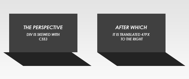
The last class, .perspective, applies two CSS3 transformations to the div. The first one - skew(60deg), transforms the div by skewing the bottom part off to the right. A correction is needed, however, because the skewing is actually divided evenly between the bottom and top part of the div, thus bringing the top part our of alignment with the other background div. A translation fixes this problem, by moving the entire div 47px to the right.
Step 3 - jQuery
We are using the latest version of jQuery library - 1.4.2, and the jQuery UI library, both of which are directly linked from Google's AJAX Libraries CDN and included in the head section of the page.
After including them in the page, we can move on to writing the code that will enable the dynamic bar effect.
sliders.js
$(document).ready(function(){
    /* The code here is executed on page load */

    /* Converting the slide handles to draggables, constrained by their parent slider divs: */

    $('.slider-handle').draggable({
        containment:'parent',
        axis:'y',
        drag:function(e,ui){

            /* The drag function is called on every drag movement, no matter how minute */

            if(!this.par)
            {
                /* Initializing the variables only on the first drag move for performance */

                this.par = $(this).parent();
                this.parHeight = this.par.height();
                this.height = $(this).height();
                this.color = $.trim(this.par.attr('class').replace('colorful-slider',''));
            }

            var ratio = 1-(ui.position.top+this.height)/this.parHeight;

            resizeBar(this.color,ratio);
        }
    });
});

function resizeBar(color,ratio)
{
    $('.cu-mid','.cuboid.'+color).height(200*ratio)
}
Here we use the jQuery UI's draggable method, which converts any div on your page into a draggable object. We are applying it to the slider-handle divs while setting a number of options. The first one - containment, limits the movement of the handle withing its parent - the slider itself. The second specifies the axis of allowed movement.
We also define the drag function which will be executed on every drag movement. In it we calculate the ratio by dividing the distance from the handle to the top of the slider to the total height of the slider. We end up with a number between 0 and 1, which is then passed to the resizeBar() function along with the color of the bar which is to be affected.
With this our colorful sliders with jQuery and CSS3 are complete!
Conclusion
There are many possible uses for this code. You could create pure CSS 3D charts by just specifying a default height of the cub-mid divs in pixels. You could also use the sliders in many different applications and by modifying the drag function you can do almost everything.
What do you think? How would you improve this example?
Bootstrap Studio
The revolutionary web design tool for creating responsive websites and apps.
Learn more
I really like the CSS skewed effect. Another great tut this week!
Perfect! Techniques very well utilized. Thank you again!
Skewed effect is definitely cool.
Excellent real-world example of putting jQuery to good, practical use. I can see this kind of thing being used on payment pages to really engage the user - could even increase sales (it's tempting to push that bar to the top!).
Amazing effect and great tut :)
Love it!
Thanks a lot!
Lots of nice use of CSS and jQuery. I appreciate that the HTML has been kept clean. Great job!
I just love your tutorials!!!
Thank you for taking the time to share awesomeness :)
Blessed Light,
Aline - @ArtWave
Excellent post! Very clear and detailed explanation for those just starting to explore the power of jQuery. :)
Brilliant idea, I like the 3D look
Thanks for sharing!
Why not use transform-origin instead of use a translation for the skew ?
that great.....!!! thanks
@Mr.MoOx
To demonstrate how different transformations are stacked. But transform-origin is a valid option. If anyone wants to implement it, they have to put the following lines somewhere before the -moz-transform rules in the .perspective class in styles.css:
This will eliminate the need for translate(47px) in the transform statements.
Ultimate work
I m lovin it
Nice post thank you for sharing! :-)
Martin, I'm curious is there anyway to have the sliders hold their position on browser refresh/relaunch?
@ Jacob
You could do this with cookies. I will not go into details, but you should probably listen to the stop event in sliders.js between lines 8-9. This event is called when dragging stops. You can then set a cookie for the slider with its current height. You will end up with three cookies for each of the sliders.
After this, you should think of a way to read these cookies on page load, and if they exist, update each of the sliders' css top positions (as well as the bars' heights).
You can read more about setting and reading cookies with jQuery in this MicroTut.
Hi there,
I love this tutorial! The effect is exactly what I am going for on a script I am working on, however I need to make a custom .drop function. Would this be the same syntax as the drag:function() ?
What I am trying to do is when the user drops the slider, they are restricted from dragging for a certain period of time and then a content pane appears, populated by ajax content.
I can see this being very useful for my client's who utilize graphs a lot. They can simply change the slider position.
Love the slider, thanks for sharing the code and very easy to follow
Wonderful effect..
Thanks so much..
Are there another examples????
chamoW
Hello !
I really love that work, and for a project, I'd like to use it and modify it to another way. I explain : I would like to make visible some parts of a database with the variations of the cursor. Do you think is it possible ? And how ?
Thank you so much for this! So simple and effective.
I am using this in a project. In a couple days the sliders will be added to tytel.org/salad
I made these small alterations:
JavaScript
(function($, window) {
  $.fn.extend({

    slider: function(o) {
      var options = $.extend({}, {
        min: 0,
        max: 1,
        start: 0.5,
        step: null,
      }, o);

      function on_drag(e, ui) {
        // 'this' is the slider handle
        if (!this.par) {
          this.par = $(this).parent();
          this.parHeight = this.par.height();
          this.height = $(this).height();
        }
        var ratio = 1 - (ui.position.top + this.height) / this.parHeight;
        var val = options.min + ratio * (options.max - options.min);
        if (options.step) {
          val = options.min + Math.floor((val - options.min) / options.step) * options.step;
        }
        this.par.trigger('change', val);
      }

      function set_position(val) {
        // 'this' is the slider track
        if (val < options.min || val > options.max) {
          return;
        }
        var $this = $(this);
        var ratio = val / (options.max - options.min);
        var $handle = $this.find('.slider-handle').first();
        $handle.css({top: (1 - ratio) * $this.height() - $handle.height()});
        $this.trigger('change', val);
      }

      return $(this).each(function(){
        var $this = $(this);
        $this.find('.slider-handle').first().draggable({
          containment:'parent',
          axis:'y',
          drag: on_drag,
        });
        $this.setPosition = set_position;
        $this.setPosition(options.start);
      });
    }

  });
})(jQuery, this);
JavaScript usage
$('#frequency')
      .slider({min: .01, max: .5, start: .125})
      .on('change', function(ev, val) {
        setFrequency(val);
      });
HTML snippet
<div id="frequency" class="colorful-slider gray">
          <div class="slider-handle"></div>
        </div>
I am still improving the CSS colors; I wanted gray
.colorful-slider { width: 6px; height: 200px; border: 1px solid #242424; position: relative; float: left; margin: 20px 20px 0; -moz-border-radius: 12px; -webkit-border-radius: 12px; border-radius: 12px; } .colorful-slider.gray { background: rgb(125, 125, 125); } .slider-handle { position: absolute; left: -11px; width: 28px; height: 12px; background: rgb(200, 200, 200); border: 1px solid rgb(100, 100, 100); cursor: n-resize; top: 44%; }Thank you for a most professional treatment on the subject of vertical sliders.
I am truly thankful and impressed. I was up and running with the vertical sliders
installed in minutes. Your presentation was thorough, complete, and honestly
refreshing.
You asked for comments:
The sliders seem to sometimes retain focus when the mouse
is moved away, have you noticed? This happens in Microsoft Edge; I cannot
duplicate the problem in Firefox. In IE11, the brower is trying to display the
tiny 'wait' hourglass while sliding. Otherwise it acts normally.
Many thanks again... -Russ