Halftone Navigation Menu With jQuery & CSS3
Providing an intuitive, yet eye-catching navigation on your site, is one of the ingredients for a great design. And with the performance improvements in newer browsers and the rise of JavaScript frameworks such as jQuery, it is becoming easier to include beautiful animations in your page designs.
Today we are making a CSS3 & jQuery halftone-style navigation menu, which will allow you to display animated halftone-style shapes in accordance with the navigation links, and will provide a simple editor for creating additional shapes as well.
Halftone is the reprographic technique that simulates continuous tone imagery through the use of dots, varying either in size or in spacing. "Halftone" can also be used to refer specifically to the image that is produced by this process.
So lets start with step one!
Step 1 - XHTML
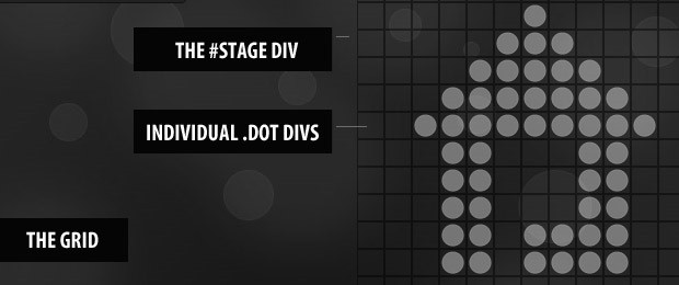
The first step is to lay down the XHTML structure of the menu. The whole menu is positioned inside an unordered list UL, which is the most suitable way of organizing your site's navigation. Inside each of the LI elements are the hyperlinks, that are later styled to look like buttons via some interesting CSS code that you will see in a moment.
demo.html
<div id="main">

<div id="navigation">

<ul class="menuUL">
<!-- The class names that are assigned to the links correspond to name of the shape that is shown on hover: -->
<li><a href="#" class="house">Home</a></li>
<li><a href="#" class="wrench">Services</a></li>
<li><a href="#" class="envelope">Contact</a></li>
<li><a href="#" class="info">About</a></li>
</ul>

<div class="clear"></div>
</div>

<div id="stage">
<!-- The dot divs are shown here -->
</div>

</div>
If you plan to use this menu on your site, you'll first need to modify the href attributes, so that they correspond to your site's structure.
Worth noticing are also the class names that are assigned to each of the links. Those are not used to style them, but rather to tell jQuery which shape to render.
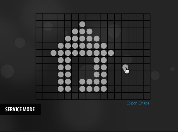
Lastly, there is our #stage div, which is filled with special .dot divs that act as pixels for our shapes. You can create custom shapes by setting the menu in service mode, which is covered in step three.
Step 2 - CSS
It is time to add some life to the design, by specifying the CSS rules. I divided the style sheet in two parts. You can see the rest of the code in styles.css in the demonstration files.
styles.css - Part 1
.menuUL li{
    /* This will arrange the LI-s next to each other */
    display:inline;
}

.menuUL li a,.menuUL li a:visited{
    /* Styling the hyperlinks of the menu as buttons */

    float:left;
    font-weight:bold;
    background:url(img/button_bg.jpg) repeat-x center bottom #666666;

    /* display:block allows for additional CSS rules to take effect, such as paddings: */
    display:block;
    border:1px solid #4D4D4D;
    color:#CCCCCC;
    border-top-color:#565656;

    padding:4px 6px;
    margin:4px 5px;
    height:16px;

    /* Setting a CSS3 box shadow around the button */

    -moz-box-shadow:0 0 1px black;
    -webkit-box-shadow:0 0 1px black;
    box-shadow:0 0 1px black;

    /* CSS3 text shadow */
    text-shadow:0 1px black;
}

.menuUL li a:hover{
    /* On hover show the top, lighter, part of the background: */
    background-position:center top;
    text-decoration:none;
}
In this first part, you can see that we are displaying the LI elements inline, which will arrange them one next to each other and thus allow us to form a horizontally oriented navigation menu in a compatible cross-browser fashion.
The hyperlinks inside them are displayed as block elements and floated to the left. Also some CSS3 rules are applied such as box-shadow, for casting a shadow under the buttons, and text-shadow, for shadows under the text of the button.
Those are all small details that contribute to the overall feel of the page, but are in no way compulsory for the browsing process. This is great for users whose browsers don't support CSS3 yet (most notably the IE family).
styles.css - Part 2
#navigation{
    /* The navigation menu bar: */
    background:#222222;
    border:1px solid #111111;
    float:left;
    padding:5px 10px;
}

#navigation,.menuUL li a{
    /* CSS3 rounded corners for both the navigation bar and the buttons: */
    -moz-border-radius:4px;
    -webkit-border-radius:4px;
    -khtml-border-radius:4px;
    border-radius:4px;
}

#stage{
    /* The stage contains the individual divs that comprise the halftone icon: */
    height:300px;
    position:absolute;
    right:50px;
    top:20px;
    width:400px;
}

.dot{
    /* The stage contains 192 .dot divs: */
    float:left;
    height:25px;
    width:25px;
}

.dot.active{
    /* When assigned the active class, the div shows a background image of a dot: */
    background:url(img/dot.png) no-repeat center center;
}

.clear{
    /* Old-school clear fix hack to clear the floats: */
    clear:both;
}

#main{
    margin:0 auto;
    position:relative;
    width:900px;
}
In the lines above you can see the rest of the CSS3 rules that are used. There we add rounded corners via the border-radius property (supported by most of the modern browsers) for both the navigation bar and individual buttons at once.
Step 3 - jQuery
After finishing with all the styling, it is time to throw in some JavaScript. The first step is to include the jQuery library to the head section of the document we are working on.
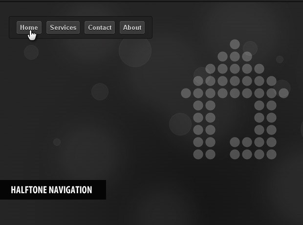
As I mentioned earlier, there are two modes available for the navigation menu. The first one is the default one, which shows a previously defined shape in a smooth animation when you hover your mouse over a navigation button.
The second one allows you to create your own shapes by clicking on the grid. You can later export the shape and insert it as an array in the shapes object. To make jQuery show it, you just need to insert the name of your just-created shape in the class attribute of the navigation link you wish to associate it with.
Now lets see how this works.
script.js - Part 1
/* Set serviceMode to true to create your own shapes: */
var serviceMode=false;

$(document).ready(function(){

    /* This code is executed after the DOM has been completely loaded */

    var str=[];
    var perRow = 16;

    /* Generating the dot divs: */
    for(var i=0;i<192;i++)
    {
        str.push('<div class="dot" id="d-'+i+'" />');
    }

    /* Joining the array into a string and adding it to the inner html of the stage div: */
    $('#stage').html(str.join(''));

    /* Using the hover method: */
    $('#navigation li a').hover(function(e){

        /* serviceDraw is a cut-out version of the draw function, used for editing and composing shapes: */

        if(serviceMode)
            serviceDraw($(this).attr('class'));
        else
            draw($(this).attr('class'));
    }, function(e){});

    /* Caching the dot divs into a variable for performance: */
    dots = $('.dot');

    if(serviceMode)
    {
        /* If we are in service mode, show borders around the dot divs, add the export link, and listen for clicks: */

        dots.css({
            border:'1px solid black',
            width:dots.eq(0).width()-2,
            height:dots.eq(0).height()-2,
            cursor:'pointer'
        });

        $('<div/>').css({
            position:'absolute',
            bottom:-20,
            right:0
        }).html('<a href="" onclick="outputString();return false;">[Export Shape]</a>').appendTo('#stage');

        dots.click(function(){
            $(this).toggleClass('active');
        });
    }
});
In the topmost part of the file is the serviceMode variable. By setting it to true, you can start creating your own shapes. Just don't forget to set it back to false after you've finished, so that your visitors don't see the grid and the export link. It would be even better if you keep a dedicated service mode version locally and use a different one for your site (this way you can also strip the unnecessary code for the service mode from the production version).
After the DOM has finished loading (on $(document).ready()) we populate the #stage with a grid of 192 divs (16 per row), that will form the pixels of the image.
script.js - Part 2
var shapes={
    /* Each shape is described by an array of points. You can add your own shapes here, just don't forget to add a coma after each array, except for the last one */

    house:[22,37,38,39, .... 166,167,168,169],
    wrench:[22,23,24,25,26 .... 148,163],
    envelope:[34,35,36,37, .... 153,154,155,156],
    info:[22,23,38,39, .... 151,166,167,168]
}

var stopCounter = 0;
var dots;

function draw(shape)
{
    /* This function draws a shape from the shapes object */

    stopCounter++;
    var currentCounter = stopCounter;

    dots.removeClass('active').css('opacity',0);

    $.each(shapes[shape],function(i,j){

        setTimeout(function(){
        /* If a different shape animaton has been started during the showing of the current one, exit the function  */

        if(currentCounter!=stopCounter) return false;

        dots.eq(j).addClass('active').fadeTo('slow',0.4);

        /* The fade animation is scheduled for 10*i millisecond into the future: */
    },10*i);

});
}

function serviceDraw(shape)
{
    /* A cut out version of the draw function, used in service mode */

    dots.removeClass('active');

    $.each(shapes[shape],function(i,j){
        dots.eq(j).addClass('active');
    });
}

function outputString()
{
    /* Exports the positions of the active dot divs as a comma-separated string: */

    var str=[];
    $('.dot.active').each(function(){
        str.push(this.id.replace('d-',''));
    })

    prompt('Insert this string as an array in the shapes object',str.join(','));
}
In the second part, you can see the shapes object. It contains four default shapes, which are set as class names to the navigation links. You can customize them by loading them in the service mode, or you can remove them completely and add your own.
After this we define the draw, serviceDraw and the outputString function. The latter two are used only in serviceMode and help you create your own shapes. If you do not plan to use the service mode, you can go ahead and remove them (just don't forget to also remove lines 34-54 from the first part of script.js above).
With this our CSS3 & jQuery navigation menu is complete!
Conclusion
Today we created a sleek animated navigation menu with the help of jQuery and CSS3. The menu is compatible with all the major browsers and works perfectly fine even if JavaScript is disabled. As most of the XHTML markup necessary for the animation is inserted dynamically by JavaScript, the page holds a bare amount of code and is SEO friendly.
What do you think? How would you improve this code?
Bootstrap Studio
The revolutionary web design tool for creating responsive websites and apps.
Learn more
You are a genius! Very simple, yet smooth effect. Great work :)
Great trick! :D
It's Rox!
This is quite nice :-)
Thank you for sharing!
Very nice - I particularly like the inclusion of the service mode.
You should package it as a jQuery plug-in.
Wow! This is amazingly beautiful!
Another stunning and excellent tutorial... You guys are doing an excellent job with this site. Who is behind the website anyway? I'd love to read more about the authors of the site. :)
Sh****t..... This is wonderfull!!!!
Thank you!!!!
cheers..........
Thx So Much love jquery tutorials :)
wow......so smart...... great. Your are the best.
Great Tut !
This is amazing. I've been waiting a few days for this, since the preview on Twitter. The crazy thing is though, I started sketching out the wireframe for the redesign of my main site and this tutorial just fleshed out a major component that was empty.
Thanks so much for this, what a lovely tutorial!
amazing...!!!
Thanks for the comments folks! Glad you like it :)
Great tutorial and amazing effect/outcome
now, THAT is cool! really nice proof of concept. not sure how i could use this, but i want to!
Impressive! Fantastic trick!
Thanks for sharing great stuff.
Chapeau!
Wow, simply sexy smooth !!
Your generosity is highly appreciated :)
Blessed Light,
Aline (@ArtWave)
Can you make it smaller?
tried several things now, but things like resizing the stage div and similar simply wont do it… have i missed something, or cant it be done??
Very impressive stuff !
Thanks for sharing .
Great and unusual effect!
Very impressive! Great stuff. Thanks for sharing.
Best, Vitor.
Hi
This is an AWESOME tutorial!!!! i was browsing for inspiration on updating my site, looking for something unique... may use this tutorial and create my own version, if that's ok with you?
Thank you very much...
All the best and keep up the good work
Excellent work!!
Una maravilla...rally wonderfull, simply but with beaufitul effect!!
voila...awesome many trick to using for web.
its my inspiration :D
Amazing effect! Great idea.
Hi,
It's a really wonderful effect!
For my family website, I'd like to have a set of shapes appear as soon as the user scrolls past 2 anchors in the page. To be clearer, when the user scrolls past the first anchor, then the first shape appears; when he scrolls past the second, then the second shape appears; and so on. But also, when the second shape is displayed and the user scrolls back up past the second anchor, then it should be replaced by the first one... Don't know if I'm making myself clear, but if someone's got a clue of the syntax to use, I would be forever grateful towards him...
Here's the code I had figured as a starting possibility, but being -really-dumb at using jQuery, I just can't go any further by myself... please help ;-)
var firstAnchor = $('#firstAnchor').offset().top;
var secondAnchor = $('#secondAnchor').offset().top;
var thirdAnchor = $('#thirdAnchor').offset().top;
luv it!
just a thought.
dots.eq(j).addClass('active').fadeTo('slow',0.4);
can also be done with
$('#d-'+j).addClass('active').fadeTo('slow',0.4);
not sure if this will improve the performance by doing a direct id search. probably wont. ;))
This is something out of the box. Excellent tutorial
Awesome thanks, going to have a play with this now.
I'll let you know how i get on! Thanks!
OMG,My web site works with the same idea.
My idea come out at 2009.10,but you make the much more batter.
I cant seem to get service mode? How to enable it? And then what? Im a noob plz help.
nth happened for me...just the nav bar with the css showed up
Please! Add some CSS to print your pages!
cannot create PDF docs from this tutorial
wow, this is really cool :)
wow, its wonderful technique
wow, this is really cool :)
it's work! and amzing to looking
How do i get on to service mode? I'm not quite getting it?
I think you aren't a human!
You are from Space
You are the best teacher!
thanks for every things.
Amazing!
for service mode change "false" to "true"
for resizing change the size of the "dot.png" and enter the appropriate values in the "styles.css" (#stage and .dot have to be changed)
one question:
how to do a fade out after e.g. 5 seconds?
I appreciate any help ;)