App Engine Series #5: The Front End
Important: As of July 2015, this tutorial no longer works, as App Engine has shut down the Master/Slave Data Store that the application uses. We are keeping it online for reference purposes and you can still download the code, but it needs to be converted to the newer High Availability Data Store to work.
This is the fifth part of our App Engine series, where we are building an uptime dashboard web application using Google’s powerful App Engine platform and tools. Read part four, where we created the controllers, which handle the URL requests to our application.
This is the final part of the series, where we will be creating the jQuery / CSS front end. We will be using the Flot jquery plugin to build a live visualization of the uptime data gathered by the application. You might want to keep part three of the series open in a tab, as we will be building upon the HTML markup discussed there.
The JSON Request
As you remember from last time, we have a dedicated controller for handling the AJAX requests. It handles and outputs JSON responses for /ajax/24hours/, /ajax/7days/ and /ajax/30days/.
The responses have the following structure:
{
"chart": {
"data": [{
"value": 231,
"label": "Apr, 10"
}, {
"value": 243,
"label": "Apr, 11"
}, {
"value": 330,
"label": "Apr, 12"
}, {
"value": 404,
"label": "Apr, 13"
}],
"tooltip": "Average response time for %1: %2ms"
},
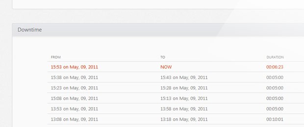
"downtime": [{
"begin": "15:37 on Apr, 11, 2011",
"end": "15:42 on Apr, 11, 2011",
"period": "00:05:00"
}, {
"begin": "08:16 on Apr, 12, 2011",
"end": "08:21 on Apr, 12, 2011",
"period": "00:05:00"
}, {
"begin": "08:09 on Apr, 13, 2011",
"end": "08:14 on Apr, 13, 2011",
"period": "00:05:00"
}]
}
The value properties in the data array correspond to the response times for the given ping, when selecting the last 24 hours, or day when selecting 7 or 30 days.
We will be using this JSON data to build the graph and the downtime list beneath it.
The jQuery
In this section we will be looking at the code in assets/js/scripts.js. Note that this is not the only JavaScript file in this application. We are also using the jQuery library, the Flot plugin, and excanvas (requested only in older IE browsers for compatibility).
The first step is to listen for the document.ready event so we can access the DOM of the underlying page.
$(document).ready(function(){
// Caching some of the selectors for better performance
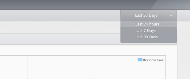
var periodDropDown = $('#periodDropDown'),
dropDownUL = $('ul',periodDropDown),
currentPeriod = $('.currentPeriod',periodDropDown),
performancePlot = $('#plot'),
cache = {};
// Listening for clicks on the dropdown:
periodDropDown.find('li').click(function(){
var li = $(this);
currentPeriod.text(li.text());
loadPeriod(li.data('action'));
});
// Disabling the dropdown when an AJAX request is active:
periodDropDown.ajaxStart(function(){
periodDropDown.addClass('inactive');
}).ajaxComplete(function(){
periodDropDown.removeClass('inactive');
});
As you can see, we are assigning some of the selectors we will be using most often to variables, which has a positive effect on performance. Also, I am using the ajaxStart() and ajaxComplete() methods to bind events which get executed once an AJAX request is initiated. In the code above, the inactive class is added to periodDropDown, which prevents it from being expanded on hover.
Next we will be binding a custom event to the plot div, which will help us organize our code better. Later in the code, we will be able to create a new plot by simply triggering the render method.
  // Binding a custom "render" event to the plot div:

    performancePlot.bind('render',function(e,plotData,labels){

        var ticksLength = 7;

        // Using the Flot jQuery plugin to generate
        // the performance graph:

        var plot = $.plot(performancePlot,
            [{
                // Passing the datapoints received as a parameter
                // and setting the color and legend label.

                data: plotData,
                color:'#86c9ff',
                label: "Response Time"
            }], {
                series: {
                    // Setting additional options for the styling.
                    lines: {
                        show:true,
                        fill:true,
                        fillColor:'rgba(237,247,255,0.4)',
                        lineWidth:1
                    },
                    shadowSize: 0,
                    points: { show: (labels.length == 1) }
                },
                grid: {
                    tickColor:'#e0e0e0',
                    hoverable: true,
                    borderWidth:1,
                    borderColor:'#cccccc'
                },
                xaxis:{

                    // This function is called by the plugin
                    // which passes a "range" object. The function
                    // must generate an array with the divisions ticks:

                    ticks:function(range){

                        ticksLength = range.max-range.min;
                        var dv = 1;

                        // Trying to find a suitable number of ticks,
                        // given the varying number of data points in the
                        // graph:

                        while(ticksLength>12){
                            ticksLength = Math.floor(ticksLength/++dv);
                            if(dv>30) break;
                        }

                        var ratio = (range.max-range.min)/ticksLength,
                            ret = [];

                        ticksLength++;

                        for(var i=0;i<ticksLength;i++){
                            ret.push(Math.floor(i*ratio));
                        }

                        return ret;
                    }
                }

        });

        // The Flot plugin has some limitations. In the snippet below
        // we are replacing the ticks with proper, more descriptive labels:

        var elem = $('div.tickLabel').slice(0,ticksLength).each(function(){
            var l = $(this);
            l.text(labels[parseInt(l.text())]);
        }).last().next().hide();

        // Displaying a tooltip over the points of the plot:

        var prev = null;
        performancePlot.bind("plothover", function (e,pos,item) {

            if (item) {

                if(item.datapoint.toString() == prev){
                    return;
                }

                prev = item.datapoint.toString();

                // Calling the show method of the tooltip object,
                // with X and Y coordinates, and a tooltip text:

                tooltip.show(
                    item.pageX,
                    item.pageY,
                    currentData.chart.tooltip.replace('%2',item.datapoint[1])
                                             .replace('%1',currentData.chart.data[item.dataIndex].label)
                );
            }
            else {
                tooltip.hide();
                prev = null;
            }

        });

    }).bind("mouseleave",function(){
        tooltip.hide();
        prev = null;
    });
The Flot jQuery plugin, which we are using to display the pretty graph, supports an extensive api. A lot of the options got used here, and although the code is commented, I am going to explain some of them further.
The plugin takes a jQuery object (or a DOM node) as its first argument, the data points that will be displayed in the graph come second, and third is an object with additional options. The jQuery object determines where the plot will be displayed (the plot takes the full width and height of the element).
The data points are requested via AJAX as you will see in a moment. As the third argument of the plugin call, we are passing an object with three properties - series, which determine the styling of the data points, grid and xaxis.
The last attribute - xaxis - is a callback function that is called by the plugin before generating the horizontal divisions of the plot. We are using it to override and decrease their number of the default divisions, so they are spaced up properly. Otherwise the x-axis would become cluttered when a full day's worth of pings are displayed on the graph.
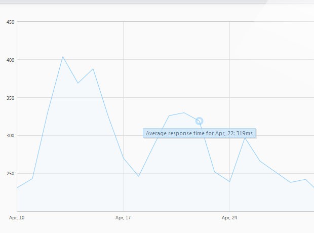
We are also binding an event listener for the plothover event that is triggered by the plugin, when the user hovers above it. We are using it to display a simple tooltip, using the methods of the tooltip object, given below:
// This object provides methods for hiding and showing the tooltip:

    var tooltip = {
        show : function(x, y, str) {

            if(!this.tooltipObj){
                this.tooltipObj = $('<div>',{
                    id      : 'plotTooltip',
                    html    : str,
                    css     : {
                        opacity : 0.75
                    }
                }).appendTo("body");
            }

            this.tooltipObj.hide().html(str);
            var width = this.tooltipObj.outerWidth();

            this.tooltipObj.css({left: x-width/2, top: y+15}).fadeIn(200);
        },
        hide : function(){
            $("#plotTooltip").hide();
        }
    }

    // Loading the data for the last 24hours on page load:
    loadPeriod('24hours');
At the bottom of the snippet, you can see that we are calling a loadPeriod function. It handles the AJAX requests and is triggered by selecting a different period from the dropdown. However, on load, we need to trigger it manually. You can see its code below.
  var currentData;

    // This function fetches and caches AJAX data.
    function loadPeriod(period){

        // If the period exists in cache, return it.
        if(cache[period]){
            render(cache[period]);
        }
        else{

            // Otherwise initiate an AJAX request:
            $.get('/ajax/'+period+'/',function(r){
                cache[period] = r;
                render(r);
            },'json');
        }

        function render(obj){

            var plotData = [],
                labels = [],
                downtimeData = $('#downtimeData');

            // Generating plotData and labels arrays.
            $.each(obj.chart.data,function(i){
                plotData.push([i,this.value]);
                labels.push(this.label);
            });

            // They are passed with our custom "render" event to the plot:
            performancePlot.trigger('render',[plotData, labels]);

            // Formatting the downtime:
            if(obj.downtime.length){

                $('#noDowntime').hide();

                if(!obj.processed){
                    // Adding the heading for the downtime list:
                    obj.downtime.push({begin: 'FROM',end:'TO',period:'DURATION'});
                    obj.downtime = obj.downtime.reverse();
                }
                obj.processed = true;

                var tmp = $('<div class="dtContainer">'),
                    className = '';

                $.each(obj.downtime,function(){
                    if(this.end == 'NOW'){
                        className = ' ongoing';
                    }
                    else className = '';

                    tmp.append(
                        '<div class="row'+className+'">'+
                            '<span class="from">'+this.begin+'</span>'+
                            '<span class="to">'+this.end+'</span>'+
                            '<span class="period">'+this.period+'</span>'
                        +'</div>'
                    );
                });

                downtimeData.html(tmp)
            }
            else {
                downtimeData.empty();
                $('#noDowntime').show();
            }

            currentData = obj;
        }
    }
});
This function issues AJAX requests, triggers the render method of the plot div, and generates the downtime log. In addition it also uses a simple caching mechanism, so that requests are made only the first time.
All that we are left to do is to add some CSS shine.
The CSS
The styles used by our uptime dashboard reside in assets/css/styles.css. This file handles everything from the styling of the body to the graph tooltips.
First we will be styling the dropdown. This is the element that holds the different periods for which we are providing down time reports.
/*===============================
*   Styling the dropdown:
================================*/

#periodDropDown{
    background: url("../img/sprite.png") repeat-x 0 -7px;
    bottom: 0;
    cursor: pointer;
    height: 38px;
    padding: 0 25px 0 12px;
    position: absolute;
    right: 0;
    text-indent: 37px;
    width: 150px;
    text-shadow: 1px 1px 0 #95999D;
}

#periodDropDown ul{
    display:none;
    background-color: #9FA2A8;
    left: 1px;
    list-style: none outside none;
    padding-bottom: 10px;
    position: absolute;
    right: 1px;
    top: 36px;

    -moz-border-radius:0 0 3px 3px;
    -webkit-border-radius:0 0 3px 3px;
    border-radius:0 0 3px 3px;
}

#periodDropDown:hover ul{
    display:block;
}

#periodDropDown.inactive ul{
    display:none !important;
}

#periodDropDown.inactive{
    cursor:default;
}

#periodDropDown li{
    padding:2px;
    text-indent: 47px;
}
#periodDropDown li:hover{
    background-color:#b0b2b7
}

#periodDropDown .left,
#periodDropDown .right,
#periodDropDown .arrow{
    background: url("../img/sprite.png") repeat-x 0 -45px;
    position:absolute;
    top:0;
    left:0;
    height:38px;
    width:11px;
}

#periodDropDown .right{
    left:auto;
    right:0;
    background-position:0 -83px;
}

#periodDropDown .arrow{
    background-position:0 0;
    width:10px;
    height:7px;
    top:50%;
    margin-top:-2px;
    left:auto;
    right:15px;
}

#periodDropDown .currentPeriod{
    line-height: 34px;
}
You can see that we are using a CSS sprite for the leftm right and arrow spans of the dropdown. The styles that are common for all these elements are placed into a single declaration group, with individual styling assigned later.
After this we style the plot and the plot tooltip.
/*===============================
*   Styling the plot:
================================*/

#plot{
    height:400px;
    margin:30px;
    position:relative;
}

#plot .preloader{
    background: url('../img/preloader.gif') no-repeat center center;
    position:absolute;
    width:100%;
    height:100%;
    left:0;
    top:0;
}

#plotTooltip{
    position: absolute;
    display: none;
    border: 1px solid #a1d0f6;
    padding: 2px 5px;
    background-color: #c5e2f9;
    color:#2a4f6d;
    font-size:11px;
    text-shadow:0 0 1px rgba(255,255,255,0.3);

    -moz-box-shadow:2px 2px 0 rgba(0,0,0,0.1),1px 1px 0 #fff;
    -webkit-box-shadow:2px 2px 0 rgba(0,0,0,0.1),1px 1px 0 #fff;
    box-shadow:2px 2px 0 rgba(0,0,0,0.1),1px 1px 0 #fff;
}
And lastly the sections and the downtime data list.
/*===============================
*   The sections:
================================*/

#page h3{
    font-size: 15px;
    line-height: 34px;
    padding: 0 15px;
}

#page .section{
    background: url("../img/sprite.png") repeat-x 0 -121px #FAFAFA;
    border: 1px solid #D1D3D5;
    min-height: 300px;
    margin: 40px 0;
    overflow-x: hidden;

    -moz-border-radius: 4px;
    -webkit-border-radius: 4px;
    border-radius: 4px;

    -moz-box-shadow: 0 0 1px #fff inset;
    -webkit-box-shadow: 0 0 1px #fff inset;
    box-shadow: 0 0 1px #fff inset;
}

/*===============================
*   Downtime styles:
================================*/

#noDowntime{
    color: #999999;
    line-height: 160px;
    text-align: center;
    display:none;
}

.dtContainer{
    color:#777;
}

.row{
    border-bottom: 1px solid #DDDDDD;
    overflow: hidden;
    padding: 6px 0;
}

.row.ongoing{
    color:#C30;
}

#downtimeData .row span{
    float:left;
}

#downtimeData .row:first-child{
    font-size:10px;
}

#downtimeData .from,
#downtimeData .to{
    margin-left: 10px;
    width:40%;
}

#downtimeData{
    margin: 50px 100px;
}
With this the front end of our application and this series, is complete!
To Wrap It Up
In the course of this series we created a simple App Engine web app using Python and jQuery, while demonstrating the various Google APIs and how to use them to build a friendly downtime report, complete with a live graph. You can use the resulting application to track the performance of your website and even modify it to include more useful features.
Be sure to share your thoughts and suggestions in the comment section below!
Bootstrap Studio
The revolutionary web design tool for creating responsive websites and apps.
Learn more
Thanks Martin! Good work.
Nice article.. I wait for the next one!!!
really amazing tutorial. Thank you!
It's really helpful article!
Be cool if this was followed up with a post on how to add some kind of header in order to identify this GAE app coming into your site every 5 minutes so that we can discount these requests.
Great tutorial, thanks.
awesome work.
Thank you, a real tutorial!!
wow.. Amazing tutorial series but I would like to point one thing about the website, displaying links for articles belonging to the same series will definitely help visitors navigate easily :)
woow wonderful tutorial thank you!